Singapore’s new train displays have serious design issues. Here’s what we can learn
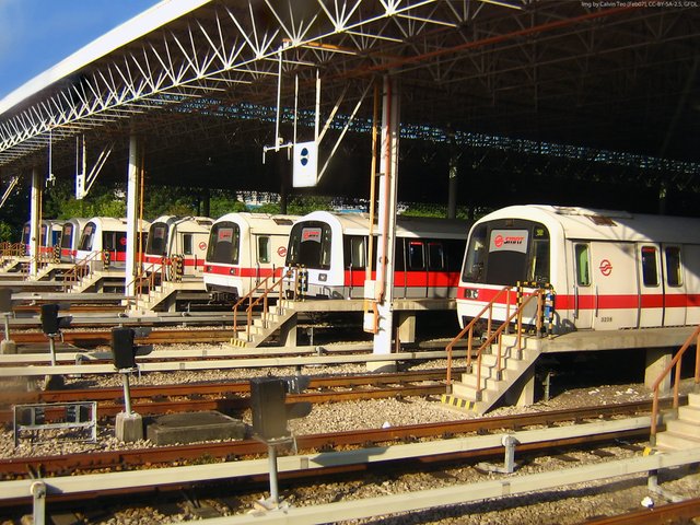
In April 2017, one of Singapore’s train operators, SMRT Corporation, started rolling out a brand-new fleet of trains. These shiny new trains have LCD displays inside them—displays that will dynamically update their content to help commuters find their way around the train network.
Sounds like a great idea, doesn’t it? But the actual execution of the display was so bad it makes for a perfect case study of how bad design can destroy a great idea. So, buckle up and get ready for a ride (sorry) that is equal parts entertaining, exasperating, and educational.
Staris 1.0: The original design
Before the new LCD displays, SMRT trains used the SMRT Active Route Map Information System or STARiS. Since I don’t approve of the quirky capitalization used, I’ll refer to it as Staris instead.
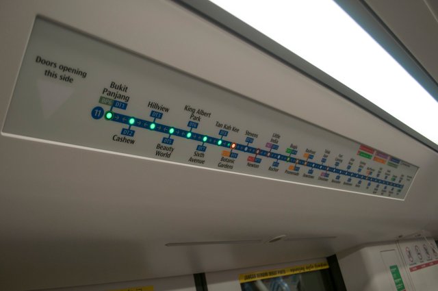
Staris displays the train route map (well, it’s technically a diagram, not a map—more about that below) of the North-South and East-West train lines. Green LED lights indicate the rest of the journey, and a blinking red light tells you the next stop. Pretty straightforward and elegant.
A major drawback of the original Staris is that, being a physical display, it needs to be changed every time new stations or train lines are added to the network. Unfortunately, that happens regularly enough to be a real pain. (On the photo above, notice the sticker near the left edge of the display, which covers a future line extension.)
Staris 2.0: Oh, no. They did not
Staris 2.0, an all-digital iteration of the previous display, makes perfect sense if it weren’t so horribly designed.
Because the problems with Staris 2 are so numerous, and because there’s so much we can learn from bad design, I’ll break down the new display, one bad design decision at a time.
- It’s ugly. Oh, it’s really ugly.
The first thing you’ll notice about the new Staris is its horrible visual design.

The screens look like they were designed by an engineer on PowerPoint. With liberal use of glossy textures and reflection effects, you’d think this screen was designed a decade ago when the first iPhone was announced.
The screens also employed a messy mix of fonts, using what seemed like Arial, Arial Round, DIN, and Ocean Sans (the official body text font), but, weirdly, not the main corporate typeface, LTA Identity.
In comparison, the old Staris looked so attractively professional.
Aesthetics plays a large role in UX, primarily by making a product work better (or at least appear to work better). In the context of a train network infamous for its frequent breakdowns, poor aesthetics can make a poor commute experience feel worse.
Lesson: Don’t skimp on good visual design. Aesthetics matters, especially if you’re dealing with millions of impatient commuters every day.
- Most of the time, it doesn’t show the full train network.
When the train is traveling in between stops, the left half of the display shows an overview of five train stations:
For context, the entire train line contains 26 stations. The old display, which showed the map of two train lines, contained more than 50 stations in total.
In other words, the new LCD displays replace the full train route map in Staris 1 and don’t show an equivalent visualization most of the time. Instead of a train network map, commuters are left with a relatively useless overview of the five nearest train stations.
When commuters can’t see the full train network, they won’t be able to determine if they’re riding on the right line or in the right direction. And if their destination is more than four stops away, they can’t get a good overview of their remaining journey.
Lesson: Don’t show any less information than your users need to effectively use your product. Less isn’t always more. If you remove essential information, less is just less.
- It shows a geographically accurate train network map—not the diagram that commuters are used to.
First, a short explainer on maps vs diagrams.
Maps are primarily used for finding your way around an area. They’re usually geographically accurate and drawn to scale.
Diagrams, on the other hand, are primarily used to gain a quick and simple understanding of complex systems. They’re schematic representations and are usually not drawn to scale.
Train networks are usually presented in the form of diagrams, with straightened lines and nice, clean turns. That’s because commuters don’t need to know the accurate shapes of the train lines. They need to know where each line goes. Maps, with their details, will confuse and overwhelm rather than help commuters.
There’s perhaps no clearer illustration of the difference between a diagram and a map than this series of beautiful animations by Redditors of Data Is Beautiful. Neat lines = diagram. Curvy lines = map.
http://i1.go2yd.com/image.php?url=0GelM34NVo
In the pretty animations above, you’ll realize that maps, while accurate, are messy and thus unhelpful in journey planning.
So, in which form did the designers behind Staris 2 choose to display the full train network?
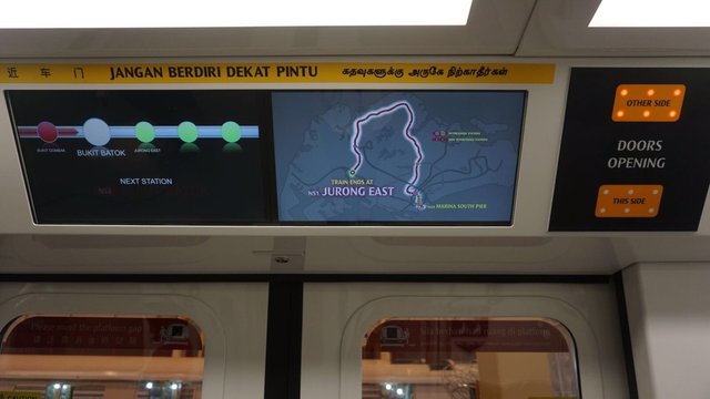
Of course, the designers thought that an accurate map was the way to go.
Staris 2 already doesn’t show the full train network most of the time. But when it does, it uses a geographically accurate train map—curly lines and all. From the map, you’re able to tell the starting and ending stations of the train—and that’s all. You can barely even make out the individual stations on the map.
In comparison, this is the train network diagram used in all stations that commuters are familiar with:
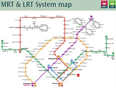
Replacing the train diagram with a geographically accurate map is likely to confuse commuters and cause frustration. Commuters now have to switch between two representations of the same information: the diagram they are used to and the map shown on the train’s screen.
Lesson: Always provide relevant information to your users in the right convention. Less is more if more contains unnecessary and irrelevant information. Train network diagrams work because they remove the noise of geographical accuracy.
- In between stations, it shows a slideshow of nearby landmarks.
When the train is making its way to the next station, the right half of Staris 2 displays a slideshow of landmarks that can be found around the next station. It’s one of those unusual little design ideas that don’t bring any benefit to users at all.
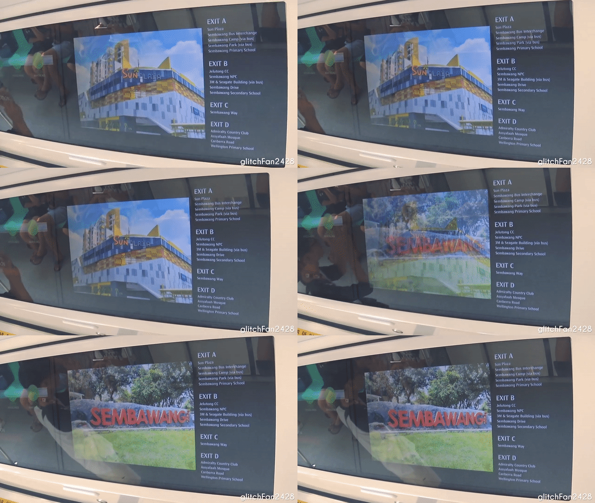
The images aren’t labeled, so they don’t provide useful information to commuters, and aren’t helpful in journey planning. Besides being not particularly useful, the images are also not particularly pretty. In other words, they fit right into the visual design style of Staris 2.
Lesson: Every element of your design should have a purpose. Just because you can find enough stock photos to create slideshows of landmarks doesn’t mean you should. Similarly, just because your app/product can have an “exciting” feature doesn’t mean it should.
- It shows a timely map of the train station, but doesn’t tell which carriage you’re in.
As the train stops at a station, the displays change to show commuters a map of the train station. It’s pretty neat, but you won’t be able to tell which train carriage you’re in. That means the station map isn’t that helpful.
It is a hallmark of good design that you could look at the Japanese train display and know where you, the stairs, elevator, and escalators are located—despite the fact that it’s all in Japanese.
The one Staris 2 uses? Nowhere near that effective.
Lesson: Always design with the user in mind. When someone uses a map, one of the most common questions on their mind will be “Where am I?” The Singapore train display is the epitome of technology-centered design, while Japan’s is the epitome of a user-centered one.
- Text labels on the station map slowly animate one at a time.
The map of the train station uses fade-in animations for the text labels of key points of interest (like stairs and escalators), which, of course, is time-consuming and frustrating to watch.
As if the slow animations are not bad enough, the map only shows text labels of one point of interest at a time. You’ll never see the station map with all points of interest labeled at the same time.
Lesson: Every time you use superfluous animations, a unicorn dies. Animations should serve a purpose and, most importantly, be fast.
- The station map is so detailed it’s hard to understand.
You might have noticed that the station map is really hard to read, mainly because of the overwhelming amount of details shown. This is, again, the same mistake of prioritizing geographical accuracy over usefulness.
While the exit labels are nice and large, the map is still really hard to process because of the many fine lines and shaded areas on the map. Do the lines represent walls? Are the blue boxes areas I should focus on since they stand out so much? Is the whole station floating in a sea of prismatic blue?
If you have problems reading the map at this level of zoom, imagine trying to read it while standing a few feet away, as you’re preparing to leave the train.
And that’s not all. Exit C is labeled as leading to Sri Mariamman Temple—a temple that’s located 20km away from this train station. Thus, on top of being unreadable, the map also provides wildly inaccurate information to commuters. (Update: A reader has informed me that there’s another similarly named temple around Khatib called the Sree Maha Mariamman Temple. The label is therefore not that inaccurate, although they did use the wrong name.)
Compare this to the station locality map, which can be found inside all train stations:
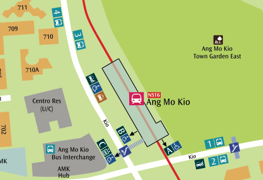
Lesson: Use abstraction to prevent information overload, and design with the context of use in mind. Especially in the context of train rides (which can be nerve-wrecking experiences if you’re rushing for time or a tourist), information overload is a sure way to overwhelm users.
- Missed opportunities: Icons, multilingual displays, and bus connections from stations
On top of the many design failures, Staris 2 has also notably missed many opportunities to create an excellent experience for commuters.
Take icons as an example. Most train stations make use of icons as a way to guide commuters who might not be able to read English. Staris 2, on the other hand, is unusually free of icons.
The doors closing screen reads “Doors closing,” and the train door visuals only appear when the door has begun closing (i.e. when it is too late). A flashing icon of doors closing would have helped. Furthermore, if the station maps were to use large icons for the points of interest, it would mostly do away with the need for text labels.
Another huge missed opportunity is that of creating a multilingual display. This is especially relevant in Singapore, where we have four official languages and you see signs like this everywhere:

Because Staris 2 is fully digital, this would have been such an easy feature to include. That it didn’t happen highlights, yet again, how non-user-centric the design process must have been.
And finally, the new train displays could have provided information on buses you could take from the next train station. In Singapore, most train stations have bus stations (if not a bus interchange) around them, and many commuters rely on a mix of train and bus services to get around. A nice, big list of buses available at the next station would have been so much more useful than a slideshow of landmarks.
Lesson: Design is essential. Strike that—good, proper design is essential. When designers (not engineers) are involved in creating a new product and when the design process is centered around users, great experiences can be created. But when design is left out of the loop, even the best of ideas will fail.
Now what?
So there you have it—everything wrong with the LCD displays in Singapore’s newest fleet of trains. If anything, the new trains are a symptomatic of a tendency to embrace technology-focused rather than user-centered design.
If you don’t happen to reside in Singapore, this post would’ve probably given you much entertainment and—hopefully—many lessons. But millions of commuters will have to face the inefficient, user-unfriendly, and downright annoying innovation known as Staris 2. Because bad design, after all, has real implications (unless SMRT reads this post, decides to hire proper designers, and releases Staris 2.1 soon). I’m not holding my breath though.
awesome
#steemit_lover
ভাই আমি আপনাকে ফলো করছি
আপনি দয়া করে আমাকে ফলো বেক করবেন।
এবং আমার সর্বশেষ পোস্ট এ upvote দিবেন।আমিও দিয়েছি
good
nice
yeh
nice
upvoted and commented
upvoted
That's a great post... Really i like that post...
nice