Mercator projection, the Comic Sans of map projections
What can be wrong with maps?
First let me give you a brief introduction about map projections and why the most common way to show the earth, distorts so much.
Before talking about any projection you must know that every map in existence, and probably every map ever to come of the surface of the earth, is false and lies in some way. This is just plain mathematics. The earth is a sphere and any attempt to display the surface of a sphere on a flat, 2D surface will lead to stretching somewhere on the map. So if you want to display the surface of the earth you need to 'project' it to a flat surface in some way. Try peeling fruit for example and laying the peel flat on the table. It will be hard to shape the peel into a map without stretching or tearing the peel. But there are literally a billion ways to project the surface on a map, so why exactly did this one gain popularity?
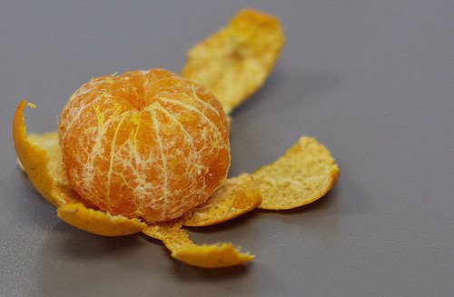
Peeled fruit. If the fruit was the earth you can see it would be dificult to 'peel' it in such a way that the peel becomes an undistorted 2D map. Photo by waferboard shared under CC BY 2.0
Why Mercator's projection was useful and how it distorts
The Mercator projection was first introduced by the Flemish geographer and cartographer, Gerardus Mercator (#proud) in 1569. It became the standard map for nautical navigation because a straight line on the map corresponded to a straight course to sail. You can imagine how convenient this was for seafarers as they could conveniently plot a course on the map and just maintain that direction until they reach there destination.. These lines of constant course are also known as loxodromes, or rhumb lines. This is not necessarily the shortest route but in the early ages convenience and lack of errors was much more important than saving time.
How does the map does this? Well, when you go to the poles, the circles of latitude become smaller and smaller. The biggest circle of latitude is the equator. So at the poles of the map, the areas will be stretched horizontally to create a square map. Then, when you stretch the Y axis just as much as the X axis is stretched at a given location, you maintain proportions, shapes and angles remain the same. This is the strength of the Mercator projection but has the great disadvantage that the actual surface area at the poles becomes stretched. A convenient way to visualize this is by showing circles on the map that have the same area. When shown on a globe, the circles are equal, but how these circles are then stretched on the map makes it clear in what way the surface itself is stretched. These clever circles on the map are called the Tissot's indicatrix of deformation.
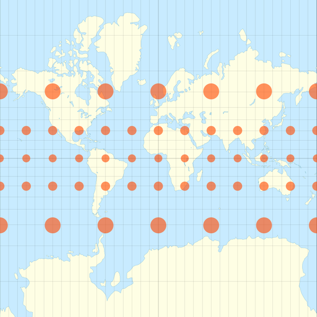 Tissot's indicatrix of deformation. Both X and Y directions are stretched to maintain shapes and angles, but results in an overestimation of land near the poles. Illustration by Justin Kunimune shared under CC BY 4.0
 Animation shows how the Mercator projection distorts land area while keeping shape constant. Illustration by Jakub Nowosad shared under CC BY 4.0
Why this projection remains in use
The aspects that make this map ideal for sea faring also proved to be the easiest way to display dynamic maps on the internet. Most of these online maps were used for navigation as well, just think about Google Maps, Bing Maps, OpenStreetMap, Yahoo! Maps etc. and since the shape of countries does not change with this projection, you only need to adjust the scale when a user goes from the equator to the poles. This is much easier than working with multiple projections and dynamically switching between them when the user scrolls through your map. The disadvantage is that when you zoom all the way out, you get a completely wrong image of the world.
It is also much more computationally easy to change the scale depending on where the user is than do complex math calculations with maps. But due to advances in computational power, Google Maps did make this switch a few months ago! If you missed it, I wrote a dedicated post to this change, and why it is so important that the largest provider of knowledge stops showing a distorted world.
Similarities to Comic Sans
I mentioned Comic Sans in the title but haven't really discussed this until now. The reason why Comic Sans is so hated amongst many is somewhat similar to why the Mercator projection annoys cartographers.
Comic Sans was also created with a very specific intent just like our projection. Created by Vincent Connare in 1994, the font was designed as a casual font for informal documents and children's materials. It was inspired by comic book lettering and was originally intended for the text boxes in the Microsoft Bob software but never made it in the final product.
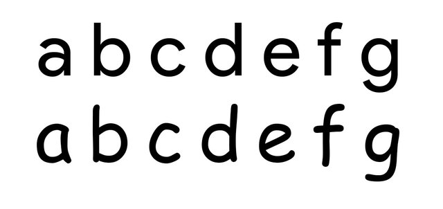
A regular font 'Product Sans' (top) compared to 'Comic Sans' (bottom). Note the small imperfections to mimic the handwritten, playfull comic-style font.
It may not have made it in the program it was intended for, but since it was developed, it was included in the standard microsoft font set and became distributed to computers worldwide. Already 4 years after its release, designers argued the exuberant use of the font.
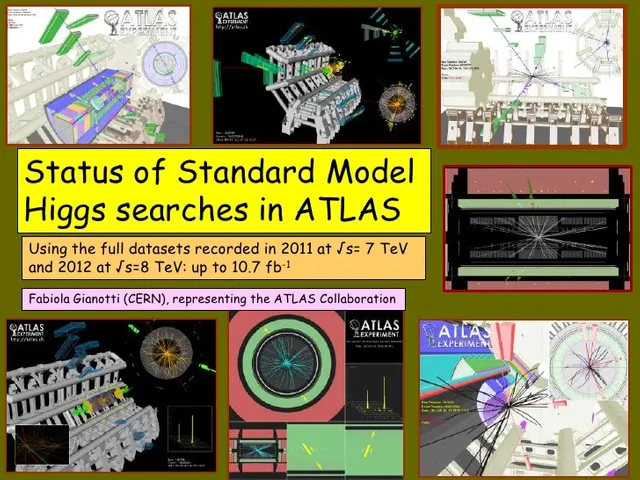
Not even CERN is safe from the trap! This is there announcement presentation for the Higgs Boson in 2012. you can find the presentation here.
When choosing a font you have to be careful to match to occasion. This kind, overly-cheerful, nonchalant and slightly weird typeface can become offensive en totally out of place when used for the wrong occasion. This is not the fault of the font, but rather the fault of the user misplacing it. Which is exactly the case with the projections. It is not the fault of the projection that there are shortcomings, just as no font is suited for every occasion. it is up to the creator to fit the right projection/font in the right use case.
Conclusion
Projections and typefaces at first do not have a lot in common, but when you look at how they are used they are more similar than you might think. Both are created for specific purposes. Whether it is for correctly displaying shape, area or distances, or showing elegance, playfulness or design, not every projection/font is suited for every occasion. It is always up to the creator to decide which projection/font bests conveys the message.
Both the Mercator projection and Comic Sans became widespread very early on which poses the risk that it is the go-to projection/font for unknowing users. So next time you see a font or a map, try determining, why did he choose this projection or font? in what way does it distort my world view or what message does it try to convey? Because both maps and fonts can have a significant, unconscious effect on our mood and opinion.
Thanks for stopping by! If you liked this post I would love to hear your feedback. If you have any comments, definitely leave it below. Have a great day.

Sources
https://www.esri.com/arcgis-blog/products/product/mapping/tissots-indicatrix-helps-illustrate-map-projection-distortion/
https://map-projections.net/
https://www.bbc.com/news/magazine-11582548
https://www.pattondstudios.com.au/blog/typography-in-context-part-ii-the-problem-with-comic-sans-1
https://en.wikipedia.org/wiki/Mercator_projection
https://misguidedmaps.com/2010/04/22/mercator-projection-evil-or-superevil/
This post has been voted on by the SteemSTEM curation team and voting trail in collaboration with @utopian-io and @curie.
If you appreciate the work we are doing then consider voting all three projects for witness by selecting stem.witness, utopian-io and curie!
For additional information please join us on the SteemSTEM discord and to get to know the rest of the community!
Nice post! Resteemed.
What a catchy title XD I love it.
First time I hear about the nautical convenience. Sometimes reasons for popularity of things are so easy. And Mercator is a pretty way to project the world. But nothing will ever beat a globe. I'm so with you about the recent change of google maps. I am so happy every time I access their page now. Especially because I zoom out and scroll over to Europe every once in a while when I miss home :P
I'm definitely team globe all the way! No projections is as cool as the real deal. (Perhaps some funky projections maybe that really make you doubt your understanding of reality). For how long do you live in Ottawa(?) already then?
Going home with Google maps--I do that from time to time.
When I was child we left "home" in a great hurry. I check the map to see if "home" is still there. Yes it is, but so much else has changed. We really can't go home again, except in our memory, I think.
Canada and Russia are a lot smaller than everyone thinks, aren't they?
My wife's grandfather invented a map projection called Chamberlin Trimetric Projection. It is used for plotting the trajectories of objects falling from high altitude. They used it during the Apollo missions to plot the landing sites for the astronauts coming back from the Moon.
Posted using Partiko Android
Never heard of that one! Had to look it up and it is definitely an interesting approach I had never heard of. Another great example of the wide variety of different approaches to solve the projection problem.
Interesting the way you connect comic sans with map-making. I actually like comic sans, but refrain from using it because it's frowned upon. I don't think I know how to be appropriate, generally :)
I looked at your earlier article and saw your rendition of how children orient themselves through mental maps. It might actually be a good diagnostic tool, asking a child to draw their environment in relation to themselves, to "map" their position in the world. There would probably be striking differences in the way children construct these visual maps.
Another great post.
Haha! Maybe it's a good thing that you cannot set fonts on Steem then 😜
It is indeed an interesting phenomenon. I wonder if there have been studies about it already. I remember as a kid that I drew a lot of maps of imagined places, and I played a lot of games such as 'age of empires' , or 'spore' where maps are important. I wonder if such things ended up shaping my mental maps.
Posted using Partiko Android
I promise not to drag you down the rabbit hole I began to dig with my speculation, but I can't resist sharing the information I've discovered since reading your comment.
Yes, there have been studies.
Turns out, work with Alzsheimer's patients utilizes maps in a similar, but not exact way.
And work with children uses maps to assess and develop spatial intelligence. A whole bunch of studies, starting with Piaget.
You don't have to respond to this...I'm like a dog with a bone when I get an idea. Your blog on maps has sent me on a tangent. It's fascinating. The way we visualize space and ourselves in that space influences just about everything.
Have a great day.
Don't hold back at all! It is a fascinating topic indeed. And your links are definitely interesting. If you are interested in the topic, I can send you some more studies for which you probably need an account to access them. I'll check it out later today!
Posted using Partiko Android
I have selected some papers I could find about the topic, I hope you find some of them interesting!
https://we.tl/t-wwCEemjgl7
You're a gem. Thanks for taking time out of your busy day to look that up. I will read with great interest.
It is done with pleasure if it is for someone who would genuinely enjoy it 😊
Great title and good post overall. I can't believe CERN has stooped to the comic sans level.
Congratulations @samve! You have completed the following achievement on the Steem blockchain and have been rewarded with new badge(s) :
Click here to view your Board
If you no longer want to receive notifications, reply to this comment with the word
STOPTo support your work, I also upvoted your post!
Hi @samve!
Your post was upvoted by @steem-ua, new Steem dApp, using UserAuthority for algorithmic post curation!
Your UA account score is currently 2.710 which ranks you at #13983 across all Steem accounts.
Your rank has not changed in the last three days.
In our last Algorithmic Curation Round, consisting of 302 contributions, your post is ranked at #203.
Evaluation of your UA score:
Feel free to join our @steem-ua Discord server
Hi @samve!
Your post was upvoted by Utopian.io in cooperation with @steemstem - supporting knowledge, innovation and technological advancement on the Steem Blockchain.
Contribute to Open Source with utopian.io
Learn how to contribute on our website and join the new open source economy.
Want to chat? Join the Utopian Community on Discord https://discord.gg/h52nFrV