Submission to Rock Paper Scissors Logo Design Contest
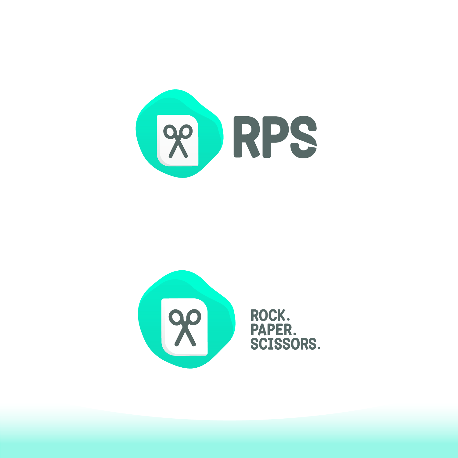
Hey internets, this here is my submission to the #rps-logo design contest featured by @peerplays. I have chosen to go with heavy symbolism for my concept with the three elements of the brand name nested within each other. The negative space creates the frame for our "paper" within the play-ful, organic yet smooth rock element. The paper the frames the simplistic scissor figure which is darkened to visually tie the mark to the acronym/brand name.
Hope y'all like it!
Cheers


Awesome !! that color in CMYK? maybe is more different? or is a specific pantone ?? I was looking for a color like that ... upped Cool Job !!
Hey thanks @yusaymon! And no it's RGB
Yes , its RGB!! when they need to print in the conversion ? Sorry my english it's bad haha ^ ^
I don't know the best conversion yet. I only found out about the contest yesterday so I had to hurry and create something so I didn't spend as much time addressing color as I would have liked
I like ur minimalism <3