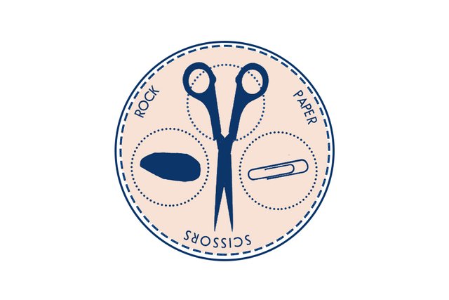
Rock Paper Scissors logo contest entry #001
Hello, Steemians! It’s Saturday night and @vermillionfox and I are enjoying a coffee, cake and some quiet work time at @caffetto. Long overdue and completely therapeutic. It’s been a nice break in the relentless pummeling life has been throwing at us lately.
Tonight’s post harnesses my excitement for @peerplays #RPS-logo Rock, Paper, Scissors contest. I would have been on this like a lampshade as a freelance artist with over 15 years of graphic design experience, but the contest rewards make this a priority before all my other work. For the next five days, you’ll be seeing contest entries from me. Thanks for sharing @timcliff!
This is a hat I haven’t worn in years. While I was pushing around design elements, @tarotbyfergus asked me “…how does it fit?”, and I said “Tight, and a little stinky”. For over a decade I designed MMA and independent wrestling t-shirt apparel for Combat Zone Wrestling in South Philadelphia, Westside Xtreme Wrestling in Germany, and FREEDOM’s in Japan. It was grueling work with insane deadlines, but I can’t say I didn’t love it. I’m glad it’s not my primary money making vehicle these days, but logo and brand design has a special place in my heart […and brain].
That’s one of my favorite things about Steemit and this community. Since joining the site last year and contributing almost daily, I’ve unlocked a renaissance of creativity across all mediums I’m proficient […and a few I’m not]. This contest was the perfect opportunity to stretch these creative logo muscles and stay limber with my design skills.
This first pass made me realize the bountiful reward for the #RPS-logo contest was in now way, overvalued. Simplicity is typically an important element for logo design and immediately, there is almost no way to make scissors simple. Also, how the Hell do you portray a rock?! Even in my first go around with this design, it’s one of, if not the most challenging elements I’ve encountered for a brand.
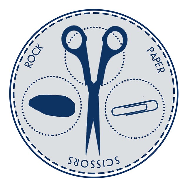
For this first attempt, I went with something that vaguely resembles a blue-print. There’s a deliberate watch face design and I took inspiration from the look of an architectural draft. I eventually changed the color combination to blue and grey to give that design aesthetic. I’ve always thought drafting and engineering diagrams is an interesting correlation with software development. I hope that came through.
Just my first crack at this #peerplays project. I’ll be doing another in the next day or two. Thanks for reading, sharing and voting, as always. I post almost daily. For more art, design, illustration and photography, follow me here at @kommienezuspadt!
Very nice! It gives me a retro vibe, it's neat, simple yet I get the message. I hope you win the contest! :)
I like it! Elegant in it's simplicity.
Clean and minimalist... the hat fits you just dandy!
Glad you and yours had a restful day 🌱