Using Google Trends To Predict Ripple
One way to analyze Bitcoin price that I discovered a long time ago was through using google trends. The idea is genius, as BTC's price would spike more people would google it so the google trends chart actually mimics the BTC price chart.
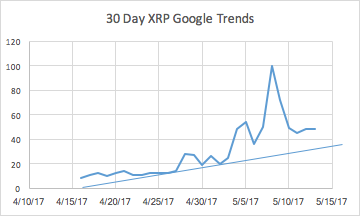
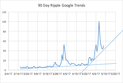
I have now decided to try and apply this method to Ripple due to the recent price spike. I took two different google trend charts, the past 30 and 90 day charts on how often people search Ripple, as a payment protocol.
On the 30 day chart one thing that I found interesting immediately was that Ripple is actually coming to the end of a price bubble. This is odd since Ripple has nearly doubled overnight. However it could mean that Ripple has stabilized and is now ready to make future gains.
The 90 day chart is similar, however there are two trend's, one from the beginning of the 90 days and one from the beginning of the last 30 days. The trend line covering all 90 days suggests that we are in a massive price bubble and Ripple is going to see some major price correction soon.
The trend line covering the last 30 days of the 90 day chart shows that we are at the end of a bubble and it is a good time to buy.
My opinion, is that because Ripple was pretty insignificant until recently, the 30 day chart is more accurate. Many people did not even touch Ripple before, people almost ignored it because it was basically worthless. With growing interest from banks across the world this opinion of Ripple has changed greatly.
Therefore, I think looking at the last 30 days is the most beneficial analysis. Meaning Ripple is at the END of a bubble even with the price spike. Meaning now is a great time to buy before Ripple continues to reach new heights.


A google trends powered rapid trading bot comes to mind
That is VERY cool. What is the site that you use for identifying keyword search trends? I'm in advertising sales and do know have to navigate google analytics, facebook advertising, etc. But i've never used this method/tool before. Would love to know the link for my research purposes as well!
https://trends.google.com/trends/
Good post, very well written! I never used Google trends before, thanks for the idea!
Thank you!
Nice post. I was about to start a similair discussion. The current total market cap of all cryptos might seem high but blockchain is here to stay and will involve all our lives. I do see a bright future for everyone that's hold's their coins with a long term vision. I really advice people to take a look at: https://www.coincheckup.com They give great insights in the team, the product, advisors, community, the business and the business model and other techincal insights. Check for example: https://www.coincheckup.com/coins/Ripple#analysis To see the: Ripple Detailed analysis