Creating a Single Page Application (SPA) with React and Bootstrap
The other day I already said how to create a simple React application and talked a bit about React components, but what I did was very simple. Now we are going to see how useful React components can be.
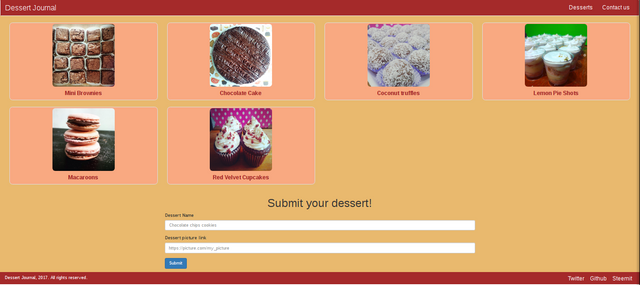
What we'll be creating and using
- A Single Page Application or SPA, it's a website or a web application that fits in a single page and that provides a more comfortable user experience.
- We are going to use Bootstrap, a front-end framework that allows us to create great well organized and responsive websites.
Before starting
Remember you can start your React application with the terminal command npm start to see all the changes you're doing to your components. Also, remember that in React we use className instead of class inside our HTML tags, this is a common mistake that may cause your application not to start.
Project structure
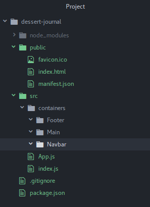
As I mentioned in the past posts, I use create-react-app to set up my projects. I deleted the elements that I won't use and created this structure in the above image. I'm going to create a SPA about desserts that will consist in a Navigation Bar at the top of the website, a Main section in the middle that will contain all the dessert's information, and a Footer at the bottom of the website with a little information about the website, like social network icons and the copyright information.
Setting up Bootstrap
In order to use Bootstrap, first we need to import it within our website with a <link> tag. In Bootstrap's website they offer us the links we need.
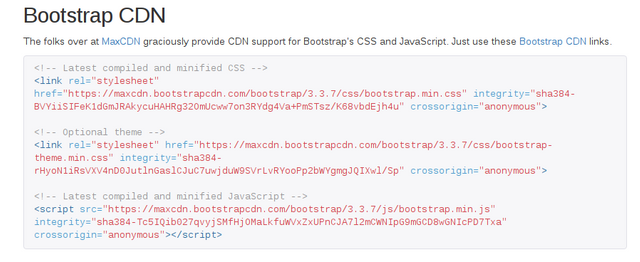
We are going to place the Latest compiled and minified CSS link inside the <head> of our index.html file, and the Latest compiled and minified JavaScript just before the </body> tag of our index.html file, just like this:
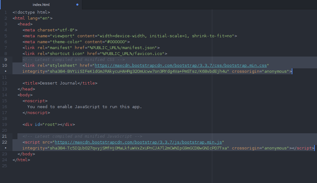
And that's it. We've just finished setting up Bootstrap in our website.
Creating the Navigation Bar component
If you have never used Bootstrap, you can check this link out to know more about all the components that Bootstrap offers. Basically, we use Bootstrap component's by setting up certain classes in our HTML tags.
Here, we are going to create a simple Navbar for our website. It consists in a navbar-header, that is the Name that will appear in the left part of the navbar, and an unordered list that will contain some links to the different parts of our website.
<nav className="navbar navbar-default">
  <div className="container-fluid">
    <div className="navbar-header">
      <a className="navbar-brand" href="#top">Dessert Journal</a>
    </div>
    <ul className="nav navbar-nav">
      <li><a href="#desserts">Desserts</a></li>
      <li><a href="#contact">Contact us</a></li>
    </ul>
  </div>
</nav>
Let's create the navbar component in React, import it in our App.js wrapper component, and add a little bit of color by creating Navbar.css inside our Navbar folder:
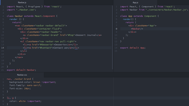
And it will look like this:
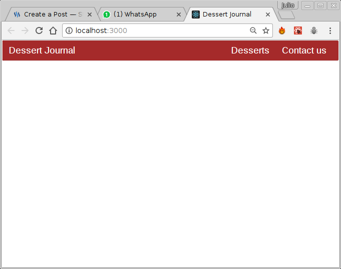
Creating the Main section components
In the main section I'm going to create two components: one that will contain all the desserts I want to show, and another one that will contain a submission form.
Desserts.js
In this component I will use the thumbnail and caption classes that Bootstrap offers, so the information will be more organized in a little thumbnail. Also, I will save all the images inside a folder call assets in /dessert-journal/src/assets/.
Please, remove the - I used at the beginning of every image tag, I don't know why Steemit doesn't allow me to post image tags.
import React, { PropTypes } from 'react';
import "./Desserts.css";

class Desserts extends React.Component {
  render () {
    return(
      <div className="container-fluid" id="desserts">
        <div className="row desserts">
          <div className="col-lg-3 col-md-4 col-sm-6 col-xs-12">
            <div className="thumbnail">
              <-img src={require("../../assets/brownies.png")} alt="Brownies"/>
              <p className='caption'>Mini Brownies</p>
            </div>
          </div>
          <div className="col-lg-3 col-md-4 col-sm-6 col-xs-12">
            <div className="thumbnail">
              <-img src={require("../../assets/chocolate-cake.png")} alt="Chocolate cake"/>
              <p className='caption'>Chocolate Cake</p>
            </div>
          </div>
          <div className="col-lg-3 col-md-4 col-sm-6 col-xs-12">
            <div className="thumbnail">
              <-img src={require("../../assets/coco-truffles.png")} alt="Coconut truffles"/>
              <p className='caption'>Coconut truffles</p>
            </div>
          </div>
          <div className="col-lg-3 col-md-4 col-sm-6 col-xs-12">
            <div className="thumbnail">
              <-img src={require("../../assets/lemon-pie-shots.png")} alt="Lemon Pie Shots"/>
              <p className='caption'>Lemon Pie Shots</p>
            </div>
          </div>
          <div className="col-lg-3 col-md-4 col-sm-6 col-xs-12">
            <div className="thumbnail">
              <-img src={require("../../assets/macaroons.png")} alt="Macaroons"/>
              <p className='caption'>Macaroons</p>
            </div>
          </div>
          <div className="col-lg-3 col-md-4 col-sm-6 col-xs-12">
            <div className="thumbnail">
              <-img src={require("../../assets/red-velvet-cupcakes.png")} alt="Red Velvet Cupcakes"/>
              <p className='caption'>Red Velvet Cupcakes</p>
            </div>
          </div>
      </div>
    </div>
    );
  }
}

export default Desserts;
Since we are using Javascript inside HTML, we need to specify the image source in a different way, using Javascript's require, and because require is a Javascript method, we need to put it inside curly braces.
I added some style within Desserts.css file:
div.thumbnail>p {
  font-size: 18px;
  font-weight: bold;
  text-align: center !important;
  color: brown !important;
}

/*Magin sure all the thumbnails have the same size*/
div.thumbnail {
  background-color: #F9A981;
  border-radius: 10px;
  height: 250px;
  width: 100%;
}

/*Making sure all the images have the same size*/
img {
  border-radius: 9px;
  height: 200px !important;
  width: 200px !important;
}

/*Removes unwanted extra margins and paddings*/
div.row.desserts {
  margin: 0px 0px;
  padding: 0px 0px;
}
This is the result. If you resize the browser window, you'll notice that all the elements resizes and reorganizes according to the screen resolution, thanks to Bootstrap and its cols.
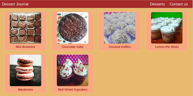
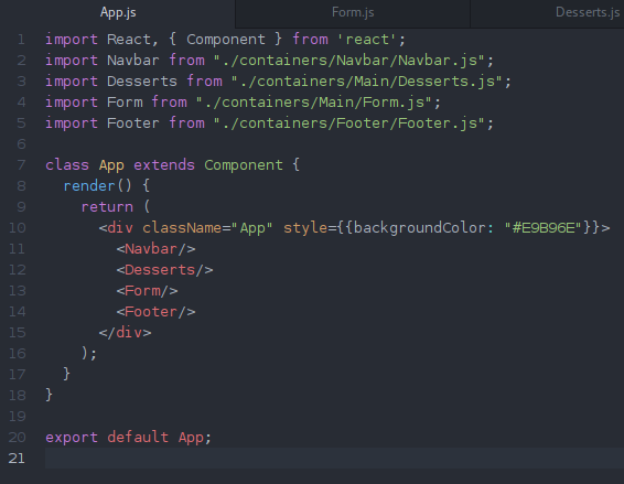
This is what our App.js looks like right now:
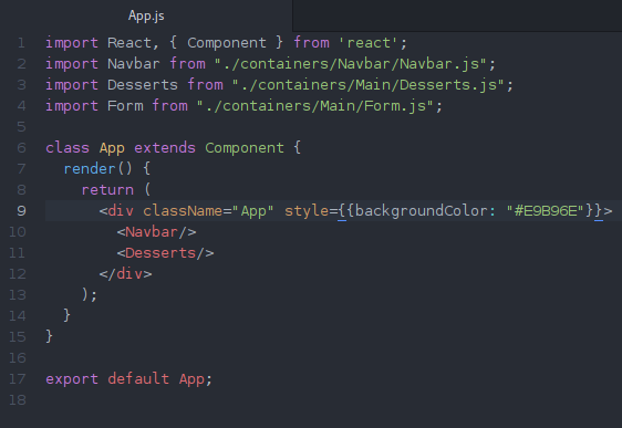
As you might notice, I used some inline style in the div that contains all the components. All the inline styles in React are wrapped by double curly braces and the elements inside are in written in camelCaseStyle, and the value inside double quotes. For example: style={{ fontSize: "18px", textAlign: "center" }}.
Form.js
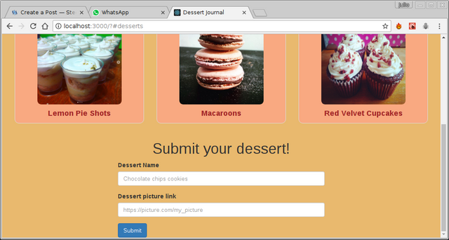
I am going to use the form example that is in Bootstrap's website. Also, I used the col-xx-offset-x classes to align the form and the title to the center of the screen. Here is what it looks like:
import React, { PropTypes } from 'react'

class Form extends React.Component {
  render () {
    return(
      <div className="container-fluid" id="contact">
        <div className="row">
          <h1 className="col-lg-6 col-md-6 col-sm-6 col-xs-12 col-lg-offset-3 col-md-offset-3 " style={{textAlign: "center"}}>Submit your dessert!</h1>
          <form className="col-lg-6 col-md-6 col-sm-6 col-xs-12 col-lg-offset-3 col-md-offset-3 ">
            <div className="form-group">
              <label for="dessertName">Dessert Name</label>
              <input type="text" className="form-control" id="desserName" placeholder="Chocolate chips cookies"/>
            </div>
            <div className="form-group">
              <label for="dessertPicture">Dessert picture link</label>
              <input type="text" className="form-control" id="dessertPicture" placeholder="https://picture.com/my_picture"/>
            </div>
            <button type="submit" className="btn btn-primary">Submit</button>
          </form>
        </div>
      </div>

    );
  }
}

export default Form;
Remember to import your Form.js component inside your App.js file, so it can appears in your application.
Creating the Footer section
Here, I will use the <footer> tag. Also, the content will be divided in two parts: the copyrights, and the social network links. It's pretty simple, below is the code of the component, and the style I used.
import React, { PropTypes } from 'react'
import "./Footer.css";

class Footer extends React.Component {
  render () {
    return(
      <div className="container-fluid" style={{backgroundColor: "brown", marginTop: "10px"}}>
        <div className="row">
          <footer>
            <div className="col-lg-6 col-md-6 col-sm-12 col-xs-12">
              <p>Dessert Journal, 2017. All rights reserved.</p>
            </div>
            <div className="col-lg-6 col-md-6 col-sm-12 col-xs-12 social">
              <a href="https://twitter.com/jfuenmayor96">Twitter</a>
              <a href="https://github.com/jfuenmayor96">Github</a>
              <a href="https://steemit.com/@jfuenmayor96">Steemit</a>
            </div>
          </footer>
        </div>
      </div>

    );
  }
}

export default Footer;
a {
  color: black !important;
  font-size: 18px;
  padding: 0px 10px;
}

a, p {
  color: white !important;
}

.social {
  text-align: right;
}

footer {
  padding-top: 10px;
  padding-bottom: 10px;
}
So, this is how my App.js file looks like:
And this is the final result:

We've just created a fully responsive website with React and Bootstrap.
Final notes
- Here we could see how the
App.jsfile works a wrapper for all our components. Also, we can really appreciate how the module system works. - It's a good practice for those who use Bootstrap to scaffold your code this way: container > row > div with columns > element. You are free to play with the elements and the columns as you desire, but it's recommendable to use, at least, the container > row sequence.
- Even though I created separated .css files for every component, sometimes you'll find yourself using inline style for little changes. Sometimes because you're just trying a style, sometimes because it's the easiest and fastest way to style a very specific element.
- Bootstrap columns divide the screen in 12 columns. Using
.col-xx-#we are saying that in axxscreen size we are taking#columns.
Great post ...
Hope you'll post a tutorial about FLUX architecture
PS: Followed, Hope we'll be friends :)
Hey, thank you very much for your comment, I really appreciate it :)
I just haved used Redux, not Flux, but I can try it someday for sure. I'll check your profile too.
Yeah...that's my mistake :)
@jfuenmayor96 Liked this post. Keep em coming!
Upvoted and following!
Thank you very much, I'm glad you liked it!
Excellent follow me @ joserc.vzla
Dude! You should cover integrating Steem.js to React.js project!
Hey, thanks for the comment! That's a good idea, I might do it, I've used Steem.js a couple of times. :)
Great tutorial, keep up the good work! Resteem for visibility :)
Thank you! I really appreciate your support!