Plotting Probability Distribution Functions In R Using ggplot2
Hi there. This post is about plotting various probability distribution functions with the statistical programming language R with the ggplot2 package. Examples include the exponential distribution and the normal distribution (bell-shaped curve or Gaussian).

Preliminaries
In R, the ggplot2 data visualization package can be installed with the code install.packages("ggplot2"). After installation, the package can be loaded with the code library(ggplot2).
In this post, we deal with continuous random variables and their probability density functions (pdf). A value of x corresponds to the height of the distribution as indicated by f(x) where the function f is the pdf.
Probabilities add up to one. When it comes to probability density functions, the area under the density curve for valid values of x is 1. For the more mathematical people, replace area with integral.
1) Exponential Distribution Density Plots

In R, I can input a value for x into the exponential density with dexp(x, rate = 1, log = FALSE). The default rate/lambda value of 1 can be changed.
The R code below shows how to create a density curve and area fill for the exponential distribution. The ggplot() part sets up the plot, the two stat_function() parts are for creating the density curve and for the area fill. The rest of the code is for labels and changing the aesthetics.
In stat_function(fun = dexp, args = list(rate = 1)), I use R's dexp() function inside of stat_function(). The args = list(rate = 1) indicates I want to use a rate/lambda value of 1 from dexp() in stat_function().
## Plotting Continuous Probability Distributions Using ggplot2

library(ggplot2)

# Plot continuous probability distributions with ggplot2:

# Explain some ggplot2 basics and resources:

# Main Code Template:

# ggplot(x = data.frame(c(a, b)), aes(x = x))
#   + stat_function(fun = function_name) +
#   other add-on functions such as labels, text and so on.


#--------------

## 1) Exponential Distribution Plot:

# Template Code in R Doc.: dexp(x, rate = 1, log = FALSE)
# Mean is 1/rate

# Initialize some values.

x_lower <- 0
x_upper <- 5

max_height <- max(dexp(x_lower:x_upper, rate = 1, log = FALSE))
max_height

ggplot(data.frame(x = c(x_lower, x_upper)), aes(x = x)) + xlim(x_lower, x_upper) +
  ylim(0, max_height) +
  stat_function(fun = dexp, args = list(rate = 1), geom = "area",
                fill = "blue", alpha = 0.25) +
  stat_function(fun = dexp, args = list(rate = 1)) +
  labs(x = "\n x", y = "f(x) \n",
       title = "Exponential Distribution Density Plot With Rate = 1 \n") +
  theme(plot.title = element_text(hjust = 0.5),
        axis.title.x = element_text(face="bold", colour="blue", size = 12),
        axis.title.y = element_text(face="bold", colour="blue", size = 12))
Multiple Exponential Distribution Density Plots
There may be cases where you may need to compare different exponential distributions depending on the rate value. This can be done in R by using multiple stat_function() parts after the ggplot() coding part. A legend is included to help to viewer associate the colours and the values of lambda (rate).
# Multiple Exponential Distribution Plots:

x_lower <- 0
x_upper <- 5

max_height2 <- max(dexp(x_lower:x_upper, rate = 1, log = FALSE),
                   dexp(x_lower:x_upper, rate = 2, log = FALSE),
                   dexp(x_lower:x_upper, rate = 0.5, log = FALSE))

max_height2

ggplot(data.frame(x = c(x_lower, x_upper)), aes(x = x)) + xlim(x_lower, x_upper) +
  ylim(0, max_height2) +
  stat_function(fun = dexp, args = list(rate = 0.5), aes(colour = "0.5")) +
  stat_function(fun = dexp, args = list(rate = 1), aes(colour = "1")) +
  stat_function(fun = dexp, args = list(rate = 2), aes(colour = "2")) +
  scale_color_manual("Rate", values = c("blue", "green", "red")) +
  labs(x = "\n x", y = "f(x) \n",
       title = "Exponential Distribution Density Plots \n") +
  theme(plot.title = element_text(hjust = 0.5),
        axis.title.x = element_text(face="bold", colour="blue", size = 12),
        axis.title.y = element_text(face="bold", colour="blue", size = 12),
        legend.title = element_text(face="bold", size = 10),
        legend.position = "top")

# References:
# https://stackoverflow.com/questions/31792634/adding-legend-to-ggplot2-with-multiple-lines-on-plot
# https://stackoverflow.com/questions/19950219/using-legend-with-stat-function-in-ggplot2
2) Normal Distribution Density Plots
The famous normal distribution from Carl Friedrich Gauss is shown and is taught in many introductory probability and statistics courses. One example of the normal distribution is something like this:
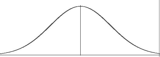
What is not really shown is the math function for the normal distribution. (It does look kind of scary at first to be honest.)

A special case of the normal distribution is the standard normal distribution.
The standard normal distribution is a special case of the regular normal distribution where the mean (mu) is 0 and the variance (sigma squared) is 1. The above equation collapses into:

In R, I can find the height of a normal distribution given an x value with the code dnorm(x, mean = 0, sd = 1, log = FALSE). By default the values of 0 and 1 for the mean and standard deviation are in the code. (The standard deviation is the square root of the variance.)
In the R code below, I produce three different normal distribution plots with different values of the mean and the variance. I have one with a mean of 0 and a standard deviation of 1 (variance of 1), another one with a mean of 0 and a standard deviation of 5 (variance of 25) and a third one with a mean of 2 and standard deviation of 3 (variance of 9). These three normal distributions are represented by the three stat_function() parts.
## 2) Normal Distributions

# dnorm(x, mean = 0, sd = 1, log = FALSE)

# Multiple Normal Distributions:

x_lower_norm <- -8
x_upper_norm <- 8

ggplot(data.frame(x = c(x_lower_norm , x_upper_norm)), aes(x = x)) +
  xlim(c(x_lower_norm , x_upper_norm)) +
  stat_function(fun = dnorm, args = list(mean = 0, sd = 1), aes(colour = "0 & 1")) +
  stat_function(fun = dnorm, args = list(mean = 0, sd = 5), aes(colour = "0 & 5")) +
  stat_function(fun = dnorm, args = list(mean = 2, sd = 3), aes(colour = "2 & 3")) +
  scale_color_manual("Mean & Std. Deviation \n Parameters", values = c("black", "blue", "red")) +
  labs(x = "\n z", y = "f(z) \n",
       title = "Normal Distribution Plots \n ") +
  theme(plot.title = element_text(hjust = 0.5, colour = "darkgreen"),
        axis.title.x = element_text(face="bold", colour="blue", size = 12),
        axis.title.y = element_text(face="bold", colour="blue", size = 12),
        legend.title = element_text(face="bold", size = 10),
        legend.position = "top")
The black and blue density plots are centered at the mean of 0 but have different standard deviations. The blue one has a standard deviation of 5 which results in a shorter peak and a more flatter distribution compared to the black density curve (the standard normal distribution).
With the red density curve, the center has been moved to the right due to the mean of 2. The standard deviation of the red curve is 3 which is in between the black and blue curves. The result would be a peak that is in between and a spread that is also in between the blue and black curves.
Note
The code used above can be transferred into other probability distributions such as the uniform distribution, Beta distribution, Gamma distribution, Weibull distribution, Pareto distribution, lognormal distribution and more. Do check the R documentation on how to generate random variables from each of these distributions.
Update On July 22, 2017: Fixed some typos. dexp() and dnorm() refers to the probability distribution given an x-value. rnorm() generates a random xvalue from the Normal Distribution.
Amazing post like always. Resteemed.
I upvoted .u upvote me also.
I upvoted .u upvote me also.