Plotting Math Functions In R
Hi. This post is on plotting math functions in the statistical programming language R. The ggplot2 package in R will be heavily used here.
The plots featured in this page include
- The Quadratic Function (Parabola)
- The Cosine Function
- The Square Root Function
- The Exponential Function
- The Logarithmic Function
- The Absolute Function
Preliminaries
To install ggplot2, use the code install.packages("ggplot2"). After installation, the package can be loaded in with the line library(ggplot2).
Custom functions will be used a lot here for the plots. The format for functions in R is something like this:
function_name <- function(arg1, arg2, ..., argn){
          <put_code_here>
}
1) Quadratic Function Plot
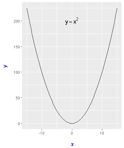
I will start off with a plot of the quadratic function (parabola). The custom function here would be a basic quadratic function of x^2. In ggplot() I enter in data.frame(x = c(-15,15) with aes(x = x). Adding in stat_function() is crucial here. In stat_function() you enter in the fun = option. The xlim(c(-15, 15)) part is for controlling the plot view.
library(ggplot2)


### 1) Parabola:

quadratic_fun <- function(x){
  x^2
}

# Basic Plot (Data frame for setting the range)
ggplot(data.frame(x = c(-15,15)), aes(x = x)) +
  stat_function(fun = quadratic_fun) + xlim(c(-15, 15))

The above plot is a good start but it could use some labels and other tune ups. The labs() function is for adding labels and theme() allows for style changes for the labels. To add text with math notation, the annotate() function does the job.
# Parabola Plot With Labels:

ggplot(data.frame(x = c(-15,15)), aes(x = data.frame(x = x))) +
  stat_function(fun = quadratic_fun) + xlim(c(-15, 15)) +
  labs(x = "\n x", y = "y \n") +
  theme(axis.title.x = element_text(face="bold", colour="blue", size = 12),
        axis.title.y = element_text(face="bold", colour="blue", size = 12)) +
  annotate("text", x = 0, y = 200, parse = TRUE, size = 5, fontface = "bold",
           label="y == x^2")
2) Cosine Function
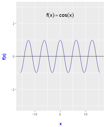
The code for the cosine function plot is not much different than the parabola one. Modifications include the ranges for x, the annotated text and the inclusion of the horizontal line at y = 0. This code template can be used for the sine function. (I have not tried this for tan(x), inverse trigonometric functions and reciprocal trigonometric functions.)
### 2) Cosine Function:

cos_funct <- function(xrange){
  cos(xrange)
}

# Cosine Graph Plot With Labels:

ggplot(data.frame(x = c(-6*pi, 6*pi)), aes(x = x)) +
  stat_function(fun = cos_funct, colour = "darkblue") +
  xlim(c(-5*pi, 5*pi)) + ylim(c(-3, 3)) +
  labs(x = "\n x", y = "f(x) \n") +
  theme(axis.title.x = element_text(face="bold", colour="blue", size = 12),
        axis.title.y = element_text(face="bold", colour="blue", size = 12)) +
  annotate("text", x = 0, y = 2.5, parse = TRUE, size = 5, fontface = "bold",
           label="f(x) == cos(x)") +
  geom_hline(yintercept = 0, colour = "black")
3) Square Root Function
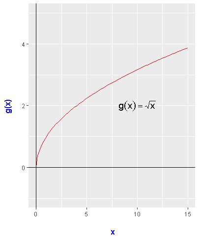
With the square root function, the function in R does require an if statement to account for the domain of the square root function. The quantity inside the square root has to be non-negative (x at least 0). The plotting code is similar to before.
# 3) Square Root Function

sqroot_funct <- function(x){
  if (x >= 0) {
    sqrt(x)
  }
}

# Square Root Plot With Labels:

ggplot(data.frame(x = c(0, 20)), aes(x = x)) +
  stat_function(fun = sqroot_funct, colour = "red") +
  xlim(c(0, 15)) + ylim(c(-1, 5)) +
  labs(x = "\n x", y = "g(x) \n") +
  theme(axis.title.x = element_text(face="bold", colour="blue", size = 12),
        axis.title.y = element_text(face="bold", colour="blue", size = 12)) +
  annotate("text", x = 10, y = 2, parse = TRUE, size = 5, fontface = "bold",
           label="g(x) == sqrt(x)") +
  geom_hline(yintercept = 0, colour = "black") +
  geom_vline(xintercept = 0, colour = "black")
4) Exponential Function (e^x with e approx 2.718)
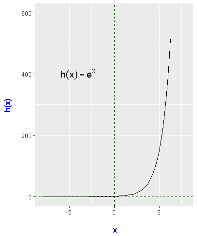
Plotting the exponential function is not too difficult. Some modifications are made to account for the viewing range.
# 4) Exponential Function (e^x with e approx 2.718)

exp_funct <- function(x){
  exp(x)
}

# Exponential Plot With Labels:

ggplot(data.frame(x = c(-8, 8)), aes(x = x)) +
  stat_function(fun = exp_funct) + xlim(c(-8, 8)) + ylim(-1, 600) +
  labs(x = "\n x", y = "h(x) \n") +
  theme(axis.title.x = element_text(face="bold", colour="blue", size = 12),
        axis.title.y = element_text(face="bold", colour="blue", size = 12)) +
  annotate("text", x = -4, y = 400, parse = TRUE, size = 5, fontface = "bold",
           label="h(x) == e^x") +
  geom_hline(yintercept = 0, linetype = "dashed", colour = "darkgreen") +
  geom_vline(xintercept = 0, linetype = "dashed", colour = "darkgreen")
5) Logarithmic Function
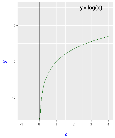
The inverse of the exponential function is the logarithmic function. Plotting it is similar to some of the plots above.
# 5) Logarithmic Function

log_funct <- function(x){
  log(x)
}

# Logarithmic Plot With Labels:

ggplot(data.frame(x = c(-0.5, 4)), aes(x = x)) +
  stat_function(fun = log_funct, colour = "darkgreen") + xlim(c(-1, 4)) + ylim(-3, 3) +
  labs(x = "\n x", y = "y \n") +
  theme(axis.title.x = element_text(face="bold", colour="blue", size = 12),
        axis.title.y = element_text(face="bold", colour="blue", size = 12)) +
  annotate("text", x = 3, y = 3, parse = TRUE, size = 5, fontface = "bold",
           label="y == log(x)") +
  geom_hline(yintercept = 0, colour = "black") +
  geom_vline(xintercept = 0, colour = "black")
6) Absolute Function
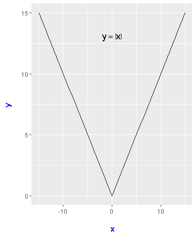
When it comes to the absolute function, the function has to be defined carefully in R. Instead of using an if else statement, the ifelse() statement is used. In ifelse(x >=0, x, - x), when x is at least 0 it is x and when it is less than 0 it is -x. The absolute function is a symmetric function like the parabola. Unlike the parabola, the absolute function plot looks like a big V than a giant bowl.
### 6) Absolute Function:

absolute_funct <- function(x){
  ifelse(x >=0, x, - x)
}

# Absolute Value Plot:

ggplot(data.frame(x = c(-10, 10)), aes(x = x)) +
  stat_function(fun = absolute_funct) + xlim(c(-15, 15)) +
  labs(x = "\n x", y = "y \n") +
  theme(plot.title = element_text(hjust = 0.5),
        axis.title.x = element_text(face="bold", colour="blue", size = 12),
        axis.title.y = element_text(face="bold", colour="blue", size = 12)) +
  annotate("text", x = 0, y = 13, parse = TRUE, size = 5, fontface = "bold",
           label="y == abs(x)")
Great post as always, thanks.
Thank you for the compliment.
This post has received a 0.20 % upvote from @booster thanks to: @dkmathstats.