Displaying Table Results In R
Hi everyone. This post is about displaying table results in the (statistical) programming language R. I include two examples with presentable table plots.

Sections
- Example One: The
haireyeDataset In R - Example Two: A Two Way Table With Various Plots
- Notes & References
Example One: The haireye Dataset In R
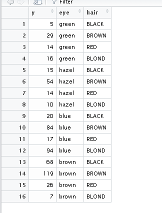
In the faraway package in R, there is a dataset called haireye which is a table that contains counts of individuals based on their eye colour and their hair colour.
I first load in the required packages and take a look at the data. (The view() command outputs the table in an Excel style manner.)
# Example One: Hair Eye Color Dataset:

library(faraway)
library(ggplot2)

data(haireye)

head(haireye)

View(haireye)
This haireye dataset does not require much data cleaning and it ready for plotting in ggplot2.
# could use colnames(haireye) <- c("Count", "Eye_Colour", "Hair_Colour") to fix column names

# Data Visualization Of Contingency Table With ggplot2, geom_tile()

# geom_tile() Way:
# https://stackoverflow.com/questions/32743004/improved-mosaic-plot-like-heatmap-or-bubbles-in-r
# http://www.sthda.com/english/wiki/ggplot2-axis-ticks-a-guide-to-customize-tick-marks-and-labels

ggplot(data = haireye, aes(x = hair, y = eye)) +
  geom_tile(aes(fill = y)) +
  geom_text(aes(label = y), color = "black", fontface = "bold", size = 6) +
  scale_x_discrete(expand = c(0,0), labels = c("Black","Brown","Red", "Blond"))+
  scale_y_discrete(expand = c(0,0), labels = c("Green", "Hazel", "Blue", "Brown")) +
  scale_fill_gradient("Counts Legend \n", low = "lightblue", high = "blue") +
  theme_bw() +
  labs(x = "\n Hair Colour", y = "Eye Colour",
       title = "Number Of People Based On Hair & Eye Colours \n",
       fill = "Answer \n") +
  theme(plot.title = element_text(hjust = 0.5, colour = "darkblue"),
        axis.title.x = element_text(face="bold", colour="darkgreen", size = 12),
        axis.title.y = element_text(face="bold", colour="darkgreen", size = 12),
        legend.title = element_text(face="bold", colour="darkred", size = 10))
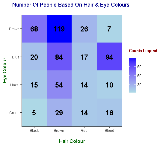
The geom_text() part of the ggplot code is crucial for displaying the counts in each tile.
Example Two: A Two Way Table With Various Plots
This example is a bit more involved as I display various plots for displaying results from a two way table (that I made up).
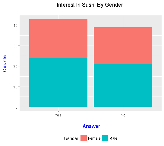
Here is a made up two way table with counts which answer the question Do you like Sushi?.
| Answer \ Gender | Female | Male |
|---|---|---|
| Yes | 19 | 24 |
| No | 18 | 21 |
In R, you can input the above data as a table into R.
> # Example Two: Survey Data:
>
> # Creating a Sample Table: Do You Like Sushi By Gender?
> # gl() generates factor levels
>
> counts <- c(19, 24, 18, 21)
> gender <- gl(n = 2, k = 1, length = 4, labels = c("Female", "Male"))
> interest <- gl(n = 2, k = 2, length = 4, labels = c("Yes", "No"))
>
> survey_data <- data.frame(counts, gender, interest)
>
> survey_data
  counts gender interest
1     19 Female      Yes
2     24   Male      Yes
3     18 Female       No
4     21   Male       No
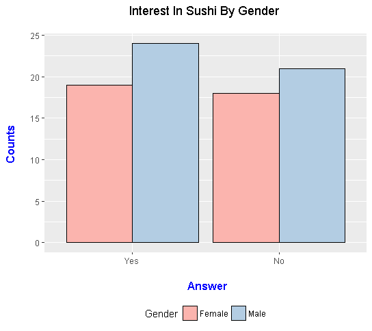
From the survey_data table in R, the counts can be displayed in two different bar graphs. The first one is a stacked bar graph and the second one is a side by side bar graph. There are some art elements when it comes to displaying your results.
# Data Visualization Of Contingency Table With ggplot2 (Stacked Bar Graph):

ggplot(data = survey_data, aes(x = interest, y = counts, fill = gender)) +
  geom_bar(stat = "identity") +
  labs(x = "\n Answer", y = "Counts \n",
       title = "Interest In Sushi By Gender \n",
       fill = "Gender") +
  theme(plot.title = element_text(hjust = 0.5),
        axis.title.x = element_text(face="bold", colour="blue", size = 12),
        axis.title.y = element_text(face="bold", colour="blue", size = 12),
        legend.position = "bottom")
# Data Visualization Of Contingency Table With ggplot2 (Side By Side Bar Graph):

ggplot(data = survey_data, aes(x = interest, y = counts, fill = gender)) +
  geom_bar(stat = "identity", position = "dodge", colour = "black") +
  scale_fill_brewer(palette = "Pastel1") +
  labs(x = "\n Answer", y = "Counts \n",
       title = "Interest In Sushi By Gender \n",
       fill = "Gender") +
  theme(plot.title = element_text(hjust = 0.5),
        axis.title.x = element_text(face="bold", colour="blue", size = 12),
        axis.title.y = element_text(face="bold", colour="blue", size = 12),
        legend.position = "bottom")
Contingency Tables & Mosaic Plots
From survey_data, you can convert the table into a 2 way table in R like the one in the start of this section. This can be done with the xtabs() function.
> ### Contingency Tables (2 by 2 Case)
>
> conting_table <- xtabs(counts ~ gender + interest)
>
> conting_table
        interest
gender   Yes No
  Female  19 18
  Male    24 21
A mosaic plot is similar to the tile plot from the first example. In this example, there are four tiles where each tile's size is dependent on the counts.
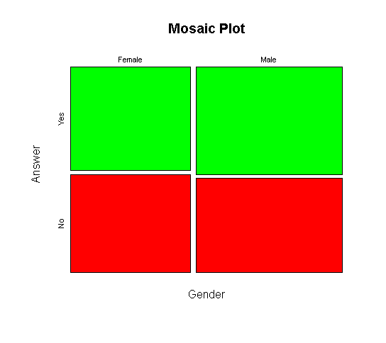
The first mosaic plot is from base R with the moasicplot() function.
# Mosaic Plot (Base R):

mosaicplot(conting_table, color = c("green", "red"), main = "Mosaic Plot",
           xlab = "Gender", ylab = "Answer")
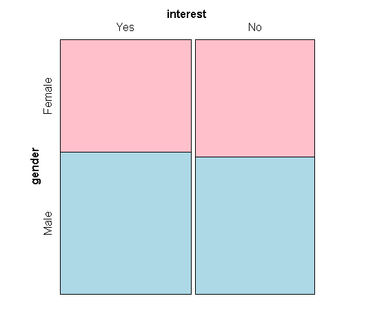
Another option for a mosaic plot is with the mosaic() package from the vcd package.
# Mosaic Plot (vcd package):

library(vcd)

mosaic( ~ gender + interest , data = conting_table,
        highlighting = "gender", highlighting_fill = c("pink", "lightblue"))
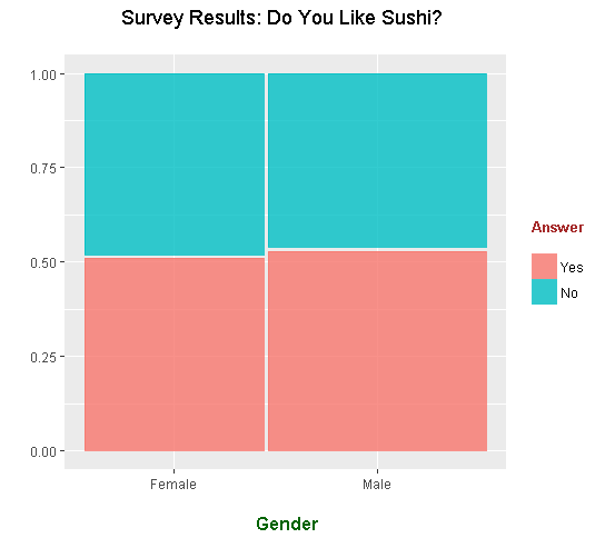
A third option for a mosaic plot is from the ggmosaic package in R.
# geom_mosaic() Plot:
# Ref: https://cran.r-project.org/web/packages/ggmosaic/vignettes/ggmosaic.html
# https://rdrr.io/cran/ggmosaic/man/geom_mosaic.html

library(ggmosaic)

ggplot(data = survey_data) +
  geom_mosaic(aes(weight = counts, x = product(gender) , fill = interest)) +
  labs(x = "\n Gender", y = " ",
       title = "Survey Results: Do You Like Sushi? \n",
       fill = "Answer \n") +
  theme(plot.title = element_text(hjust = 0.5),
        axis.title.x = element_text(face="bold", colour="darkgreen", size = 12),
        axis.title.y = element_text(face="bold", colour="darkgreen", size = 12),
        legend.title = element_text(face="bold", colour="brown", size = 10))
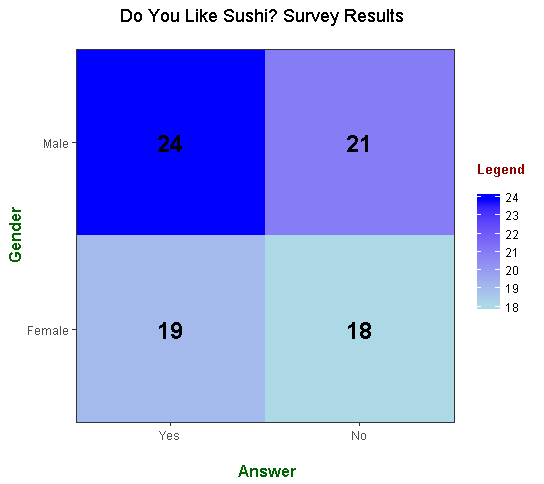
Tile Plot With geom_tile()
Like in the first example, here is a tile plot with counts.
# geom_tile() Way:
# https://stackoverflow.com/questions/32743004/improved-mosaic-plot-like-heatmap-or-bubbles-in-r

ggplot(data = survey_data, aes(x = interest, y = gender)) +
  geom_tile(aes(fill = counts)) +
  geom_text(aes(label = counts), color = "black", fontface = "bold", size = 6) +
  scale_x_discrete(expand = c(0,0)) +
  scale_y_discrete(expand = c(0,0)) +
  scale_fill_gradient("Legend \n", low = "lightblue", high = "blue") +
  theme_bw() +
  labs(x = "\n Answer", y = "Gender",
       title = "Do You Like Sushi? Survey Results \n",
       fill = "Answer \n") +
  theme(plot.title = element_text(hjust = 0.5),
        axis.title.x = element_text(face="bold", colour="darkgreen", size = 12),
        axis.title.y = element_text(face="bold", colour="darkgreen", size = 12),
        legend.title = element_text(face="bold", colour="darkred", size = 10))
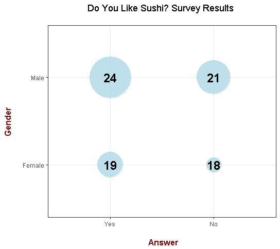
A Dot Plot With Counts Using geom_point()
Instead of tiles, you can use dots and have counts associated with the counts. The size of the dots depend on the counts. Personally, I think this plot looks cool and informative.
# geom_point():

ggplot(data = survey_data, aes(x = interest, y = gender)) +
  geom_point(aes(size = counts), alpha=0.8, color = "lightblue", show.legend = FALSE) +
  geom_text(aes(label = counts), color = "black", fontface = "bold", size = 6) +
  scale_size(range = c(10,28)) +
  theme_bw() +
  labs(x = "\n Answer", y = "Gender \n",
       title = "Do You Like Sushi? Survey Results \n",
       fill = "Answer \n") +
  theme(plot.title = element_text(hjust = 0.5),
        axis.title.x = element_text(face="bold", colour="darkred", size = 12),
        axis.title.y = element_text(face="bold", colour="darkred", size = 12))
References
- https://stackoverflow.com/questions/32743004/improved-mosaic-plot-like-heatmap-or-bubbles-in-r
- http://www.sthda.com/english/wiki/ggplot2-axis-ticks-a-guide-to-customize-tick-marks-and-labels
- https://cran.r-project.org/web/packages/ggmosaic/vignettes/ggmosaic.html
- https://rdrr.io/cran/ggmosaic/man/geom_mosaic.html
- https://stackoverflow.com/questions/32743004/improved-mosaic-plot-like-heatmap-or-bubbles-in-r
- R Graphics Cookbook By Winston Chang
- Page From My Website
Although maybe not really applicable here, I also like the Pairs Scatter Plot.
I appreciate all your posts using R. I've learned something new each time (like the geom_text() ).You keep it simple, concise, and with examples, which (in my opinion) is the best way to learn something brand new...then once you get the basics of it, can expand and embellish it. As I'm continuing to learn more of the libraries and such with R and Python, I may be coming to you with questions.
Your first statement reminds me that I forgot to include a plot with the
facet_grid()option. I could've used this to make separate graphs by gender.I do try to keep it simple and thorough as possible. There are so many libraries in R (and Python) and it is kinda hard to keep up. The main R libraries I think are
dplyr,ggplot2,tidyrandstringr.The
geom_text()part with labels is really good. I learned from the R Graphics Cookbook (a very good resource with ggplot2 examples).