The Restyling Of An E-commerce
HOW TO DEAL WITH THE RESTYLING OF AN E-COMMERCE
Some simple (but not trivial) considerations and guidelines on how to deal with the restyling of an E-commerce. Which critical issues to discover, what optimisations to make and what interventions to carry out to improve the user experience and the conversion rate
It often happens in our business to have to face a graphic restyling and / or optimization of a web site, due to "age limits" or more simply for marketing and communication needs. But it also happens to have to intervene on projects carried out by other companies, which for various reasons do not convert or present technical and communicative limits, which affect the results.
If on the one hand it pleases (as well as being our core-business) the involvement on such projects, on the other hand - aware that companies have previously already invested time and money - we always place ourselves with an improved approach and if possible the most conservative possible of what good (if there is!) has already been done. For several reasons that we will see later, not always enter a stretched leg and shave everything is the most appropriate approach .
We therefore enter into the life of the advice and considerations in this regard. To do this I will take as an example a recent project passed on for our hands. The E-commerce site in question is Slownau Athleisure .
The initial analysis
After being contacted of the company in question and understanding that the situation was quite critical (active site for a few months, very few visits and zero sales), we immediately carried out a detailed analysis by examining the following points:
The Communication - transmitted messages, style, confidence transmitted to the buyer, the clarity of the terms and conditions, etc
The contents - the presence and quality of textual and photographic content, the details of the product and techniques, tips, etc ...
the ' User Experience - the product selection process and purchasing, etc ...
The SEO - the presence of suitable title and description, h1 and h2, robots.txt, sitemap.xml, micro-data and so on and so forth ...
the Platform - the configuration status (in this case Magento 2), any critical issues, necessary updates, cache, etc ...
What emerged was then inevitably shared with the project's representatives, so as to establish what to do and how to do it.
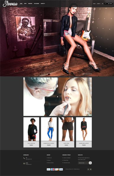
Home page
At the initial state, the home page presented several critical issues. First of all, the slide was not aimed at an action (CTA) but it was a simple flow of 6 images in themselves ... images of good quality, but ends in themselves.
The video player improperly occupied an overly dominant position and reduced product space.
Total absence of "trust" messages such as fast deliveries, returns or free expenses and nothing that tells the brand or the collection.
Overall the look-and-feel (the graphics) was not great but it is also true that stylistically beautiful sites are not sure that they sell more than "bad" or untreated sites. I leave the opinions on the graphics to you that you read.
Continuing the analysis, we then focused on the product detail page.
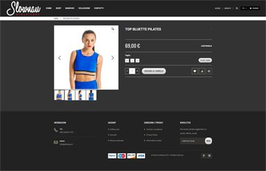
Product page
Even the product detail page presented (inevitably) serious problems and shortcomings. To begin with total absence of description of the product on sale, no reference to materials and to the pluses offered and no advice regarding the washing and care of the garment. The price then seemed to have more importance than all the rest.
The images, although well made, seemed to highlight the model more than the garment worn and did not allow to see in detail the quality of the garments.
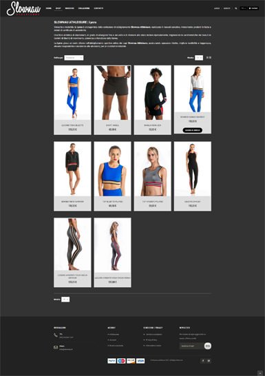
The collection
Many of the considerations made earlier for the home page and the product detail page, were equally valid even though on the whole this was the least critical section.
I repeat, I am not reporting stylistic / graphic considerations, and I leave all judgment to you.
Continuing the analysis (I will spare you the details) we have deepened the pages of brand, contact and all the information sections highlighting for each of them the critical issues present.
At this point, I wrote a preliminary analysis document, containing all the indications on the status of the SEO, we shared the considerations with the project representatives and we started the consultancy copy and communication, re-design and fine-tuning of the Magento platform. 2.
The Re-design
The graphic re-design was tackled, as initially stated, with a conservative and improving approach that focused on the lightening of the site graphics and on the introduction of clear funds and a modernization of styles (flat design).
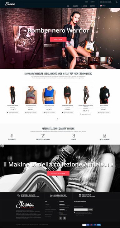
The New Home Page
What we did to improve the user experience of the home page was primarily to optimize the header and the navigation menu so as to better distribute some information and features such as search and the shopping cart summary.
Then we worked to make the main slide more "useful", introducing call-to-action (CTA) to each image so as to invite the purchase and are introduced thumbnail preview, to facilitate the user.
The garments of the collection were given more prominence , and a textual area describing the brand and the collation useful for the SEO was introduced, as well as the user experience.
To conclude, we immediately highlighted the pluses and the performances of the proposed garments, reorganized the elements present in the footer and made the area for the video player more captivating.
Note the choice to review the presentation of the leaders deserves a part. What do I mean? In fact, the photos have been resized "amputating" the heads of the models.
Because? Simply to avoid psychological effects such as "the face reminds me of that ..." or "... has an unpleasant face", and therefore focus more attention on the garments.
But let's move on to the detail page ...
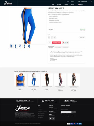
The new product page
The article detail sheet is the one that required more intervention. Specifically we have expanded the size of the images produced to give greater visibility to the garments and introduced a whole series of previously absent information, including: the description of the garment , the data on availability or not in stock (stock), information on care and washing and information on the material (Lycra Sensitive) with which the garments are made.
Naturally, the main usability guidelines have been applied to the arrangement of the elements.
The icing on the cake is the section of related or suggested products, so as to offer the user possible alternatives or additions to what he is consulting.
Completed the re-design and optimization phase of the Magento 2 platform, we focused on the SEO with the drafting of appropriate title, desciption, configuration of micro-data, robots, sitemap and everything you already know is necessary.
What can we add to all this? First of all, although it may seem obvious, I would say that your B2C E-commerce projects should be entrusted to skilled hands and not to improvised developers. Beware there are many good freelancers and many capable agencies, but there are also many who improvise and your business does not have to be improvised !
Always evaluate the references of a company as well as a freelance and in doubt call the customer and let them know whether or not he was satisfied with the work they did for him. Do not improvise ... ever!