The Uniform Distribution [With R Code]
Hi. This post is about the uniform distribution from probability and statistics. R code is included for plots.

Sections
- The Uniform Distribution
- Density Plot In R
- Simulating Uniform Random Variables
The Uniform Distribution
Suppose that the random variable X follows a uniform distribution. The probability distribution function (pdf) for the uniform random variable is:

The parameters a and b represent the minimum and maximum values for x in the uniform distribution.
Density Plot In R
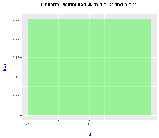
From the formula above, it may not be clear on what the probability distribution looks like. Here is a density plot of the uniform distribution (with a = -2 and b = 2). The R code and output is included here.
# The Uniform Distribution

library(ggplot2)

# Uniform probability density function:

xvals <- data.frame(x = c(-2, 2)) #Range for x-values

ggplot(data.frame(x = xvals), aes(x = x)) +
  xlim(c(-2, 2)) +
  ylim(c(0, 1/4)) +
  stat_function(fun = dunif, args = list(min = -2, max = 2), geom = "area",
                fill = "green", alpha = 0.35) +
  labs(x = "\n u", y = "f(u) \n", title = "Uniform Distribution With a = -2 and b = 2 \n") +
  theme(plot.title = element_text(hjust = 0.5),
        axis.title.x = element_text(face="bold", colour="blue", size = 12),
        axis.title.y = element_text(face="bold", colour="blue", size = 12)) +
  geom_vline(xintercept = -2, linetype = "dashed", colour = "red") +
  geom_vline(xintercept = 2, linetype = "dashed", colour = "red")

The probability density function represents the height on the density plot. In this case, the height is 0.25 or one-quarter. The distance from -2 to 2 is 4. The area of the (green) region is 1 which represents 100%.
(For the mathematical people, integrals can be used for finding the area under a curve/line given a region for x.)
Simulating Uniform Random Variables
In this section, we deal with sampling/simulations of random variables. Instead of realizing random events and random outcomes ourselves, we let the computers do the dirty work for us.
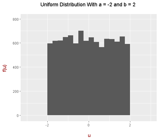
In this example, 10000 uniform random variables are generated/sampled/simulated into R. The resulting histogram would be plotted with the ggplot2 package.
# ggplot Histogram

# Uniform Distribution With a = -2 and b = 2

unifs <- runif(n = 10000, min = -2, max = 2)

ggplot(data = NULL, aes(x = unifs)) +
  geom_histogram(binwidth = 0.25, boundary = 2) +
  xlim(c(-3, 3)) +
  ylim(c(-10, 800)) +
  labs(x = "\n u", y = "f(u) \n", title = "Uniform Distribution With a = -2 and b = 2 \n") +
  theme(plot.title = element_text(hjust = 0.5),
        axis.title.x = element_text(face="bold", colour="brown", size = 12),
        axis.title.y = element_text(face="bold", colour="brown", size = 12))

The Standard Uniform Distribution
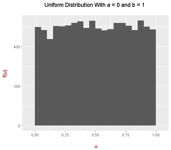
When a = 0 and b = 1 the uniform distribution now becomes the standard uniform distribution. Here is the code and output for this case.
# Standard Uniform Distribution With a = 0 and b = 1

std_unifs <- runif(n = 10000, min = 0, max = 1)

# ggplot Histogram

ggplot(data = NULL, aes(x = std_unifs)) +
  geom_histogram(binwidth = 0.05, boundary = 1) +
  xlim(c(-0.05, 1.05)) +
  labs(x = "\n u", y = "f(u) \n", title = "Uniform Distribution With a = 0 and b = 1 \n") +
  theme(plot.title = element_text(hjust = 0.5),
        axis.title.x = element_text(face="bold", colour="brown", size = 12),
        axis.title.y = element_text(face="bold", colour="brown", size = 12))

References & Notes
- R Graphics Cookbook By Winston Chang
- Math text created with QuickLaTeX.com
- The uniform distribution is sometimes referred to as the rectangular distribution due to its shape.
- This distribution does not seem like much but it does have applications (i.e. Monte Carlo Simulations).
- I replaced
xfrom the beginning with the variableu.
Edit: I forgot to mention that the histograms of simulated uniform random variables are approximations to the uniform density plot (green area plot). In theory, if I increased the sample size from 10000 to one million (for example), the histograms would look closer to a smooth rectangle.