Why can't the CIA do good graphic design?
Today's new Wikileaks are fascinating because they expose, again, how 'intelligence' agencies cannot make good art.
Nobody who works for these shadowy agencies has any idea how to design anything. I want to know why.
Let's begin by deconstructing, for example, the logo for the Information Operations Centre. Featured in today's leaks:

Zeus. There's so much going on here, I'm not sure where to begin.
So, there's a old-fashioned door key. Underneath that, there's an embarrassed eagle on top of a warped-looking world filled with ones and zeros. Then there's some kind of red lighting bolt running through the eagle's neck.
What the fuck does this mean?
Why is the eagle so embarrassed to be there? The 'artist' seems to be trying to communicate something complex. It would be easy to dismiss this as random clip-art, but I feel there is more to it.
The words 'stealth', 'knowledge', and 'innovation' are obviously satirical. And the eagle knows it. Look at his eyes. He cannot believe he is there.
It reminds me of the 39 Renaissance Babies Who Cannot Believe meme. This eagle Cannot Believe either.
The CIA's logos restore my faith in the world's artists. Clearly all of them, every single last one of them, no matter how poor, refuses to work for the CIA.
Thank you, artists.
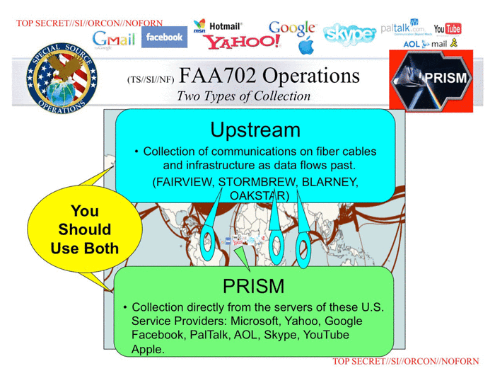
I'd like to leave you with this slide, from the PRISM leak. This is an example of the kind of graphic design work going on at the NSA. I don't want to say anything about this one because it speaks (screams?) for itself:
:D
Upvoted, just for the title alone! Haha, instantly reminded me of this nice TED-talk:
On your question "Nobody who works for these shadowy agencies has any idea how to design anything. I want to know why." I can answer that: Because creative people would stay the fuck away from a corrupt and ugly corporation like any of these "intelligence agencies". Following orders, spying on your own people and all the secrecy is not for the artist.
Thanks! And, yes, this TED Talk helps me understand more about where the CIA are going wrong (graphically). Thanks for sharing it!
Morally, the CIA are going wrong too.
Perhaps the two things are related. Maybe if their morality improves, their graphic design will too.
On a vaguely related note, the 'gold'-leaf on the front of my new passport is falling off. And so is the 'gold-leaf' on the government who issued it (metaphorically). Perhaps design is a very good indicator of the entire organisation that it represents.
"All your base are belong to us"
Yeah... they suck.
Upvoted
@shayne
No doubt!
This is a very astute observation that most would not even rub two neurons over. It reminds me of NASA's/Project Paperclip 1994 project Clementine and how odd that emblem was, never really thought about who did it or how abysmal the graphic art was.
Check it out, be warned though, this might send you down some deep rabbitholes so brew a lot of good coffee.
I feel the same about some sports design. This is the Oakland Raiders American football 🏈 team logo. They made him blind.
It looks like that "Church of the SubGenius" stuff.
You have an awesome work done
check my new post
https://steemit.com/uikit/@abkktk/resource-ui-ux-tool-for-web-service