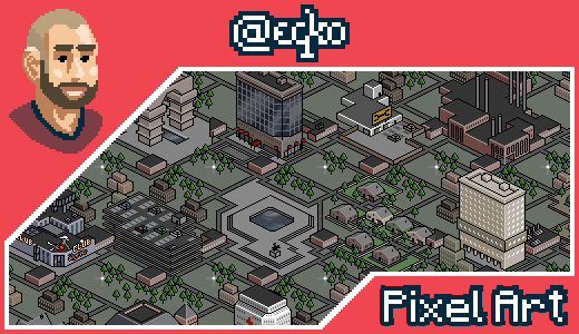
Pixelart - textbased game graphics upgrade.
When I was a lot younger, some 10 years or so back, I used to be kinda addicted to an online textbased zombiegame called Urban Dead. It was this grid based game where every action cost points which reloaded over time (kinda like voting power come to think of it). You moved from grid to grid, could bash in doors, attack people and zombies and all those sorts of game mechanism. It was loads of fun. I believe it's not really running anymore though or at least waned in popularity, but back than, it was all the rage as they would say.
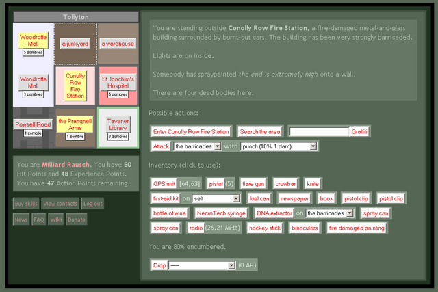
The problem for me with the game, as a designer, was that the interface was SHIT. It really was, see below screenshot to see how it looked by default. Admittedly, the green gave a very Zombie-ish feel, but the map in the top left with all the pastel colors just wouldn't do. The inventory looked like my wife's purse, what with all the stuff jumbled together and never able to find what you're looking for.
Developers are no designers.
I guess it's what you get when you let a programmer (the developer of the game) do the graphics. I've seen it time and time again over the years in my contact with developers. They are great at code, but they don't even really care about UI & UX. I mean look at this.
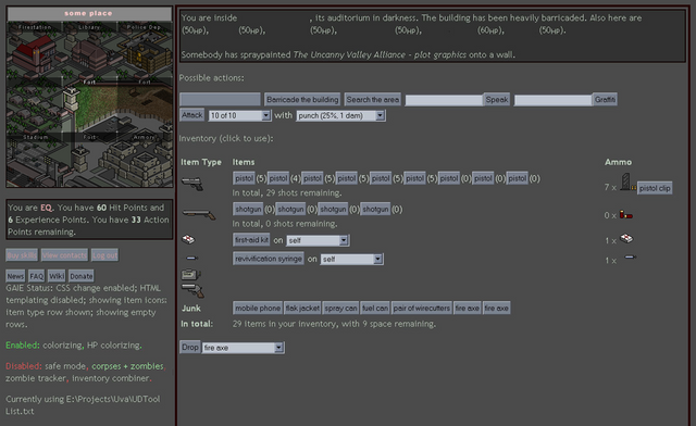
Luckily, someone had written a Firefox extension for some graphics updates. It still looked better, but still not up to par because the upgrade graphics were a collection of unrelated images. There were style issues allover the place. Which is where I came in. Below screenshot is with my graphic updates implemented. Obviously I was limited by whatever the extension provided in terms of layout and controls.
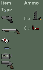
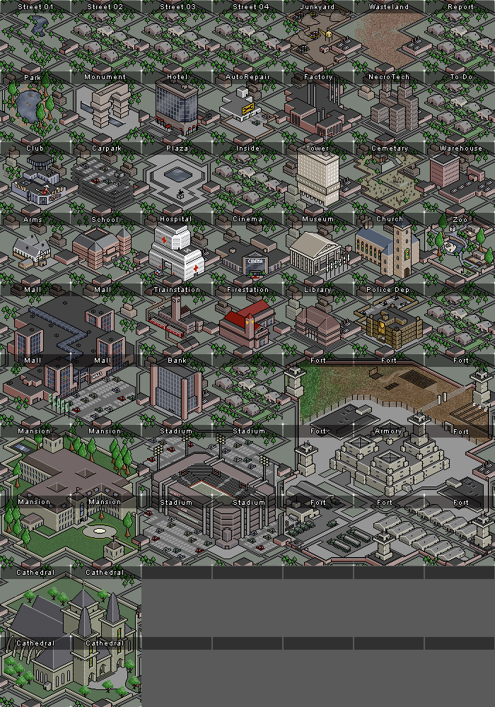
I created new pixelart graphics for the icons and created a detailed map for all possible mapsquare type (residential, commercial, stadium, military base, church, carrepair, etc.)
I had to make sure that they would flow nicely one into the other so I made a tileable template and adjusted that where needed for the type of tile I wanted to make. if a certain object required more tiles (the buildingsizes were 1x1, 2x2 or 3x3 tiles) I just made sure those fit together like a puzzle as well (like the military base for instance)
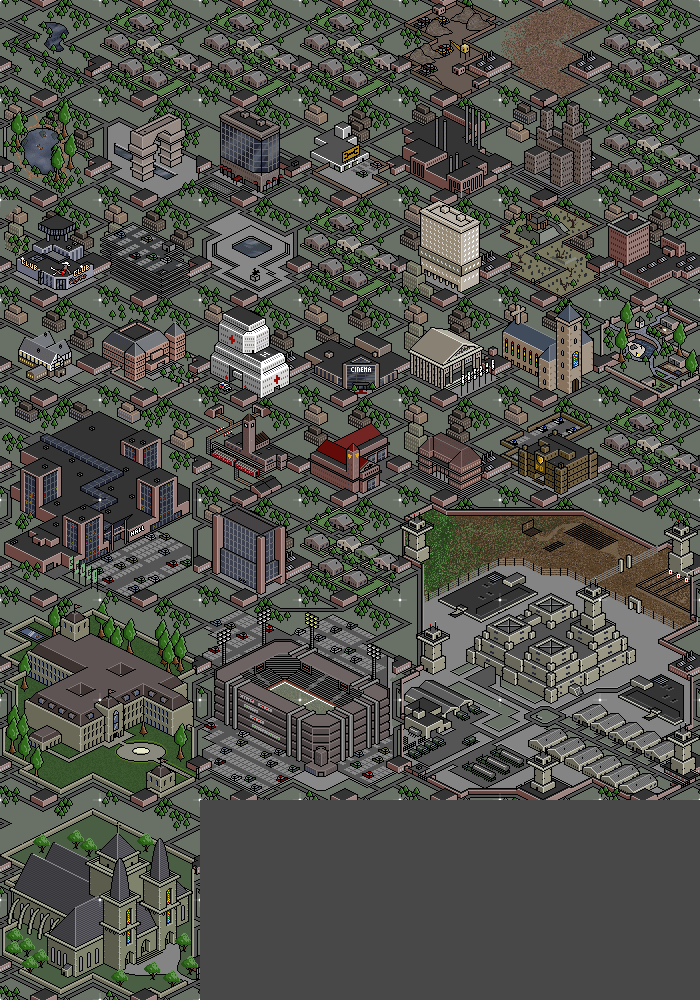
The Actual Art
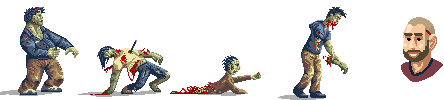
A clearer view of the individual tiles.
Well, as can be expected, in time I've moved on to other things and new addictions ...
HELLO STEEMIT.COM / BUSY.ORG
Full STEEM ahead my fellow Steemians - @eqko
Me and my fellow blockbrothers are a witness as @blockbrothers. If you want to support us we would appreciate your vote here. Or you could choose to set us as your proxy.
Vote for @blockbrothers via SteemConnect
Set blockbrothers as your proxy via SteemConnect
As blockbrothers, we build Steemify, a notification app for your Steemit account for iOS.
Get it Here:

Lol, it is so true. I have worked with a ton of developers and even the best of them usually had the oddest of ideas about the UX and even the controls or navigation of a thing! I think your update above made it look a hell of a lot better!
Uch don’t get me started on controle and navigation ... or sort alphabetically ... that’s a thing as well lol. they don’t care about visual sorting
uyyy beautifull workk ... congratulations master ....
soo nice
blessings!!
Thank you.
Awesome Bro, I think I can even remember this from the old days