Color pop / splash tutorial or 'how to make pictures stand out in five minutes'

If you look at the above picture I think it's easy to say that the 'before' on the left looks pretty bland. It's an okay snapshot, but it doesn't stand out in any way. It's not clear if the focus is the broom part or the metal structure behind it. The color red is both on the broom and the metal structure, making the eye wonder which of the two it's supposed to look at. The background has color and kind of blurs out.
What I want to say is that the image to the left sucks.
Compared to that the 'after' on the right looks quite decent if I may say so myself. The main focus piece is clearly the broom and the rest creates a nice background that suddenly looks interesting and I find myself looking for details in the black and white parts like the dirt in the foreground I didn't even notice in the fully colored image.
It's also a pretty unique look in times where every picture you take has been shot better and more professionally by someone with a worse and cheaper camera than you own. Sure it takes some time (5-10 minutes per image) but the result is a pretty unique shot that draws attention simply due to the fact it combines the best of both colored and monochrome pictures.
Following I will detail two slightly different methods for achieving this look, followed by some more examples of pictures I edited this way with some thoughts on why I left this or that part colored. Disclaimer: I kind of edit all my pictures this way these days, I just love the effect.
So, on to the tutorial part.
The first method will use Photoshop or the amazing iPad app Affinity Photo that I use most of the time because they both have editable black&white layers. The second will use the free paint.net which is my favorite image editing software for most tasks that don't require photoshop features and a workaround in case you don't want to spend any money. This is a lot easier if you have some kind of touch screen / graphics tablet which is why I use the iPad most of the time, but all phones and tablets can do the same thing and if you have to it's also possible using just the mouse - albeit a bit awkward.
Photoshop / Affinity Photo:
Create a black&white layer. Instead of directly manipulating the base image to monochrome it does instead create a filter layer on top, which can be 'erased' by painting on top of it with a black brush. This is a very convenient method, simply paint black over the parts you want to stay colored and you are done. An image like the example above takes less than five minutes to edit this way because there is just a simple block of color. The one below took a little longer because the railing was a very fine, detailed structure that took some zooming and detail work.

Paint.Net:
Paint.Net is a great tool, but if you convert something to monochrome it manipulates the whole image, meaning we have to work around this and it takes a second longer.
Start by duplicating the layer and go back to the first layer. Convert it to black and white and go back to the top layer that should still be colored. Grab the eraser tool and erase everything but your main color. Ideally you just erase the outline, then grab the lasso selection tool and make quick work of the rest of the image.
No matter which way you choose this is a fairly quick process after you've done it a couple of times, then it becomes great fun.
I hope that was useful for you and now as promised some more examples:
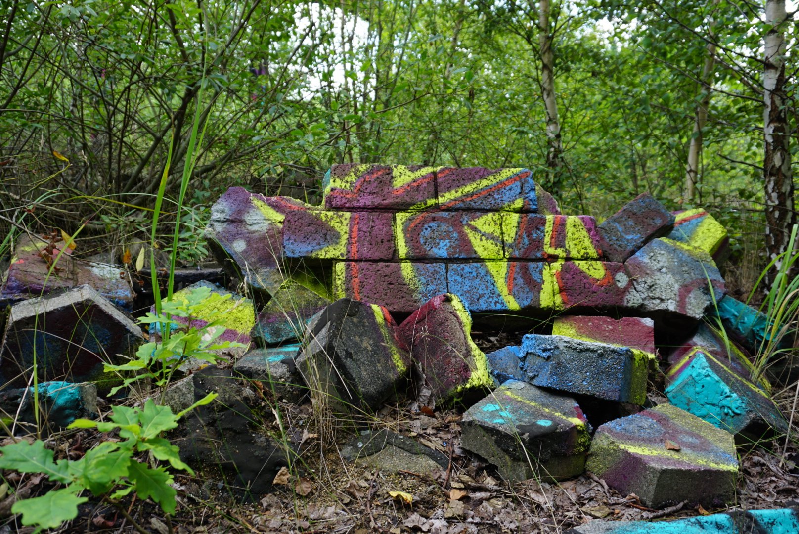

This is one of my favourite pictures from an abandoned trainyard and I already liked the colored shot quite a bit, but as you can see after I edited it (and cropped it a bit) the confusing and distracting green background disappears and the image is taken up another notch. The colors are very flashy and unique thanks to the graffiti and stand out even better with the whole rest in monochrome. You might notice I didn't color the whole brick pile because I didn't want to overdo it as the colored part of the image is already pretty substantial percentage wise.

I can't seem to find the before shot of this but I wanted to include it because I didn't use the effect to make the main focus stand out further. Instead I wanted to give a secondary point of interest to make the viewer look at it a little longer, just like with the next image:


In this case I liked the overall shot, but it was too confusing for me. There is a lot happening in the background, everything was kind of green and even though I had tried to make the tire the main focus I kind of failed. Since the tire in full color looks, well, monochrome I decided to grab the little strand of leaves directly in front to draw the focus back to where I wanted.
That's it, I hope you enjoyed this tutorial and maybe use it for yourself. If you do I would love if you commented with a link to your posts, I always love seeing color pop images :)
Upvote, follow and resteem if you like my posts, it helps a lot!
Classic effect! There's a time and a place for this as well
Thanks, glad you liked it!
@originalworks
Thanks, I wasn't sure if putting it into the tags was enough. Still learning how this all works.
you call it within the body or in the comments. It seems it has become very slow! Sometimes the node would fail and the bot is out! So if nothing happens by evening call it again! :)
The @OriginalWorks bot has determined this post by @trashureseeker to be original material and upvoted it!
To call @OriginalWorks, simply reply to any post with @originalworks or !originalworks in your message!