Poetic Floral Portraits
I have always admired flowers and used them as subjects in my photography. I am drawn to their elegant shapes, delicate textures and beautiful colors. When I started a series of flower portraits, I wanted to create something special to pay tribute to nature's most beautiful creations. I searched the web for inspiration and was shocked to see so many photos of flowers shot from all possible angles and under any lighting condition. How am I supposed to create something different? How am I going to impart something of myself so unique that it would not look like the thousands of flower images out there?
The answer I found was to look for trailblazers in art, those innovators who are able to carve their own path through a vast forest of sameness. Brigitte Carnochan is one of those. Her lyrical images of flowers and painted photographs made such an impact on me, that I felt the need to get out, get a camera and start my photographic journey. Another one is Huntington Witherill, a fine art photographer living in Monterey, CA, who I met in my initial pursuits of photographic knowledge. His distorted images of colorful botanicals left me speechless, impressed with his artistic vision and creativity. When talking about flowers, I could not leave out painter Georgia O'Keeffe, who according to Wikipedia, is "best known for her paintings of enlarged flowers, New York skyscrapers, and New Mexico landscapes."
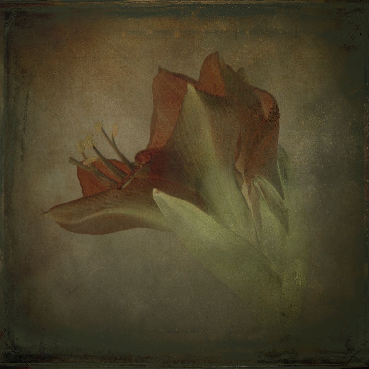
Drawing inspiration from those art pioneers, I created my series of flower portraits titled "Dissonance". Like Carnochan and O'Keeffee, I isolated them from the environment where they exist and made them the central piece highlighting their exuberance and distinctive character.
I photographed each flower in an improvised studio setting using only natural light coming from a skylight and a reflector placed underneath to eliminate shadows from the bottom of the flower. I shot three images at -2EV, 0 and 2EV and processed them as HDR in Photomatix software. Then the fun begins.
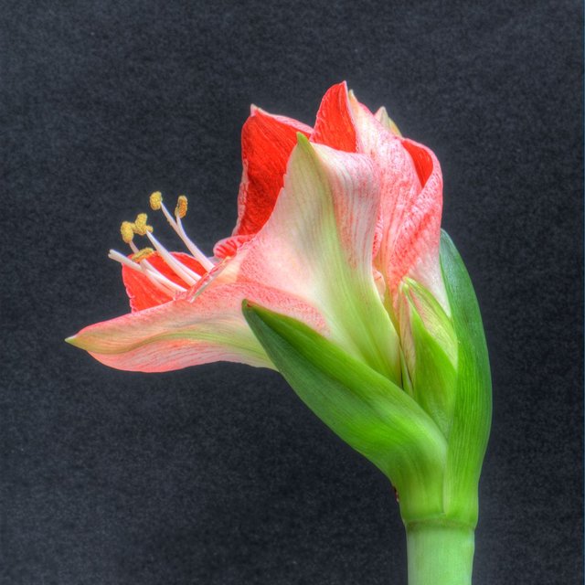
Original Image
I altered their colors and contrast, then started blemishing them with a variety of scratchy and grunge textures. I made extensive use of layer blending modes, including the rather obscure "difference" blending mode, which helped me make the image more mysterious and intriguing.
------------- Understanding the difference blending mode ---------------
To better how the difference blending mode works, we are going to work with the layer's color. The original layer has the base color and the layer we want to blend in has the blend color.
Is the base color brighter than the blend color?
YES -> subtract the blend color from the base color
NO -> subtract the base color from the blend color
The result is that all brighter areas in the base color will be darker. How much darker? By the difference between the base color and the blend color. On the other hand, all darker areas will become brighter. How much brighter? By the difference between the blend color and the base color.
As an example, let's imagine the base color has 7 levels of brightness (0-6) where 0 is the darkest and 6 is the brightness. To make it easier, let's blend it with its average color, so the blend color's brightness is (0+6)/2 = 3.
So this is what happens to each brightness level on the base color:
base color blend color result perceived result
6 3 6-3=3 darker (3 is darker than 6)
5 3 5-3=2 darker by 2
4 3 4-3=1 darker by 1
3 3 3-3=0 unchanged
2 3 3-2=1 brighter by 1
1 3 3-1=2 brighter by 2
0 3 3-0=3 brighter by 3
The overall result is a compression of luminance (thus lower contrast) and color (thus lower detail). The extreme case is using white as blend color. In the table above, use 7 instead of 3 and the result will be a complete inverse image. Using black as blend color (0 instead of 3) has no effect.
At this point, you might be asking: why not just invert the image? The complete inverted image is a particular case of the difference mode when the blend color is white. Using the difference mode technique, you can control the amount of inversion by adjusting the blend color.
The foggy effect was achieved by using a photo of light gray concrete and "lighter color" blending mode. I increased drama by using a burnt paper texture blended with "linear burn" mode to darken the image while giving it a rich warm tone.
This series received a bronze award from PX3 Prix de la Photographie Paris in 2011 and was a fine art nominee at the 3rd Fine Art Photography Awards in 2016.
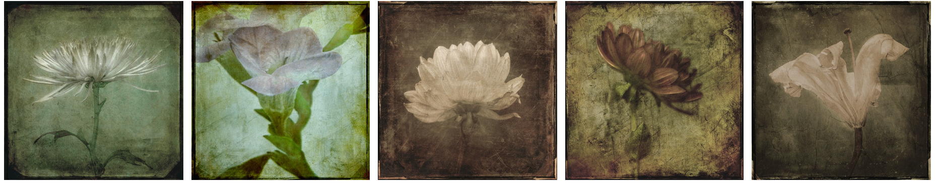
Here are some other images in this series, which are also available on my website:
--
Eduardo Fujii
Website: https://eduardofujii.photography
Email: [email protected]
Steamit: @sea-otter
Congratz, you just have been resteemed by @pixresteemer!
(All right but who is pixresteemer?)
Thank you, pixresteemer. 😀 Hmm. I think you might be following me, considering you saw my post just a few minutes after I published it. 😝
Congratulations on your awards for your fabulous series. My favorite part of a flower is their buds, so my favorite is what you did to this original image in this post. That is an Eduardo Fujii!
Thank you, whatisnew :)
Wow. Incredible post. I know a couple people that could stand to see this.
Thank you, voder :)