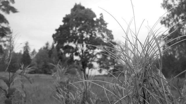
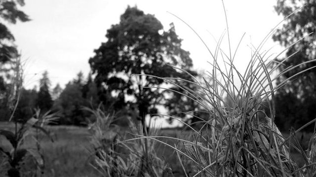
You know, I like the idea of the #1 A, but if I used it myself I'd adjust the levels, to something like this perhaps:
edited & resized, original by @markkujantunen
'Cause I like a more striking look -- a personal preference, of course. That may leave BW feeling a little bit cold, but to alleviate that one can add a tinsy bit of sepia tone, if willing.
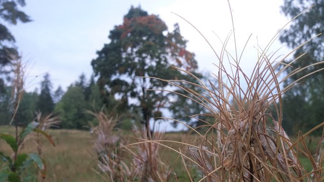
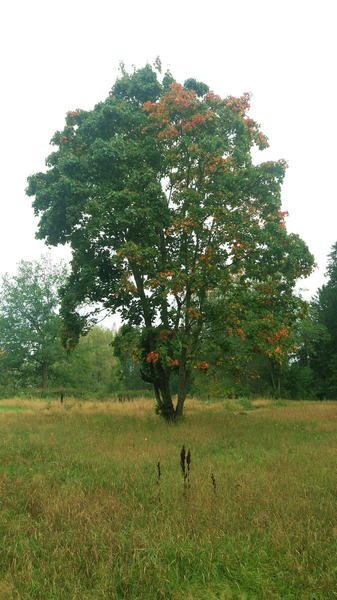
For #2, B) is probably just better overall -- too much information is lost as the rust-oranges have barely translated to a different shade at all.
That core "crisp" feel. Postproduction has its uses!
There's one more thing I'm reminded of, although you may be less interested, but for 2B -- if you lower the color temperature a bit the greens become more vibrant (I overdid it a bit here, let's say, for effect):
edited and resized, source by @markkujantunen
Overall, if color adjustment is useful to you, try sitting down to mess about with simple postpro tools -- I'm sure you'll find more uses for 'em.
I do edit them but not with tools that are any good. I plan to buy a DSLR this year. I'll probably start using Lightroom. My phone camera spits out jpegs which is not that great.
Your post was upvoted by @steem-ua, new Steem dApp, using UserAuthority for algorithmic post curation!
Your UA account score is currently 3.537 which ranks you at #6046 across all Steem accounts.
Your rank has dropped 5 places in the last three days (old rank 6041).
In our last Algorithmic Curation Round, consisting of 429 contributions, your post is ranked at #273.
Evaluation of your UA score:
You're on the right track, try to gather more followers.
You have already convinced some users to vote for your post, keep trying!
Try to improve on your user engagement! The more interesting interaction in the comments of your post, the better!
You know, I like the idea of the #1 A, but if I used it myself I'd adjust the levels, to something like this perhaps:
edited & resized, original by @markkujantunen
'Cause I like a more striking look -- a personal preference, of course. That may leave BW feeling a little bit cold, but to alleviate that one can add a tinsy bit of sepia tone, if willing.
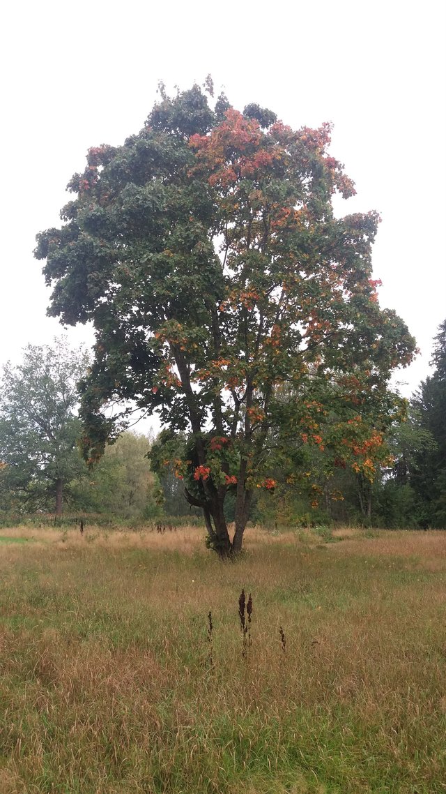
For #2, B) is probably just better overall -- too much information is lost as the rust-oranges have barely translated to a different shade at all.
Thanks a lot! Your version IS better! You're going above and beyond what I was hoping for!
In fact, I think your suggestions will help me a great deal at making better B&W in the future!
I added contrast to the B&W photo. It made a huge difference. I've received similar advice before. In B&W contrast is king.
That core "crisp" feel. Postproduction has its uses!
There's one more thing I'm reminded of, although you may be less interested, but for 2B -- if you lower the color temperature a bit the greens become more vibrant (I overdid it a bit here, let's say, for effect):
edited and resized, source by @markkujantunen
Overall, if color adjustment is useful to you, try sitting down to mess about with simple postpro tools -- I'm sure you'll find more uses for 'em.
I do edit them but not with tools that are any good. I plan to buy a DSLR this year. I'll probably start using Lightroom. My phone camera spits out jpegs which is not that great.
I think your black and white photos need more contrast. I like the shadows to be deep
B2. Guess because of the color...just looks better to me
Thank you.
both B's because i love colourfull photograph every color has its uniqueness and beauty like blaxk and white is doing in A's .... but i preffer B's
Thank you for your comment.
every photo is nice,its look like it is of village, but last one is better
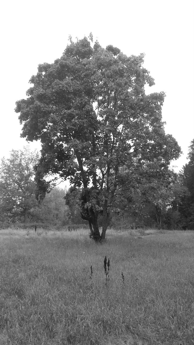
1-A
2-B
I like the color in 2-B due to the contrast in the color of the leaves that can't be appreciated in black and white
I would go for 1B and 2 A without any doubt ;)
Hi @markkujantunen!
Your post was upvoted by @steem-ua, new Steem dApp, using UserAuthority for algorithmic post curation!
Your UA account score is currently 3.537 which ranks you at #6046 across all Steem accounts.
Your rank has dropped 5 places in the last three days (old rank 6041).
In our last Algorithmic Curation Round, consisting of 429 contributions, your post is ranked at #273.
Evaluation of your UA score:
Feel free to join our @steem-ua Discord server