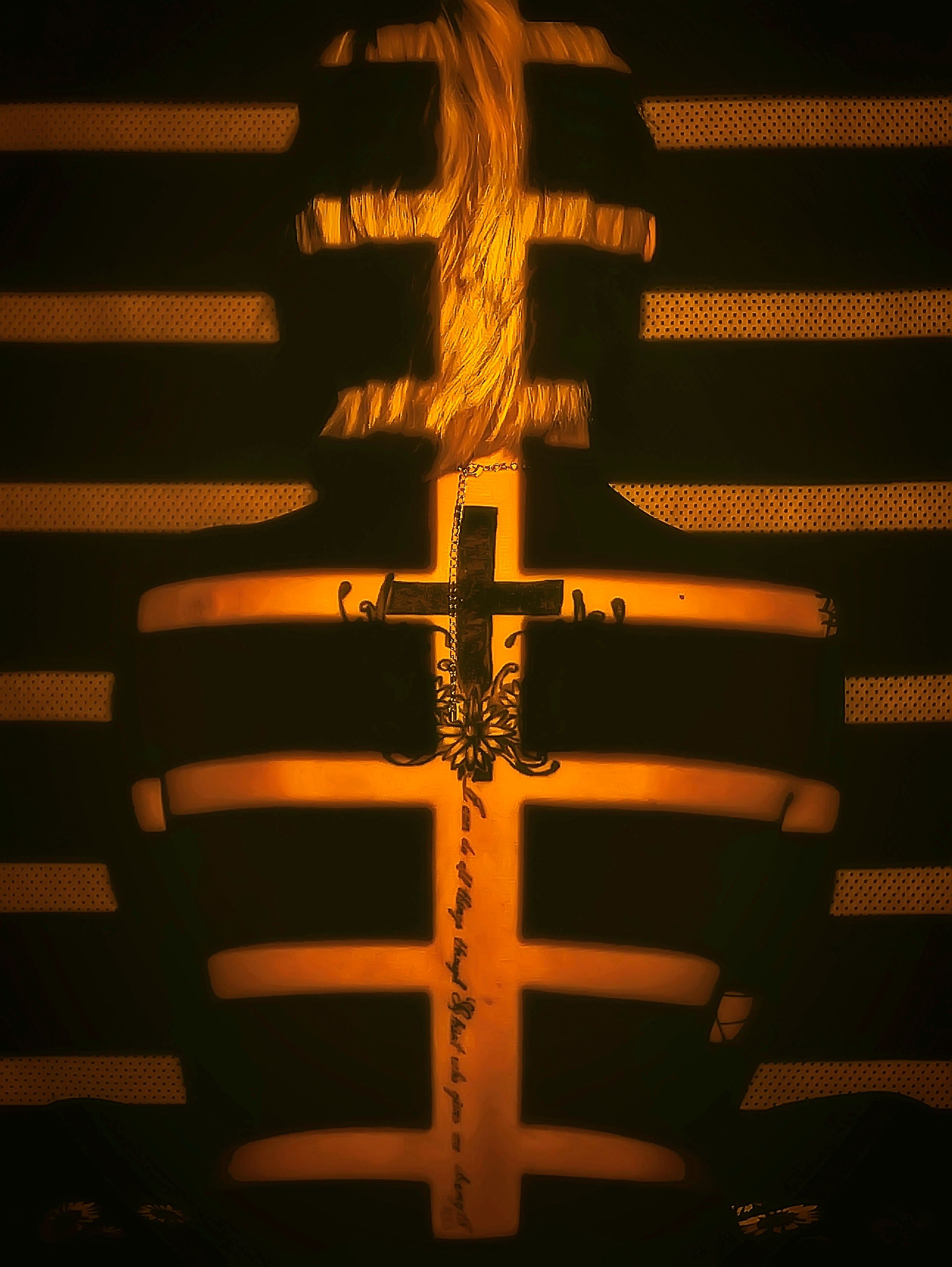
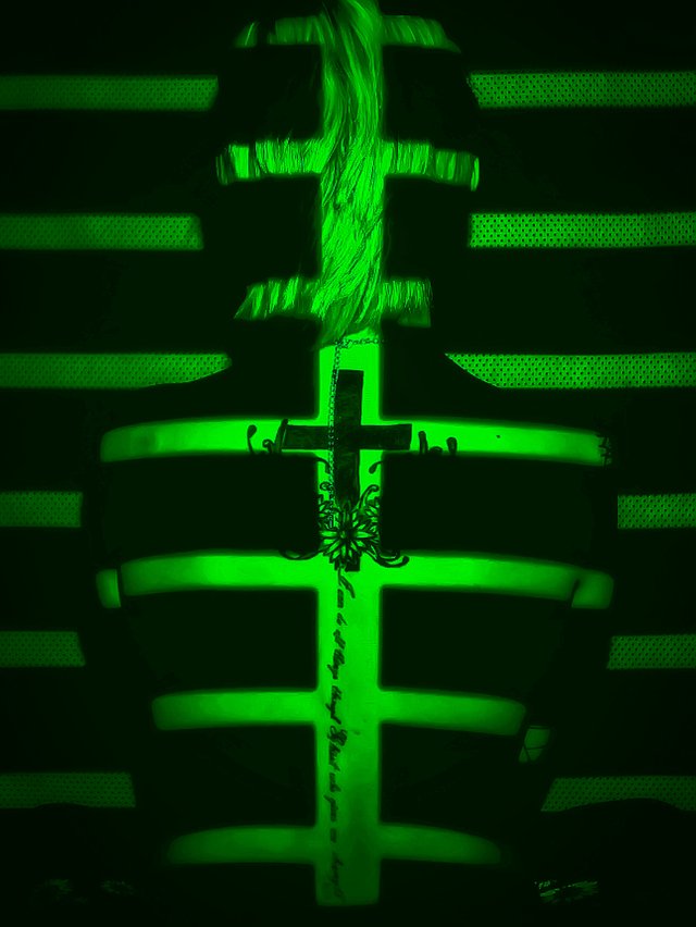
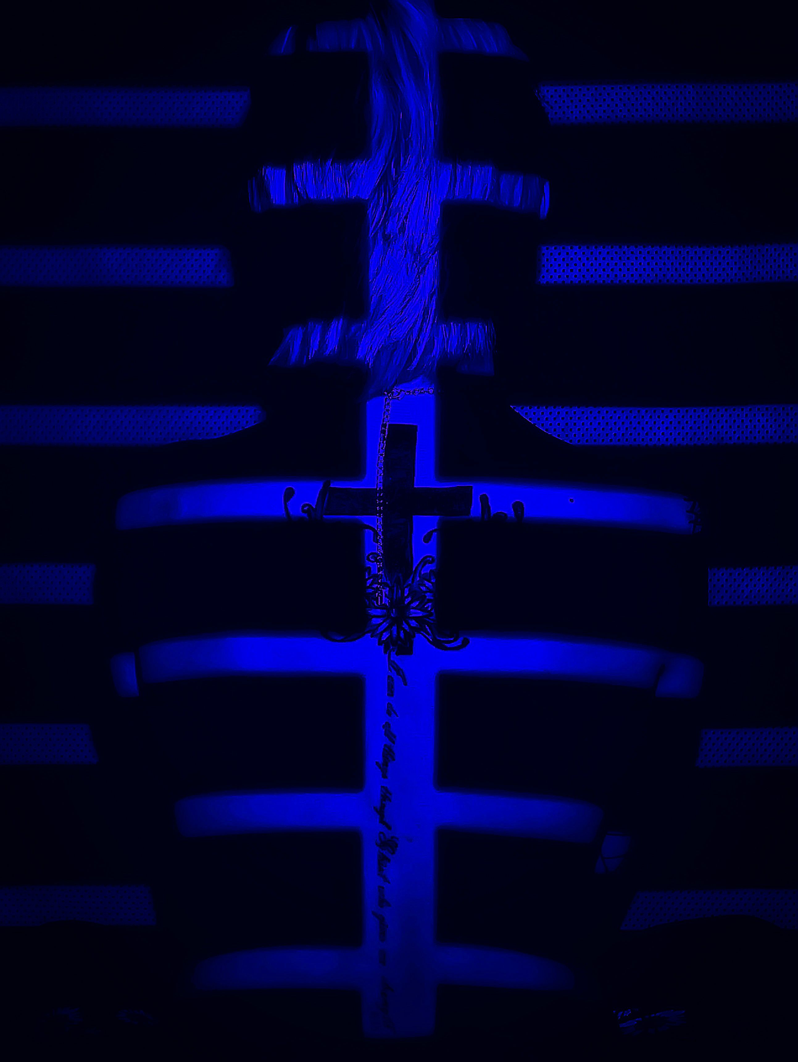
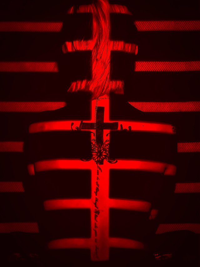
New Series (Need Opinions, Critiques, and Suggestions)
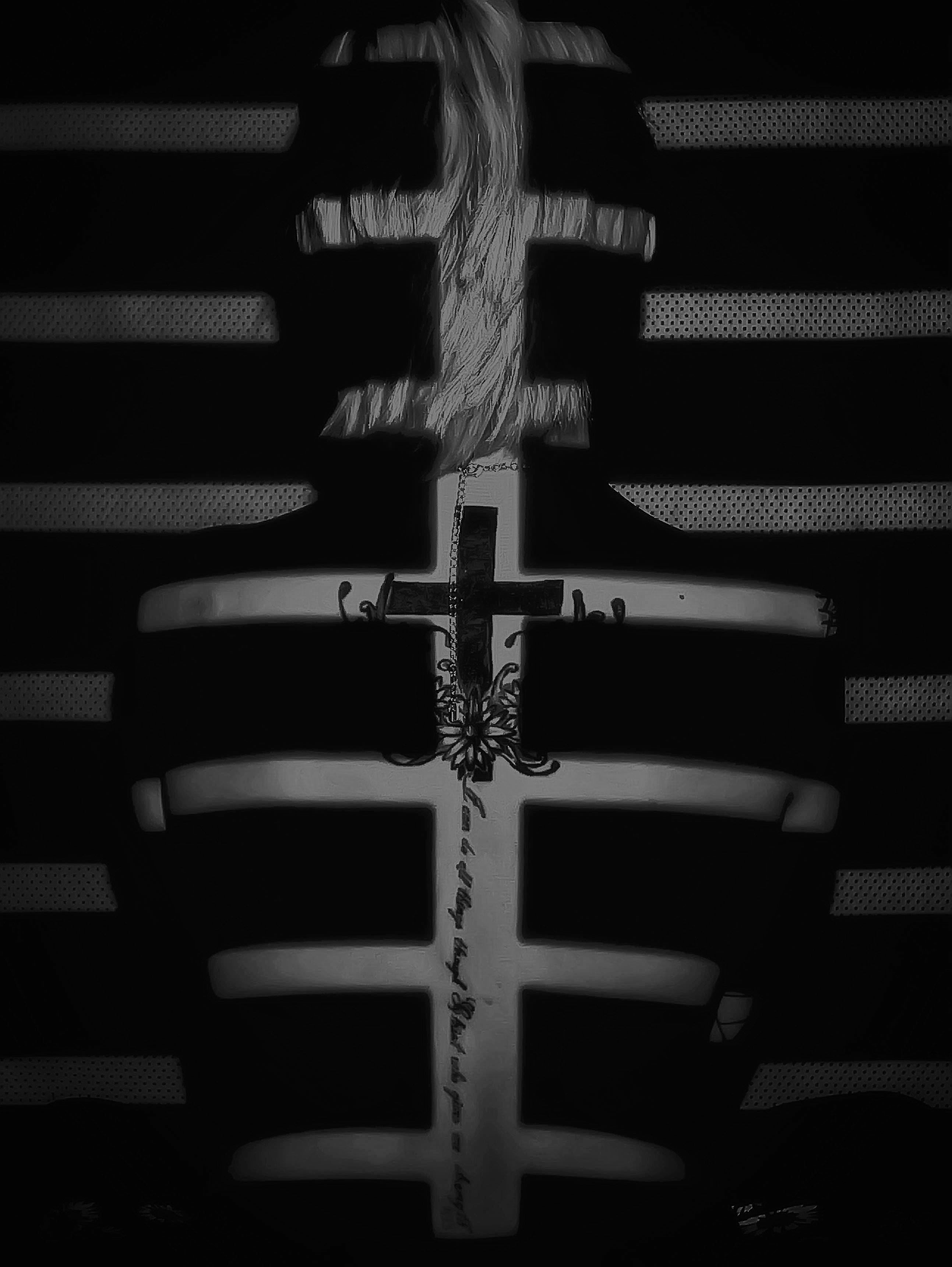
I couldn't decide which color to go with. The yellow worked best with her skin tone and hair, but all the other colors give it a different feeling entirely. Should I just leave all the colors or establish a certain tone to it all around by picking just one?
I also really love how the black and white version pops a little more and removes some of the grunge of the coloring.
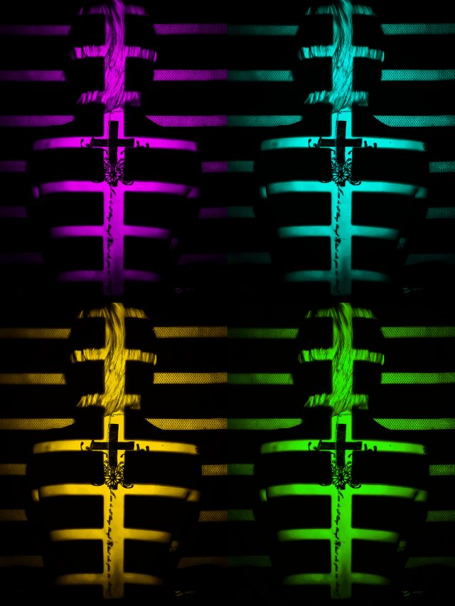
Finally I did sort of a Warhol-esque Quad photo showing the variations so that the observer can make up their own mind when looking at all of them together. I did more Neon-type colors for this one.
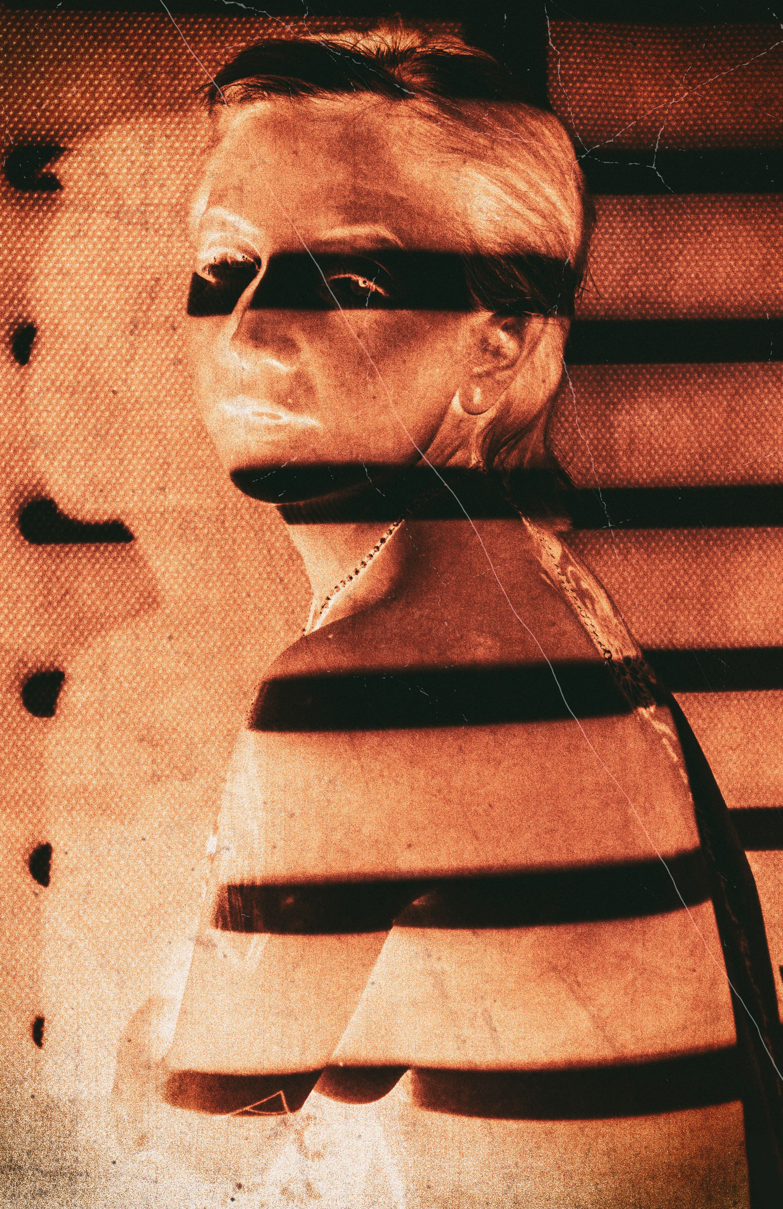
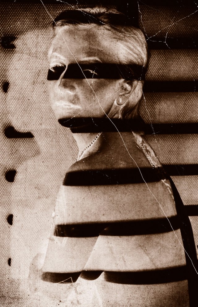
Next, we have a side view where she's looking through you. These I worked on with her because she wanted an old vintage-type photo, which I agreed worked out best for the look of the photo itself. For these I only made 2 variations. They feel complete to me this way.
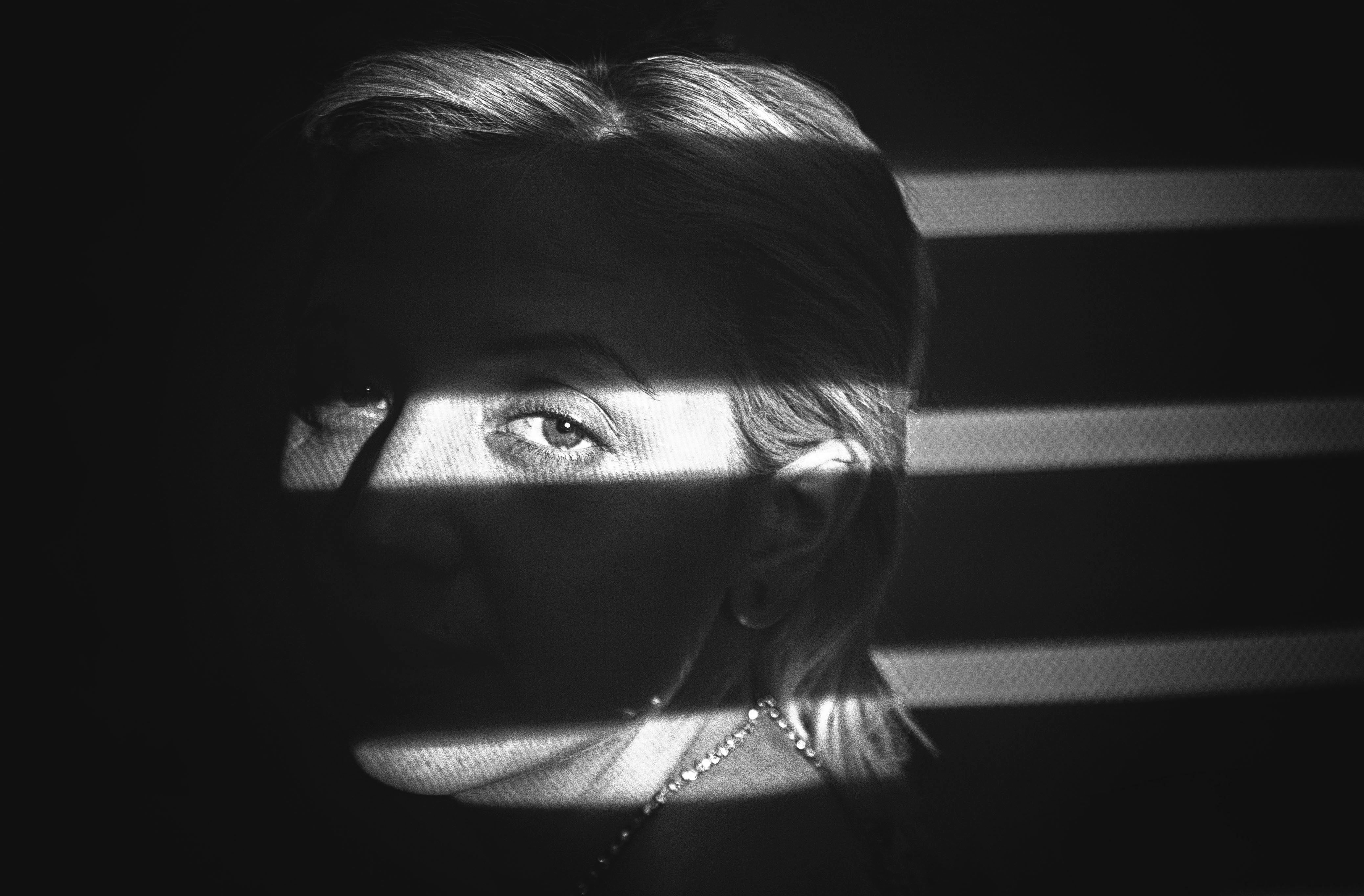
And, finally the close-up shot. Do you ever find yourself disappointed after staring into a beautiful woman's eyes for too long? Yea, neither do I.
If you like all or some of what you've seen and want to share your thoughts on them, then please, throw me an upvote, a comment, or a resteem. Anything I make on this site goes directly towards new equipment, props, models, etc.... It'd be greatly appreciated. Thanks for viewing!
colorful photos.
Nice... I like each one of them because every color having its own power to explain the emotion.
And I love that concept of horizontal lines.
I like the blue and purple. I don't know the emotion you are really going for either.
Anyways I enjoy the symmetry in the top ones
Nice one, not saying about which one is the best. I like the concept.... This is what I want to see here - more artists like you.....
yeah, I liked the concept too :)