B&W or Colour?
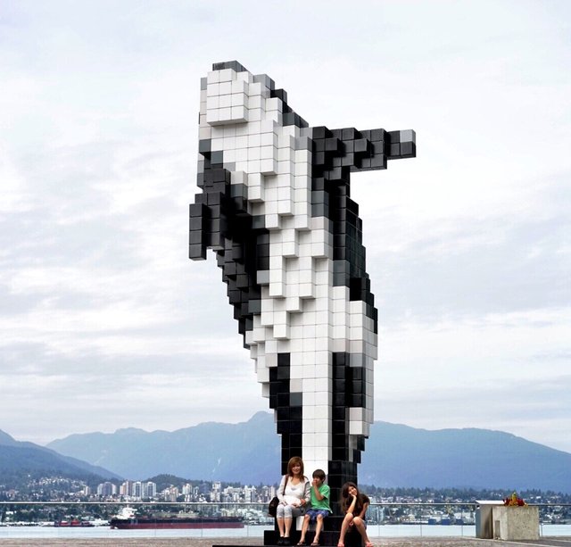
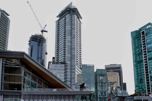
These photos were captured at the Vancouver Harbour Convention centre, by the "Digital Orca", created by Douglas Coupland. A Sony A7 and Zeiss 55mm lens was used. Which do you prefer Colour or B&W?
========================================
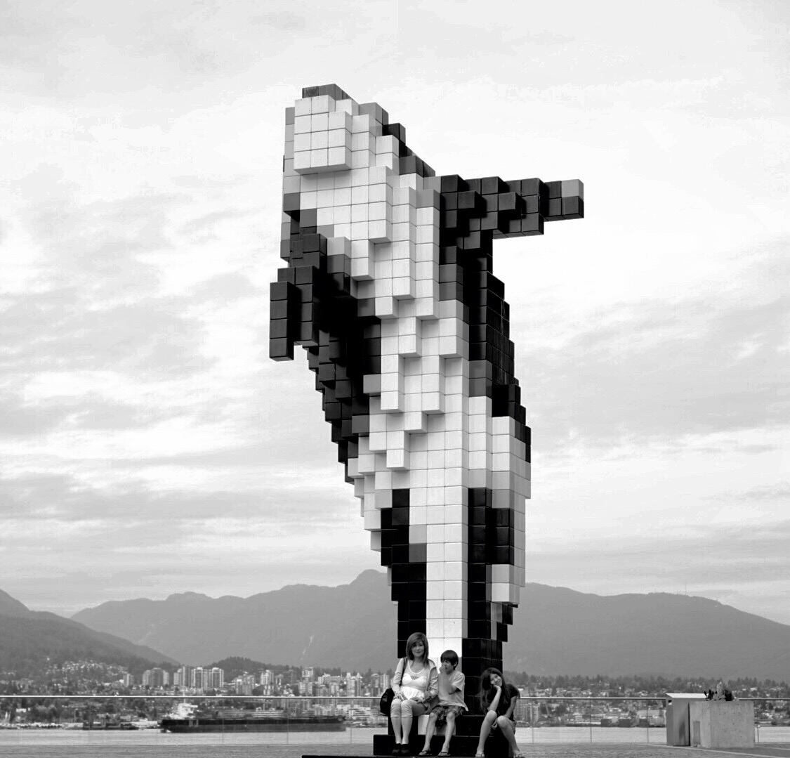
ISO 100 ~ f/4
========================================
========================================
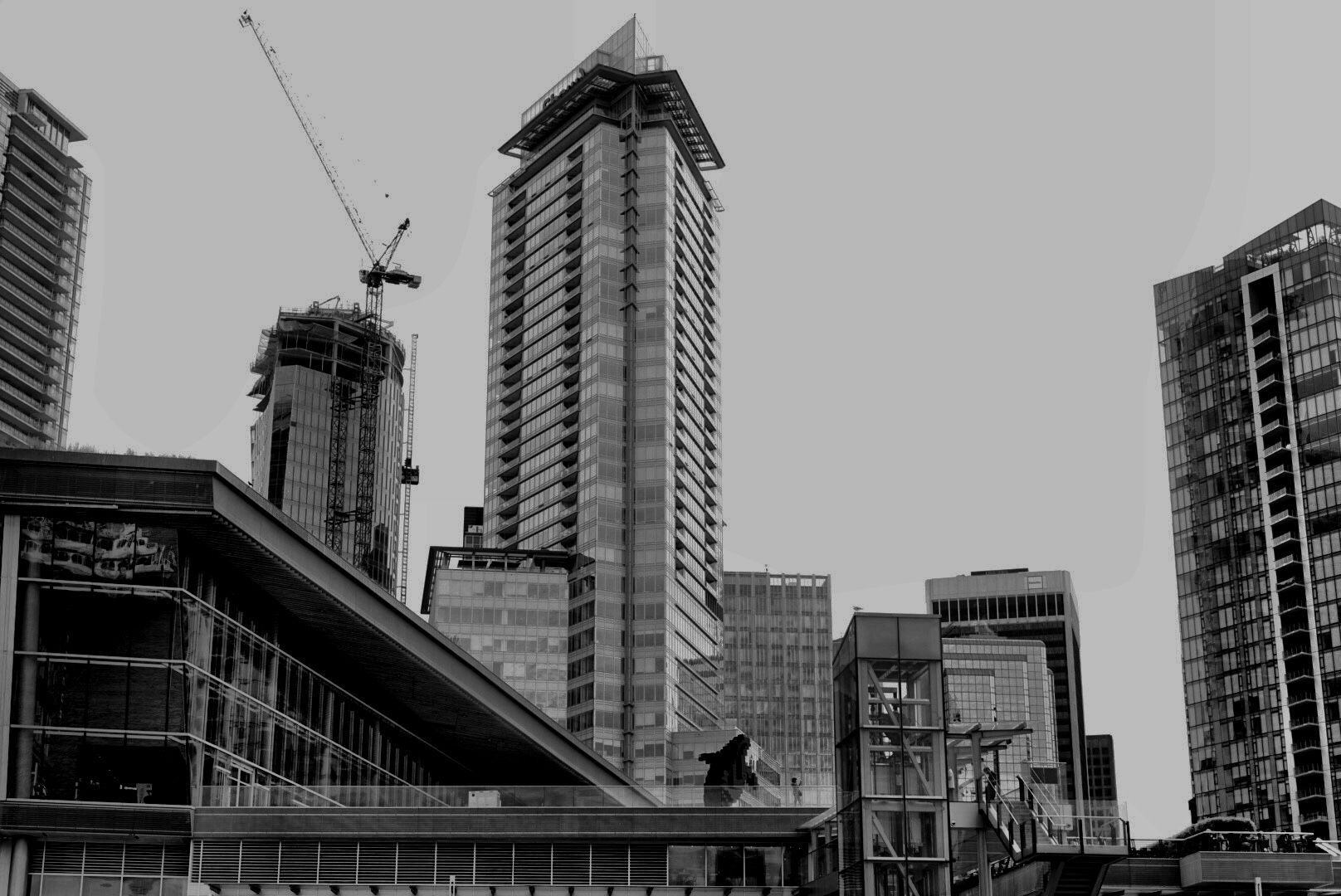
ISO 100 ~ f/3.2
========================================
========================================


I really liked the first photo, Orca Whale !
this is great in color mode
and for more artistic photo building in bw mode.
Appreciate your comment!
It's nice that you're making a serie of these posts. I just love them.

I really believe that black and white is more special and connects better (I guess my english was too bad on that last description). I hope these posts are just for fun and not because you have doubts about how your photographs would be better.
Keep posting good stuff.
Steem-On!
The posts are just for the FUN of it!
I like both, but sometimes b&w just add another dimension to the photo
I prefer them in BW
Thanks for your comment!
Also, some photos that I take has really bad colour and lighting. Or if it looks boring. I would use BW to try save them from despair. Haha.
I like both of them @daveks . . 😊
Thanks!
Color
This one is better colored. Because the sky looks cloudy white. But if the sky is blue or a combination of blue and white, then the black and white version is better. Best regards 👍
I like them both but I think black and white is better for the buildings if you ask me. :)
In my opinion, both versions work great for the first shot! For the other one I prefer BW.
Thanks for your input!
I'm sorry to do this here, but can you help me please? Is for my dogs!
https://steemit.com/littlecontest/@yiyi.maiola/a-little-contest-for-a-big-reason
Wow that is incredible. You know I wish my life was that photogenic.