Photoshop. Secrets for beginners.
Photoshop. And it's all about it.
With Photoshop I met a long time ago. While still studying at the university, I wandered into the computer audience, and I stayed there. The local guys took me in a surprisingly friendly way, gave me their personal computer, account on the network and a bit of the Internet. Then I had a limit of 50 megabytes a month. Now, it's funny, but then it was quite enough. In the browser, by default images were not shown, and on the Internet there were almost no sites in Russian.
Then I came across graphic editors. First it was a package of Corel PhotoPaint, later for me appeared Photoshop.
Then, for me, still barely understanding English, studying the program was very difficult. Clear were the simplest operations, lying surfaces.
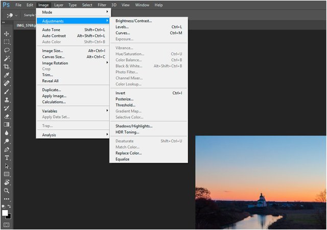
For example, Brightness / Contrast ...
Now I do not use this point at all, because the increase / decrease in brightness or contrast across the entire field is almost never required. Because if you do so, the boundary brightness is cut off. Those. lost information in the image, disappear close to the lightest and darkest tone. Moreover, such a change can be made by another tool. For example, Levels. This happens on a new level of understanding of Photoshop. Next, you begin to understand what Curves is. And that's all! Never again go back to the previous instruments.
Everything I'm talking about here is subjective. I just studied the matchmaking itself and without any prompts. Probably not the shortest and the right way.
But, understanding the work of curves is the most important skill for working in Photoshop. It is associated with such things as understanding color. Understanding the color space. Understanding all these abbreviations RGB, sRGB, AdobeRGB, CMYK, lab and others ... For me this understanding resulted in the fact that colors do not exist. Even the definition of color, if not peek on the Internet, is quite a funny thing. Think about it. Color is a subjective characteristic, our perception of some kind of electromagnetic influences that stimulate our brain through the visual apparatus and we feel this effect in the form of color. Maybe a little messy, but the essence is we see the brain. The eye and all sorts of cones and rods are just a receiver that creates raw information, and the brain, then, paints it with bright colors.
They say that the Eskimos distinguish better shades of gray, white, in general, light. Understanding these differences is vital. What snow is there today? And there are 20 different words to determine the shade of this snow. Equatorial inhabitants live in conditions of powerful contrast. The sun shines on them from above and, accordingly, their life occurs in conditions of severe glare and very deep shadows. The colors are all bright and saturated. Again, the colors. Straight beams bring to the surface of the short-wave waves. Purple, blue stimuli. When the sun is at an angle to the horizon, the thickness of the atmosphere absorbs a part of the short waves and dominates the long waves, warm shades.
But I will not run ahead.
The first thing that was required to process photos, it was to increase the brightness and contrast and increase the sharpness. Very simple, Brightness / Contrast ... and Sharpen.
The second is retouching. Those. the fact that I used to do aniline paints with a zero brush directly from the photo, now I did a stamp in Photoshop.
All these methods required mastering, but this was some kind of extensive study. And now it seems that some strange training has appeared, that I, sort of like, know the photoshop. Those. I poked with the mouse on all the points, half did not understand and broke off as unnecessary, made a file of several layers, pampered with filters and seemed to understand what's what.
It was a fatal mistake. The photos that seemed good and beautiful to me were actually horrible. Usually overcooked, overstuffed, with lost details and other troubles. Only then, after some long time, I realized that Nicherta did not understand in Photoshop. However, I still thought a couple of times that I know photoshop. And every time decently so broke off. Now I do not say anything like that. Simply every time I am surprised when new faces of processing, such as frequency decomposition, use of modes of imposing are opened, not destructive processing.
For a successful and fast work in Photoshop, there is much to learn and understand ...
I'm ready to share.
Let's start with ... curves
Not ... Not so ...
Let's start with some input data. Probably everyone knows it all, but it's very important for me to say this, that it would be somehow logical to use these or other terms and concepts later.
RGB.
I already mentioned RGB. This designation indicates that we have an additive color model. This is a method of color coding. Additive means from English addition.
R - red, G - green, B - blue. These are three channels for indicating the primary colors. When mixed, we get all the other colors. It must be understood that this mixing is not colors, but light. These channels were chosen because of the physiological susceptibility of the person to these stimuli. If everything is mixed together in the same proportion - we get a neutral (white or gray or black (depending on the brightness).
Such a system is used in TVs, monitors. For standardization, an sRGB standard was devised, describing how colors should be mixed and what shades are achievable when mixing. The sRGB standard does not cover much of the entire human spectrum.
Adobe RGB has a wider reach.
Non-destructive processing.
Reading the lectures of Andrei Zhuravlev, who is really a very cool expert on photoshop, and indeed, on Adobe products and color in general. He worked in a printing house, on television and just an intelligent, interesting person, I realized that there is an approach to processing in Photoshop, in which you do not lose any information.
Those. actively apply the corrective layers, blending modes, smart objects and, as it were, layer-by-layer form the final image, on the steps. Each step can either turn on or off, or change the force of the impact. The bottom layer is the source. With him, no action, changing it, is not done. Thus, not only the source code is preserved, but also the processing history stored layer by layer is formed. This is very convenient in the sense that you do not need to backup the source, and that another designer (photographer), calling your file, will get the whole structure of the work on the file. He can use it to similarly process another file or adjust your. This approach is akin to a worldview. Once you start working not destructively, there immediately appears the need to apply and learn new methods of work for yourself. I strongly recommend Andrei Zhuravlev's lectures and his non-destructive approach.
A curve in Photoshop. Called either from the menu, or by pressing the Ctrl-M hotkey. Knowledge of hot keys in many ways gives an advantage when working in Photoshop. First, it's faster. Secondly, do not climb the menu in search of a specific item. But such a choice of the curve is work in the layer immediately, i.e. after applying it, the information will change in the layer that was active at the time the curve was called (as, indeed, any other tool from the Adjustments menu.
For non-destructive processing, an adjustment layer is required. Creating a correction layer occurs when you click the icon in the Layers palette (Layers). When you click on it, a menu appears with the choice of the type of adjustment layer. Choose Curves ... (Curves).
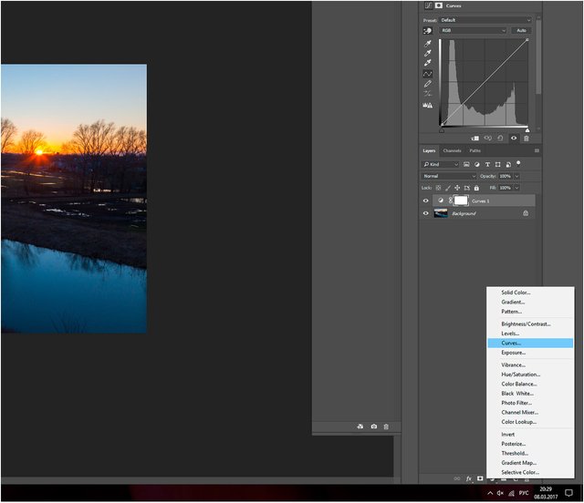
A layer above the active layer appears. In this layer there is a curve, the display of which is visible in the Properties palette. Now let's see what it is - a curve.
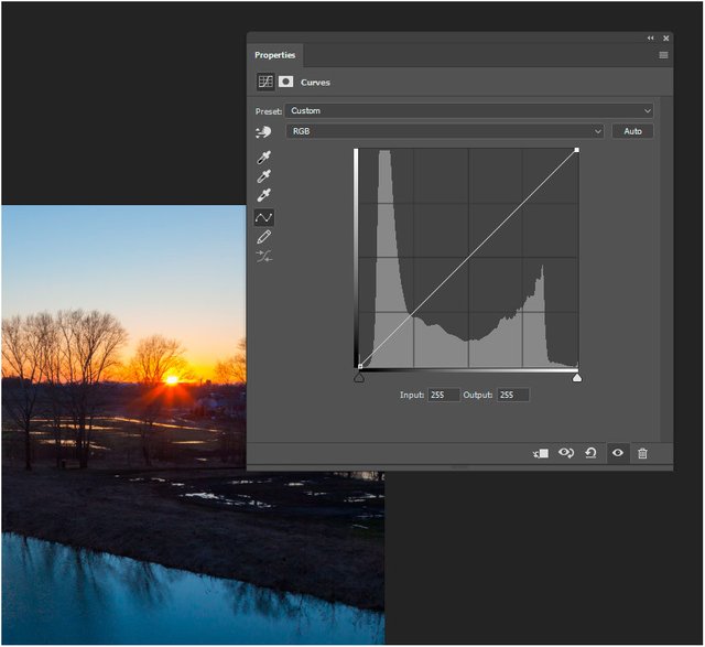
Before us is a graph. It has two axes. The horizontal is X, the vertical is Y. The line runs along the diagonal of the square - this is the curve. The background is a histogram. Below the numbers in the windows and the pictograms at the edges.
Let's start with the histogram. The histogram shows the distribution of the brightness of the image along the X axis from the darkest, with a brightness of 0 to the lightest, with a brightness of 255. (The figures are for an eight-bit image, if the bit is larger, 255 is a conditional value, since the brightness gradation becomes much larger ).
Vertical (scale Y) - distribution of brightness after the impact of the curve. Those. if we pull the curve, its shape will change and the brightness distribution will change.
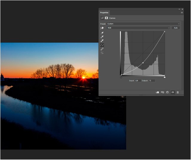
So, I pulled the curve down in average brightness along the X axis. The value along the X axis is 128. The average brightness. We see it in the Input window. In the output window, we see a value of 72. And there were also 128. Ie. it turns out that the curve changed the brightness of 128 to 72. And all the brightness along the entire curve also changed.
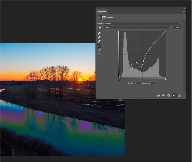
On the curve, you can put a lot of points and bend it, controlling the brightness. Choosing a point, we see the input and output brightness. Work with the curve you need carefully, since the force of the impact is very large. But now it is too early to talk about working with a curve, because there are a lot of nuances and controls. But about this - in the next post.
to be continued ...
p.s. I made this article in Russian language first. After all I translated it into English. I'm not good in it but I hope you'll find something interesting in my work.
Lessons from professionals! Hooray!
Very awesome learning information @amikphoto!
I've never tried that till now, it took the photo I was
playing with to a whole new level! Thank You ❣