Photography curse N2 (Color) ❤ ❤ ❤ . I'm David a professional Photographer traveling around the world. Easy tips to archive the perfect photo!. + Giveaway!

Hello comunity!! I hope that this gets you in a exelent mood.
I will start teaching you all I know about photography!.
*All photographs are taken by me ❤
I'm David, 24 years old, I live in Argentina, a country in the south of America. I work as a professional Photographer and Videographer.
Let's Start!
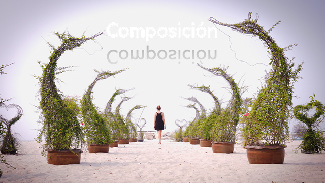
Composition:
In photography composition is the arrangement of parts of a scene to form a particular visual outcome. Composition can also be about picking a viewpoint to form a pleasing visual outcome. In practical terms, the photog tends to use both “arrangement” and “choice of viewpoint”.
In general composition aims to direct the viewer to see the point of the photograph. The “point” may simply be an aesthetically pleasing scene, or something containing a more complex story. Even a visually disturbing or discordant outcome are the result of efforts in composition.
The finer points of a particular composition relies on a range of “photographic elements” and the “principles of photographic art” for using them.
Today: Color
The appropriate use of color in photography adds a dynamic element to your images that is very pleasing to the eye. The correct use of it will allow you to create photographs to be proud of. Bold colors and bright composition in your photos result in images that sell!.
COLOR ISOLATION
It’s very important to isolate colors when trying to create a dramatic image. Using a telephoto or zoom lens will allow you to isolate a particular part of a scene that has a striking color or combination of colors. Another technique is to use your feet and change the angle of view so that the color is isolated from its surroundings. Getting in closer helps and allows you to combine colors that are more interesting and work well together, e.g. contrasting or complementary colors.
ADVANCING COLORS
This was an interesting concept the first time I read about it. Colors at the warm end of the color spectrum stand out and demand more of our attention. They are said to be advancing colors. Take red for example, it is strong and bold and when viewed in an image tends to dominate through its boldness and rich color. You’ll notice how strong it is when you have a scene that has only a little red, like a postbox, and yet it still has a dominating effect on the overall image. Yellows and oranges have a similar effect although they aren’t as strong as red. So be aware of advancing colors so that they work for you and don’t upset an image. Another example would be a bridal scene where a red object is part of the image. It will take the attention off the bride so be aware of this.
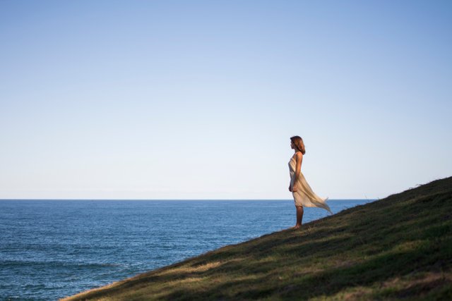
RECEDING COLORS
This concept is opposite to advancing colors. They take a background role and are more like supporting actors in a film cast. They like the background and add to the scene creating beautiful images. This is why blues and greens, the more cooler colors, work so well as backgrounds. They recede into the distance and help other colors stand out. Large areas of blue sky do this together with rolling green hills. Use them effectively and you will have great photos.
And an amazing explain video!
Giveaway! :
If you want some HD files to use as desptok background please ask me. I can send the file to your email for free!
Social media contact: https://www.instagram.com/dbusseti/
Support my photography and business donating or delegating steem!