Color vs. black and white images
Before taking a picture, it is better to determine in advance whether the shooting will be done in color or better to hold it in black and white.
Of course, any color images can be made in black and white in subsequent processing (and vice versa, but a little more difficult). But the hallmark of the professional photographer's approach is a clear understanding of the color palette of future images even at the shooting stage.
In this article I will give you the features of both options that can enable you to create the right accent in your drawing.

The main difference between black and white photographs is their reductive simplicity.
That's why artists start learning with black and white palettes, which are much simpler, as they have fewer elements. But it allows you to clearly convey objects, volumes and other properties.
Similarly, black and white photography, because it has no other color except all the gray color between black and white, there is no colored element in it that can distract the viewer from the important objects of the frame. This leads to a general simplification of image perception by viewers.
In b / w the image is much easier to transfer the composition, structure and texture of the object to be photographed, as well as the spatial interaction of the object to be photographed.
One bright example is the silhouette photo, without much detail, but able to convey the essence of the object.
In cases where the silhouette is clearly separated from other figures or objects in the composition, it becomes an independent element.
Contrasting shadows and light can deliver dramatically, or increase the sense of volume. In particular, it is valuable to highlight vignetting as a method to increase viewers' attention, in black and white photography its influence is multiplied.
Monochrome shooting is often considered more serious and professional and makes you think.
Sometimes it is difficult to say in advance which version of the image will be more profitable, but "remove" the color effect, it is much easier to focus the viewer's attention on composition, playing lines, rhythms and shapes.
In addition, translating images into black and white may allow "correcting" the wrong white balance or parasitic light and reflexes (the parasitic color of adjacent objects).
Many studies show that the human eye can distinguish between 1 and 10 million colors. Therefore, color photographs from the human brain are more difficult to see than black and white - we must also analyze the color components other than contrast, volume and shape.
But this does not mean that you have to shoot in black and white. With proper use, color allows you to emphasize and convey your mood. But at the same time, very often distract from the main object.
In a color photograph, the main object, ideally, should have a brighter color than the surrounding minor details.
As I said in the previous article, the colors in the photo must be matched with the basic color scheme, the following which will allow to make the image more harmonic.
For beginners, as for artists and photographers, I would recommend at the beginning of composition studies to take their pictures in a black and white palette.
However, the advantage of color in photography is the creation of a richer and deeper description of the fixed moment.
Among other things, colors can convey to the viewers and information about the time of shooting. Whether it's the time of day or time of the year.

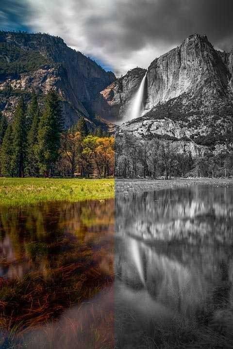
So, if you see the dark blue colors deeply felt from the images, they may show late at night, the warm yellow color at sunrise, and the red-orange sunset, and the red, yellow and orange leaves give a clear idea of the fall. The bright green foliage can convey the charm of spring to the viewer. However, the autumn photos on black-and-white photos are easily confusing with the summer, and sometimes even winter pictures. This can be easily viewed on the title page.
Also talking about color, it should be noted another article, where I briefly touched the question of how often this color or perceived.
Color photographs are considered by the human brain to become more natural, because we all see the surrounding world in color. As a result, the colored frame evokes the emotions of everyday reality in the viewer.
In conclusion, I would like to note that the very choice of color photography solutions is as subjective as the frame construction or choice of objects for shooting. And every photographer should make it, depending on his idea. Think about what you want to convey to your audience and what is most important in future frames. Where the special elements and atmosphere are in the frame, you want to emphasize.
But in order to understand and discover your own vision of the world, it is important to understand the color and black-and-white effect capabilities of the transmitted scene and the audience.
Congratulations @alifjayaputra! You have completed some achievement on Steemit and have been rewarded with new badge(s) :
Click on any badge to view your own Board of Honor on SteemitBoard.
For more information about SteemitBoard, click here
If you no longer want to receive notifications, reply to this comment with the word
STOP