Photobomb Challenge UPGRADE- New logo
Hello photobombers!
After just 9 weeks of new challenge and after few thousands entries it is time for a little logo upgrade.
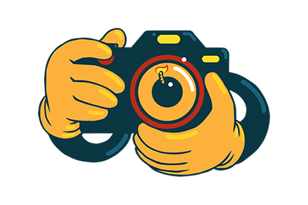
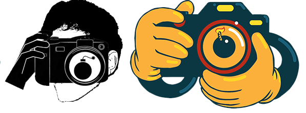
Old logo vs New logo
Please let me know in comments your opinions on new logo :)
Did we make an upgrade?

Greetings from @fibra59
Please let me know in comments your opinions on new logo :)
Did we make an upgrade?
Greetings from @fibra59
Did we make an upgrade?
Greetings from @fibra59
Although I like b/w concept more, this new logo really stands out, eye catching! I like it!
:))
I find the new logo to be much more dramatic and eye catching. The color ads rather than detracts from the impact in my opinion. It is definitely an upgrade!
Thank you a lot @onceuponatime :)
I am very glad to hear that one of very first supporters love it :D
I love it, @fibra59! It's way batter than the previous one. :)
Thank you a lot :)
Both looks good. But the new one fits better in theme of photobomb than the old logo. Its cartoon-ish look brings a funnier side. And change is good.
Thank you !! :)
His new logo is less attractive to his brother @ fibra59.
Because only hands that appear.
Maybe people will be scared to see the logo.
They think the ghost is holding the camera.
Suggestions from me, the logo is made with the camera and the person.
thank you
I will follow every contest from @ fibra59
Thank you for your opinion :)
Good luck on challenge
For me, it's not yet reflect the #photobomb characters... it's more to photograph generally. :)
Thank you for your opinion. I think that this is good motive for combination of photo and bomb for challenge that is named photobomb :D
I think it could better if the bomb just more bigger than camera/lens, in design :D
I think the new logo can not beat the previous logo, color and shape less luxurious. That's My opinion @fibra59 😊😊
Thank you for your opinion :)
U'r welcome @fibra59
Nah..
looks nicer and fresh !
Thank you!!
cool logo!
Thank you ! :)
both are awesome..
hahah :D