Photograph Analysis
I thought it would be interesting and useful for us amateurs regardless of whether we use high-end gear or just camera phones to collaborate in order to better our photography skills. I suggest that we harness each other's knowledge and offer each other constructive criticism, suggestions for improvement and encouragement in photography. To do this, I propose we use the #photoanalysis tag whenever we want our pictures constructively criticized. Ways to improve composition and technical quality are welcome subjects of discussion. Also, it would be interesting to discuss the artistic aspects of the photos.
The use of the tag #photoanalysis will make it easier for people to find posts under this category. I have benefited from suggestions by others both on Steem and elsewhere, so I've decided to give back to the community in the form of this initiative.
By the way, I give you permission to re-post any picture I have published in this series in the comments of a post of mine under this tag.
WIthout further ado, I'll analyze a few photos of my own to get this series started. They range from what I think are better than most to those have lot's of room for improvement. You're most welcome to join in and offer your insights.
1
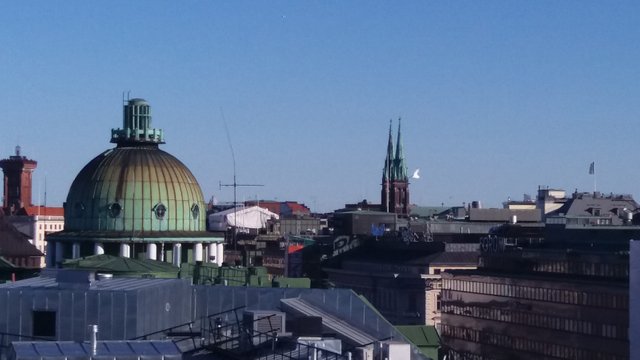
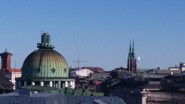
The main subject here is the dome. It's placed in the lower left and it is the first thing that one looks at in this photo. The secondary subject and the second thing to draw attention is the church tower in the distance. It's a massive object but much further than anything else. Its purpose in the photo is to counterbalance the main subject. I think the relationship between the two is what's best about this photo. It was taken with a phone camera and cropped which is why the image quality is not terribly good but it's not awful, either. When I look at this picture now, I wonder if I should've lowered the horizon enough for everything below it to make up the lower third of the picture. Let's see:
Yes, definitely better. Fewer distracting details at the bottom and better balance between the rooftops and the sky. When I was composing the original, I was thinking about this one.
I wonder what other ways the original could've been improved. Please tell us in the comments, if you have suggestions.
2
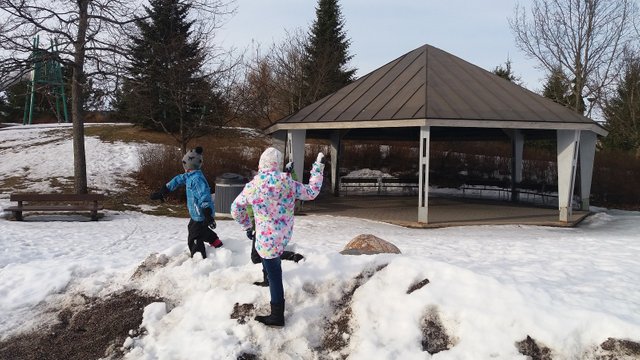
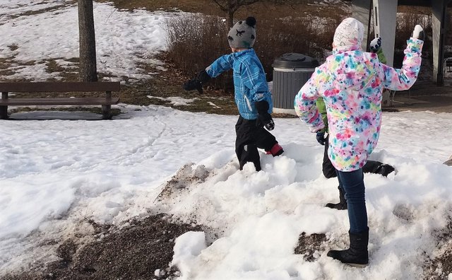
The biggest flaw in this one is the fact that the main subjects, the children throwing snowballs, are too small. I should've gone much closer. The background is overemphasized. I should've placed my daughter near the left edge of the picture because the kids are moving towards the right. One should always leave space if there is any on the side towards which the subject is moving or looking at. Otherwise it's a good one in the sense that it's a fun situation. Let's do some cropping to see if the composition can be improved.
Definitely better, although the sharpness of the image has suffered a little. Should've gone closer.
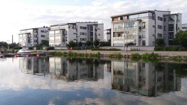
3
The horizon is not usually placed in the middle of the picture but here it is because of the reflections. They are far from perfect but they're there. There are three buildings in the picture which is not a co-incidence. When there is an odd number of main elements in the picture, the eye is not drawn back and forth between the two (groups of) main elements as easily which makes for a calmer and less restless composition. The reflections are not that great. It may have been better to wait for calmer weather. I did have plenty of opportunities.
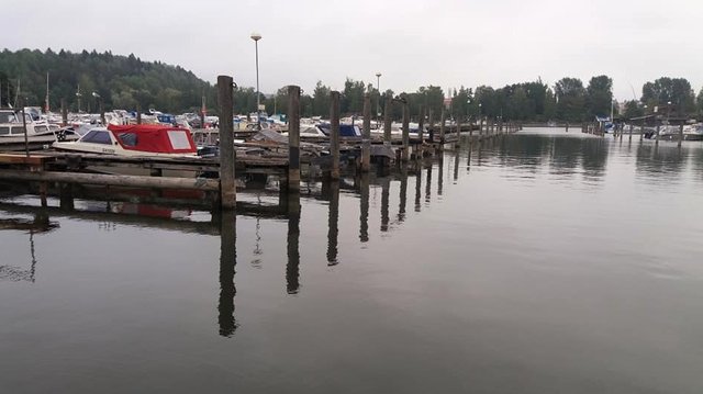
4
This one is a failure because, although the mooring posts form a leading line, it leads nowhere in particular. The picture is flat and uninteresting in general.
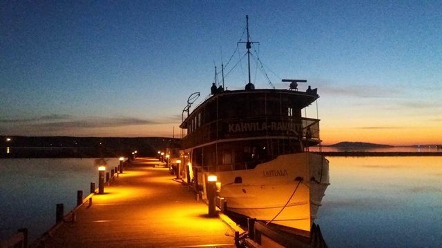
5
This one is otherwise a fine picture but the technical quality is very poor. It's simply too grainy. That's because there is not enough light for the kind of short exposure used. Using longer exposure and a tripod to keep the camera steady to prevent motion blur would've been the only ways to make this a decent photo. I haven't shot anything like this since May.
Thank you for getting this far! Any constructive comments and suggestions are most welcome. Please don't forget to use the #photoanalysis tag if you want your photos to constructively analysed and commented on.
As it happens, I'm currently writing a blog post in Insaneworks account and the #photoanalysis tag fits perfectly to it! Just give me a minute (or several...) to finish that and in a moment, I'll analyse what I can here.
Great idea by the way!
But first --> coffee... :D
I'm not a photographer but I think this is a good initiative to help the community and engage with the community, well done.
Photo composition is a topic I know nothing about, so I'm mainly here to learn :)
But I have one question, not entirely irrelevant to the topic. You've mentioned that your going to get Adobe Lightroom for photo adjustments when you get the pro camera, but what are you using right now?
I've checkout those impressive edits Adobe shows off on their site and it made me want to try some advanced editing with my own and my family's snaps some time. For an amateur and an irregular photographer to boot AL is definitely and overkill, so after a quick search I found a couple likely free candidates:
Tried any of those?
This is a very good idea! I enjoy reading the article and I learn from these comments too. Thank you for such creative effort!