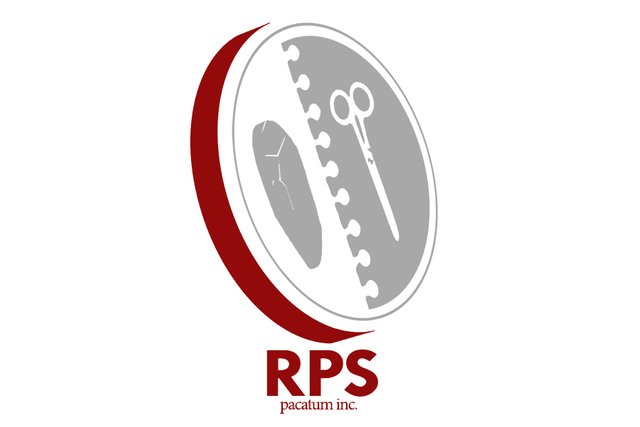
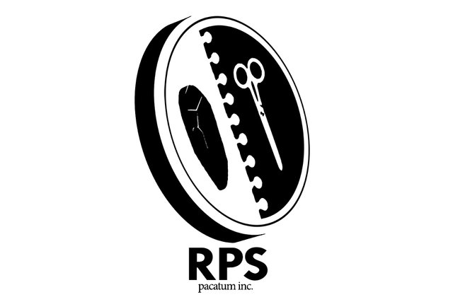
Rock Paper Scissors logo contest entry #005

Good evening, Steemians! I just finished my fifth and final entry to the #RPS-logo contest for @peerplays and Pacatum Inc. When I first read about this contest courtesy of @timcliff, I told myself I would do five, completely different logos. As someone that did graphic design and logo creation for 10 years, I knew that was a big undertaking. I'm happy to say I reached that commitment and each logo entry has been entirely it's own. This last design [...as is usually the case for first and last designs] is my favorite.
I've done dozens of designs for MMA and professional wrestling apparel companies, which pride themselves on noise and dozens of design assets. It's a niché. Surprisingly easy to design for considering there's SO much to work with. Corporate and company branding gets harder and harder the less you have to work with. Rock Paper Scissors involves three separate elements, the understood meaning of the game, and I was seriously perplexed on how to make that "simple".

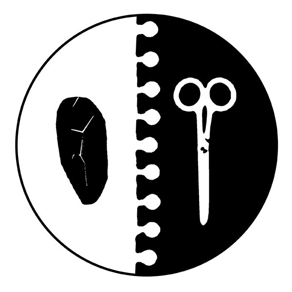
I landed on this design and it's my favorite of the five because it's simple, relevant and effective. The original design was a front facing circle. The ripped memo paper separated the other two design and brand elements [...rock, and scissors]. The contrast makes it easy to see, but it did look flat when I stood back. Not necessarily bad, but it was hard to get excited about.

I messed around and created a drop shadow that could be representative of a coin or "token". That brought the design to life but also, subtly suggested a blockchain, coin or token aspect, which I think fits in perfectly with @peerplays. There could be a lot of color variation with this logo, but even as a black and white image, I think it looks sharp.
Thanks for hosting the contest @peerplays and Pacatum Inc. This was a great exercise for me creativity and I loved coming back to the design medium.
I post daily. For more design, photography, illustration and stories behind the work, follow me @kommienezuspadt!
Great works, I wish you success
The logo for paper and scissors is OK but I think you can improve the rock a little bit to make it more recognizable. At first I didn't thought of it as a rock. I though it's some kind of seed or something :)