Neon Alley - Digital Illustration

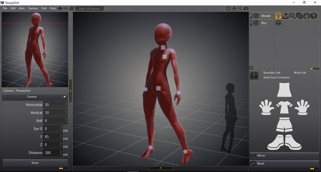
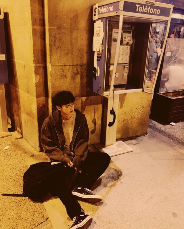
I used as a reference a photo for the background, for the pose, since it was quite complicated to use a program called DesignDoll that allows you to create 3D poses and thus be able to see them from any angle, since I have the free version I could not save the pose that I created but here is a screenshot of how the program is:


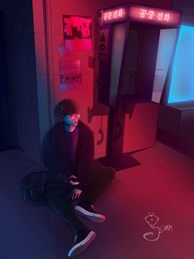
I made the line art directly photoshop and added other elements to the background to make it a little more interesting, some posters and papers stuck to the wall, with respect to the character I drew a backpack that looks more clearly than in the reference photo and completed the shoes
The most tedious part of doing was the public telephone because it has many details to draw, especially the keys. In the reference photo, the sign above is written in Spanish, but for my drawing I put it in Korean because I think it looks better since the idea was to paint it later with neon light, and the kanjis look very good in neon.

For color, I compiled many photos of cities with neon light to better understand how it works, the color palette in this case is composed mainly of magenta, violet and blue.
To paint I used the gradient tool on the walls, mixing the variations of the tones mentioned above, on the bright parts, like the window or the phone sign, I used the outer glowing layer effect and then retouched it creating a new layer on the lighting mode and with a basic brush with hardness 0 add lighter colors so that the external brightness will be flushed with the fill color
To paint the boy, I used a basic photoshop brush on the face with hardness or mixing the magenta and blue tones and, for the rest of the body, I used the brush with a 100% hardness.
To add color highlights on the body, I used the same brush I used to draw the lineart and then on the top layer in the rinsing mode, add brushstrokes in magenta and blue on the clothing to create the illusion of a gradient illuminating.
and to finish, I lowered the opacity of the layer where the lineart is so that it integrates better with the colors and, at the top, add more brightness with a layer in clear mode.

I hope you like it <3
Thanks for the support! <3
Follow me on my blog @genyway
https://www.instagram.com/geny_art/
I love the colors you chose for this job @genyway, great illustration. 🤗
[nTopaz Curator]
This comment from the curator is for information and encouragement. The upvotes from nTopaz and rankings are based on the popularity of your art work when posted to the nTopaz platform.thank you :3
You're welcome <3 <3 <3
Wow amazing artwork @genyway It looks really much more beautiful than the photo.
[nTopaz Curator]
The comments from curators are for information and encouragement. The upvotes from nTopaz and rankings are based on the popularity of your art work when posted to the nTopaz platform. Join nTopaz Discord Channelthank you very much <3
Awesome artwork and presentation @genyway:) The magenta and blue tones is a favourite combination
of mine and the cute little details like the korean lettering really made it a masterpiece! I love it:)
[nTopaz Curator]
The comments from curators are for information and encouragement. The upvotes from nTopaz and rankings are based on the popularity of your art work when posted to the nTopaz platform. Join nTopaz Discord ChannelI'm glad you like it c:
Nice work!
thank you <3
Great job @genyway it's so cinematic and I love the soft blur to the background forcing the eye to the figure. Well done and enjoying it thanks to @ntopaz post featuring you.
thank you very much, I'm glad you like the details