Twitter renews its design based on user feedback
Twitter renews its design, which makes the site and apps of the service lighter, faster and user-friendly.
Twitter reports that it does the innovations based on user feedback. The updates will be posted on Twitter, Twitter for Android and iOS, Tweetdeck and Twitter Lite.
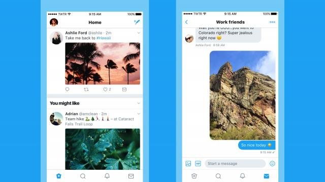
The reaction symbol changes from an arrow to a talk cloud. According to Twitter, new users thought when viewing the arrow was intended to remove the tweet or return to a previous page.
On Android and iOS, users immediately see comments, retweets and likes appear below their message. Cups from different sections such as the Home page and 'while away' are now printed in bold for more clarity. Profile photos can now be displayed around.
Also, there are fewer buttons in the bottom of the screen, with now only home feed buttons, search / discover, notifications, and private messages. Also buttons are unlabeled, and the settings menu is simplified. In addition, the symbols for reaction, retweet and similar are slightly lighter.
Twitter rolls the innovations from Thursday afternoon. Based on user feedback, more updates will be made in the coming period.