[DIPLOMA TIPS] The Practitioner's Comprehensive Guide to Technical Analysis
What is technical analysis?
Technical analysis is the study of financial market action. The technician looks at price changes that occur on a day-to-day or week-to-week basis or over any other constant time period displayed in graphic form, called charts. Hence the name chart analysis.
A chartist analyzes price charts only, while the technical analyst studies technical indicators derived from price changes in addition to the price charts.
Technical analysts examine the price action of the financial markets instead of the fundamental fac-tors that (seem to) effect market prices. Technicians believe that even if all relevant information of a particular market or stock was available, you still could not predict a precise market "response" to that information. There are so many factors interacting at any one time that it is easy for important ones to be ignored in favor of those that are considered as the "flavor of the day."
The technical analyst believes that all the relevant market information is reflected (or discounted) in the price with the exception of shocking news such as natural distasters or acts of God. These fac-tors, however, are discounted very quickly.
Watching financial markets, it becomes obvious that there are trends, momentum and patterns that repeat over time, not exactly the same way but similar. Charts are self-similar as they show the same fractal structure (a fractal is a tiny pattern; self-similar means the overall pattern is made up of smaller versions of the same pattern) whether in stocks, commodities, currencies, bonds. A chart is a mirror of the mood of the crowd and not of the fundamental factors. Thus, technical analysis is the analysis of human mass psychology. Therefore, it is also called behavioral finance.
Technical analysis pre-empts fundamental data
Fundamentalists believe there is a cause and effect between fundamental factors and price changes. This means, if the fundamental news is positive the price should rise, and if the news is negative the price should fall. However, long-term analyses of price changes in financial markets around the world show that such a correlation is present only in the short-term horizon and only to a limited extent. It is non-existent on a medium- and long-term basis.
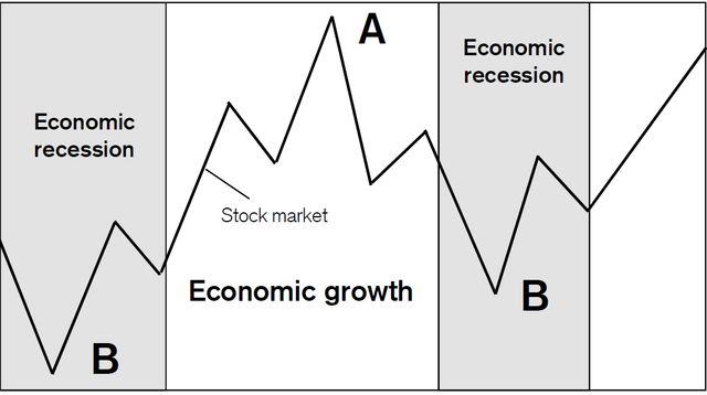
In fact, the contrary is true. The stock market itself is the best predictor of the future fundamental trend. Most often, prices start rising in a new bull trend while the economy is still in recession (position B on chart shown above), i.e. while there is no cause for such an uptrend. Vice versa, prices start falling in a new bear trend while the economy is still growing (position A), and not providing fundamen-tal reasons to sell. There is a time-lag of several months by which the fundamental trend follows the stock market trend. Moreover, this is not only true for the stock market and the economy, but also for the price trends of individual equities and company earnings. Stock prices peak ahead of peak earn-ings while bottoming ahead of peak losses.
The purpose of technical analysis is to identify trend changes that precede the fundamental trend and do not (yet) make sense if compared to the concurrent fundamental trend.
Mood governs ratio
Know yourself and knowledge of the stock market will soon follow. Ego and emotions determine far more of investors´ stock market decisions than most would be willing to admit.
For years, we have dealt with professional money managers and committees and found they were as much subject to crowd following and other irrational emotional mistakes as any novice investor. They were, for the most part, better informed, but facts alone are not enough to make profitable deci-sions. The human element, which en-compasses a range of emotions from fear to greed, plays a much bigger rolein the decision-making process thanmost investors realize.In a practical sense, most investors actexactly opposite to the rational wisdom of buying low and selling high based on very predictable emotional responses to rising or falling prices.
Falling prices that at first appear to be bargains generate fear of loss at much lower prices when opportunities are the greatest. Rising prices that at first appear to be good opportunities to sell ultimately lead to greed-induced buying at much higher levels. Reason is replaced by emotion and rationalization with such cyclical regularity, that those who recognize the symptoms and the trend changes on the charts can profit very well from this knowledge. Investors who manage to act opposite to the mood of the crowd and against their own emotions are best positioned to earn money in the financial markets. Financial risk and emotional risk correlate inversely. The main purpose of technical analysis is to help investors identify turning points which they cannot see because of individual and group psychological factors.
Bar charts
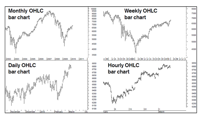
Four bar charts of the Swiss Market Index are shown above. They are the most widely used chart types.
The bar charts are: High-low charts or High-low-close charts or Open-high-low-close charts One single bar shows the high and the low of the respective trading period. A vertical bar is used to connect the high and the low. Horizontal lines are used to show the opening price (left) of that spe-cific trading period and the closing price (right) at the end of the period. For example, on the monthly chart, a bar indicates the high and the low at which the SMI traded during that single month.
Line charts
Sometimes we use line charts, especially for Elliott wave analysis. A line chart is the simplest of all methods. It is constructed by joining together the closing price of each period, for example daily closings for the daily line chart, weekly closings for the weekly chart or monthly closings for the monthy line chart.
Trendlines
Resistance levels can either be drawn by horizontal lines (as discussed on the previous page) or can be uptrending or downtrending lines.
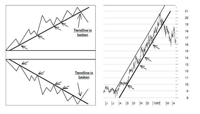
The trendline is nothing more than a straight line drawn between at least three points. In an upmove the low points are connected to form an uptrend line. For a downtrend the peaks are connected. The important point is that it should not be drawn over the price action. Trendlines must encorporate all of the price data, i.e. connect the highs in a downtrend and the lows in an uptrend.
The trendline becomes more important and gains credibility as the number of price extremes that can be connected by a single line increases. The validity and viability of a line that connects only two price extremes (for example the starting point and one price low) is questionable.
The trend is broken when the price falls below the uptrend line or rises above the downtrend line. Some analysts use a 2-day rule, meaning that the trend is only seen as broken if the price closes above/below the trendline for at least two days. Others use a 1% stop (could be higher depending on market volatility), meaning the trend is only seen as broken if the price closes over 1% above/below the trendline.
The chart above shows Intel´s rise from July 1996 to March 1997. Based on the uptrend line, inves-tors would have held onto the position from around 38/40 until 66 or even 74/76. Most often inves-tors take profits much too early. Stay with a trend until it breaks, avoiding the urge to sell too soon because the profit could be higher than you originally thought.
Investment horizons
The charts on the previous pages show that investors require perspective. It is imperative to differen-tiate between a short-term, a medium-term and a long-term trend. If somebody tells you to buy the US dollar because it is likely to rise, make sure you understand whether the dollar is expected to rise over a few days or a few months and if you should buy the dollar with the intention to hold it for several days, several weeks or several months.
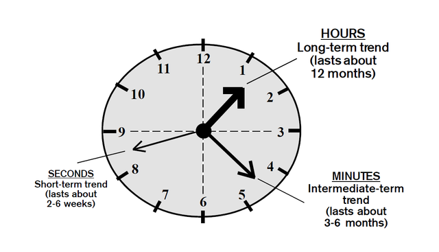
For a technician on the trading floor, the long-term horizon is entirely different from that of an institu-tional investor. For a trader, long-term can mean several days, while for the investor, it can mean 12 to 18 months. We can compare the charts and indicators to a clock (shown above). Short-term trends (the seconds) are best analyzed on daily bar charts. Medium-term trends (the minutes) are best seen on weekly bar charts and long-term trends (the hours) are best seen on monthly bar charts. Some investors only want to know the hour, some want to know the seconds and some want to know the exact time.
The best investment results are achieved when all three trends on the daily, weekly and monthly charts point in the same direction.
Momentum
In physics, momentum is measured by the rate of increase and decrease in the speed of an object. In financial markets it is measured by the speed of the price trend, i.e. whether a trend is accelerating or decelerating, rather than the actual price level itself. While moving averages are lagging indicators, giving signals after the price trend has already turned, momentum indicators lead the price trend. They give signals before the price trend turns. But once momentum provides a signal it has to be confirmed by a moving average crossover.
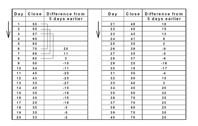
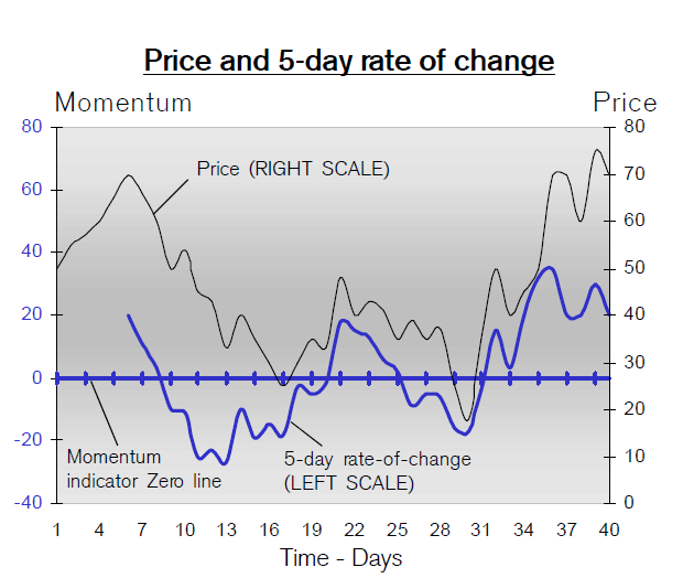
Instead of calculating the moving average of the sum of 5 days, here we calculate the difference over a constant 5-day period for a 5-day rate of change. This is shown on the chart above together with the zero line. If today´s price is higher than five days ago, the indicator is positive, i.e. above the zero line. If the price continues to rise compared to five days earlier, the indicator rises. If the price today is lower than five days ago the indicator is negative, i.e. below the zero line.
The rate of change oscillator is rather volatile. Therefore, we have smoothed it out (see blue line) so that it provides easy-to-read directional change signals as explained on the next page. The moving aver-ages are always displayed on the same chart and with the same scale as the price from which they are calculated. The momentum indicators are calculated using the price difference rather than adding the prices (as with the moving averages). This is why the momentum indicators are displayed with a different scale than the price scale. On the chart above, it is shown by the scale to the left.
Thanks for reading guys!!!

Fantastic, exactly she stuff we need on steemit.
thanks very much for commenting @knircky