Fictional Brief (from briefbox.me)
An underground music shop in Detroit, Michigan, called 'Reverb' have been working with various different designers over the past few years on a selection of printed marketing materials. They have previously used a variety of designers as they enjoy seeing how different people approach design briefs. However, this year they are hoping to work with one designer on all of their artwork, as they've realised the importance of having a unified, clear and memorable brand.
To start with, they are looking for an awesome A3 poster to put around the city that will highlight their new range of speakers, vinyl and other electronic music equipment. They want the poster to feature custom lettering and illustrations throughout and do not want to use cliched images involving reggae and graffiti. For this poster, they require something that is more creatively focused on basslines and electronic music as a whole. They are excited to see how a designer can use this theme as a direction for their artwork and are open to possible outcomes and visual representations of this.
With basslines on your mind, try to work out a creative way to portray the effects a bassline can have on your mind and body. Perhaps you want to focus on the social aspect of how bass in music can bring people together whilst dancing or socializing, or perhaps you want to focus more on the way it can help people to zone-out and forget about the worries in their life. Either way, come up with an awesome poster to represent this whilst promoting the music shop at the same time.
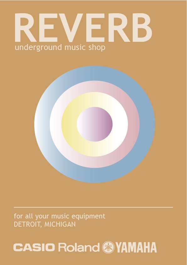
I started off with this design. The circles in the middle represent a speaker and I think that the typography was a good choice. But I thought the colours didn’t work very well and I wasn’t feeling the vibe of an underground music shop!
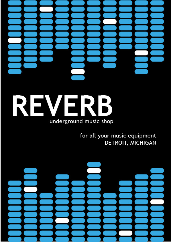
I moved on to another idea. I decided to use brighter colours this time and modernise it slightly. I used the same typography, I think it works better with the black background. The blue and white squares represent a music equaliser. This is a better style for the company I’m designing for, but it looks a little busy and there's so much going on on one page.
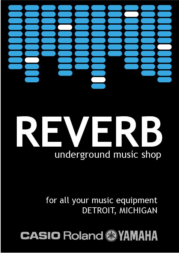
I stripped it down and only used the equaliser boxes at the top and enlarged the text. I think the negative space gives it better clarity and has a better impact. Less is always more!


Third one's def the best!
Thanks 😊
Your post received an upvote by the @illuminati-Inc music curation team and its partner @curie.
You may consider voting for the Curie witness; all witness payouts are used to fund Curie operations including but not limited to more than 10 curation teams (vote here).
Thank you!