5 Stories Behind Rock Band Logos
1. Nirvana
![]()
The Nirvana smiley is easily one of the most recognizable and iconic rock logos ever. The logo was drawn by Kurt Cobain in 1991, and it first appeared on a flyer for the release party of their second album Nevermind also in 1991. It was inspired by a logo of a strip club in Seattle called The Lusty Lady which was a dazed-looking smiley face with a phrase next to it that said “Have an erotic day!”.
2. The Rolling Stones
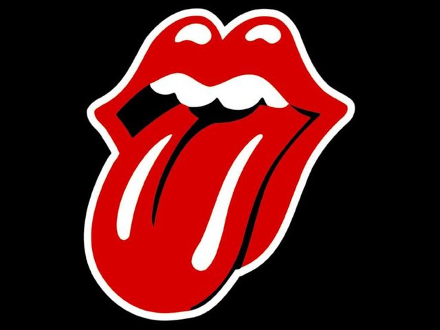
A lot of people think that the logo of the legendary English rock band The Rolling Stones was designed by Andy Warhol, but was actually created by an English artist John Pasche. A lot of people also thought that the logo was a representation of Mick Jagger’s mouth, which was incorrect. It was in fact inspired by the Hindu goddess Kali, who is usually depicted with her tongue sticking out of her mouth.
3. Queen
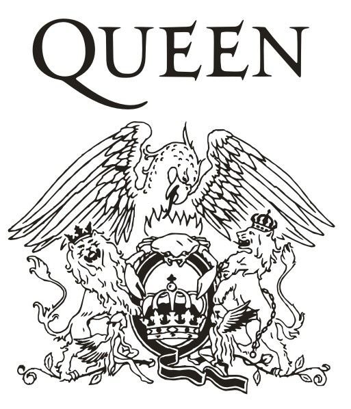
The Queen’s logo was designed before the release of their debut album by Freddie Mercury himself. It depicts the zodiac sign of each of the members of the band. The two lions ( John Deacon and Roger Taylor are Leos) stand to the right and left of the massive Q in the middle of the logo. On top of the Q sits a crab (Cancer) which represents the guitarist Brian May. Below the two lions are two fairies on each side of the Q that represent Mercury himself (Virgo). And lastly, the giant Phoenix on the top was drawn by Freddie for no specific reason, other than it looked cool.
4. Red Hot Chili Peppers
![]()
Some logos don’t have any meaning to them at all. For example the logo of the rock band Red Hot Chili Peppers. According to the autobiography of Anthony Kiedis, he was asked by the record label executive to design a logo for the band. Kiedis drew the very first thing that came to his mind. The logo has no meaning behind it at all.
5. Led Zeppelin
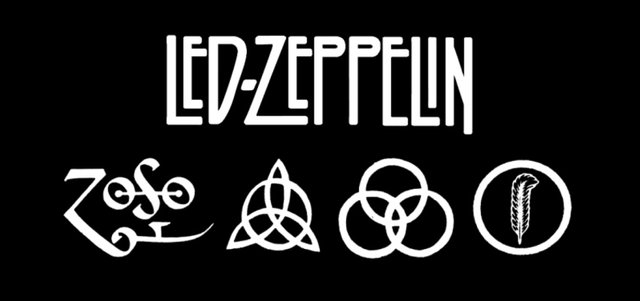
Lastly we have the iconic logo of the rock band Led Zeppelin. The four symbols represent each member of the band:
- Drummer John Bonham’s symbol is three interlocking circles, which represent the child, the mother and the father. The symbol was found in Rudolf Koch’s Book of Signs.
- Singer Robert Plant’s symbol (which he designed himself), is a feather inside a circle. The feather is an emblem of a lyricist (or writer) and is based on the lost civilizations of Mu.
- Bassist John Paul Jones’ symbol was chosen from the same book as John Bonham’s symbol. It depicts a circle intersecting 3 vesica pisces. It symbolizes a person who has both confidence and competence.
- Guitarist Jimmy Page designed his own symbol, which is often referred to as “ZoSo”. Although he never publicly explained what is the true meaning behind the symbol, it was discovered that it dates back to the year 1557 and it represents Saturn.
Hey, cool post, I had never thought about the there being any meaning behind these!!
That is why I made this article! Thanks for reading :D
I guess my favorite logo is the Queen. It's powerfull, have everything to do with their music!!!
And yours?
It would have to be The Rolling Stones logo. Thanks for stopping by!