Let’s Analyze the New Justice League Poster
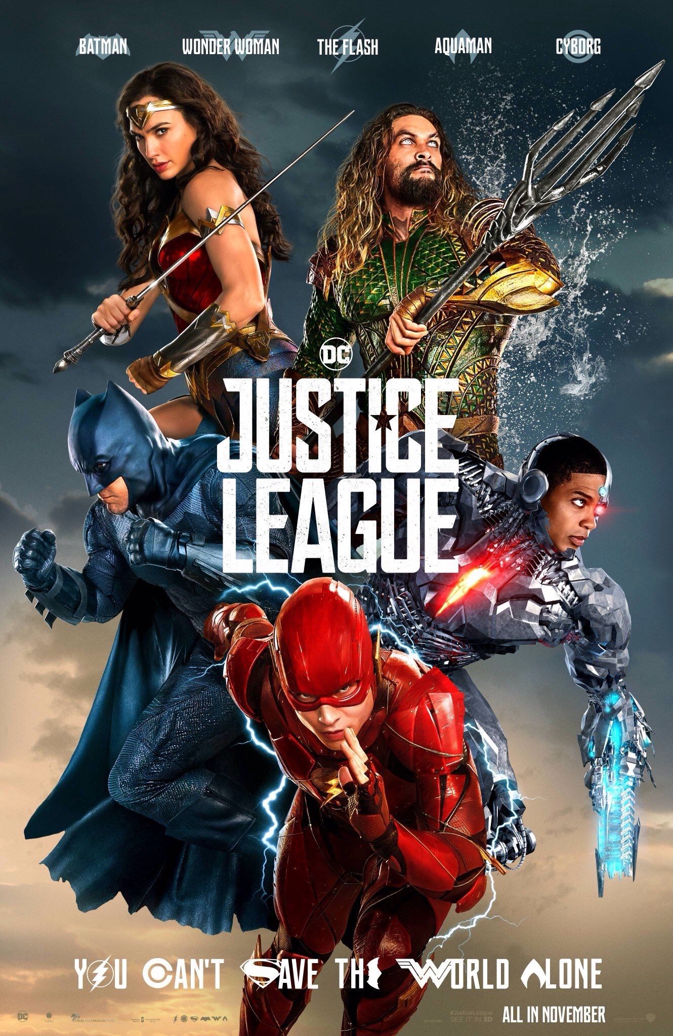
The previous Justice League poster was clearly inspired by Alex Ross art and was meant to please hard core DC fans. This poster is just fun! There is no other way to describe it. Still, unlike some claims I’ve seen going around, this poster is still very much for DC fans. So much so, that it doesn’t even bother to state the name of the actors – it simply gives you the name of the characters.
According to the positioning of characters in the poster, everyone’s favorite characters in this movie are Wonder Woman, Aquaman and the Flash. Poor Batman has been pushed aside. Technically, the name of the character written in the middle is the most famous one or popular, but to me Wonder Woman pop-ups the most. Her character is the only that makes clear eye contact with the viewer. The success of her solo movie is shown all over the Justice League marketing campaign. She moved from the sides of posters, to their center.
I do think that the tone of this poster is misleading. We’ve seen the trailers, they are dark and gritty – this poster is not. New viewer might be in for unpleasant surprise.
What do you think?
Please follow me and upvote my posts to help yourself stay up to date with everything that is nerdy and awesome.
Resteems will also be most appreciated.
See you in my next post.
I think they could have made a much better poster.
The background has nothing of visual appeal and the characters unfortunately either.
To me it seems like 3 (WW, Aquaman and the Flash) are in action and that's visually appealing enough. But it may be aimed at a younger audience.