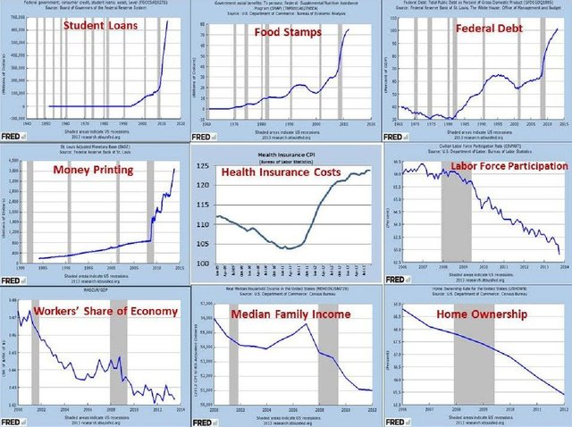
FED Data
Gathering some data to try and predict the long term direction of the economy.
A picture is worth a 1000 words. Facts, not fiction.
These graphs are directly from the Federal Reserve web site.
If you vote, these graphs take out all of the noise, campaign Ad's, rhetoric and lies.
You won't see this information in the media.
Thank you for sharing.
You have a new follower
Andrew, Thank you for following me.
You are welcome!
upvoted and followed ,You may find some of my work interesting @me-tarzan
me-tarzan Thank you for following me.
Good. In fact very good graphic demonstration of what really is going on. Long term direction of the economy - collapse.
I believe this all points to too much government.
These graphs show a steady decline yet from what I can tell, within the next 5 years self driving vehicles and automated fast food will cause a true spiral. Not yet depicted in these graphs. :(
thecastle, I don't believe we have 1 year left, let alone 5 years. Soon we, the USA, will be like Venezuela is now.