5 Tips for Creating a Minimalist UI Design for Your Mobile App

There was a time when integrating an array of colors and elements to a mobile app was a huge trend. Gone are those days and now users’ behavior and choices have changed considerably. They prefer features that save them time and effort. In other words, they want minimal designs that allow them to connect with limited things on an app’s interface.
Minimalist UI design offers a wide range of benefits so it’s no surprise that it’s all the rage these days. It delivers a clear message since there are only a handful of elements added to the screen. Navigation process is improved and loading time is reduced because unnecessary components are eliminated. A minimalist app design also helps brands boost their app stickiness. Users can stick to the interface longer without a decline in interest and engagement.
Having enumerated the major benefits, it’s worth keeping UI design simple yet appealing. Note that the UI plays a crucial role in enhancing user experience. It must have all the essential elements that allow users to interact seamlessly with your app. It is therefore imperative for mobile app designers to incorporate minimal designs that are also fully functional. If your app has lots of confusing elements, it can ruin user experience and lead to app abandonment.
In this article, we’ll discuss 5 tips for creating a minimalist UI design for your mobile app.
Include White Space
White space is also known as negative space since it does not have any color yet. It is the space located between text lines that gives a clutterless impression to the mobile app interface. This entices users to interact with the page. The blank space is important for adding structure, developing contrast, and focusing on the different design elements.
It plays a major role in creating room for elements to balance and breathe. It’s also one of the most effective ways to add elegance and highlight the core elements of your mobile app.
The white space is therefore a crucial component from a designer's perspective and it is considered as the backbone of minimalist app design. When used wisely, white space offers a number of benefits, but this is only possible when you focus on the following:
• Content to be positioned on the left side
• Focus on the hierarchy of elements
• Make interactions simple without scarifying important information
• Variations in white space must be maintained for various resolutions
Designers can utilise as much white space as they want, it all depends on their expertise and how they’ll use it to make the design more aesthetically appealing.

Use the Blur Effect
The blur effect is a logical answer for a minimalist mobile app design, allowing a certain measure of play with the layers and hierarchy of the app interface. Blur makes it easier to create layers of data in the UI. It also offers designers an opportunity to explore various overlay solutions, menu, and the mobile's flow.
Some notable benefits of using the blur effect include the following:
• It provides a clear understanding of your app's user flow
• As the name suggests, it blurs out the unnecessary elements so users can focus on important information
• It allows users to concentrate on the object that is in focus and disregard objects that are unclear
• It improves text readability. In most cases, the content background affects readability of text. You can use blur effects to add contrast between text and the background. This is a great technique to make overlaid content more readable.
Discard Redundant Elements
Before adding more details to your mobile app design, pause and figure out if such details are important for your target users. If not, it’s advisable to get rid of them. Bear in mind that integrating too many features will make your mobile app confusing and difficult to navigate. This is called feature overload or feature bloat, which can lead to users abandoning your app. When you have fewer design elements, the users can focus on the ones that are most relevant to them.
One of the best practices for minimalist UI design is to make sure that no unnecessary element is added to the screen. This means introducing elements to a screen that serves a purpose there. But how can you determine which elements to keep and which one to remove?
Here are a couple of tips…
• Refrain from adding images unless they help in making your message clear to users
• Use simple and limited words in order to effectively communicate to your audience
• Don’t oversimplify design elements
The last one may sound contradictory but in general, simplicity leads to minimalism. Note that an oversimplified UI can be boring and can make it tough for users to understand the purpose of your app. It can also disrupt the navigation flow, which can lead to lower engagement and retention rate.
The bottom line here is to strike a delicate balance between simplicity and minimalism while designing your mobile application.
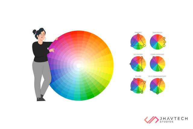
Use Fewer Colors
Using too many colors tends to leave a negative impact on users since it reduces the sophistication of your app and most users are repelled by it. The best way to limit the number is to use different shades of the same color. This will help you add elegance to your design and entice users to engage with your mobile app. For a minimalist UI design, you can choose from one of the following:
Analogous color scheme
Technically speaking, analogous colors are three colors that are next to each other on the color wheel. They consist of a dominant color (a primary or secondary color), a supporting color (usually a secondary or tertiary color), and a third color that is either a mix of the first two, or an accent color that stands out. These colors work well with each other to convey a serene and comfortable design that’s pleasing to the eyes.
Monochromatic color scheme
Monochromatic color pertains to a color scheme that is composed of variations of a single color. This means monochromatic color schemes are obtained from a single base hue and then extended using its tints, tones, and shades. This will help you change a color’s brightness, contrast and saturation to create a variety of color pallets.
Use Single but Expressive Typeface
Using multiple typefaces is actually doing injustice to your mobile app. This mistake can ruin your app, so you must be aware of the difference among the various typefaces and when/where to use them. Remember that the type of font that you are supposed to use depends on the kind of content and the experience that you want to impart to your users.
In most instances, combining more than one font makes an app look sloppy. To avoid this, test different types of fonts and different font sizes. You can also try tweaking the font length, style, spacing, and weight until you find the best typeface for your app.
Final Thoughts
Minimalist UI design has been a popular approach for a few years now and it’s likely to be one the major UI/UX trends too. So, it is advisable for everyone who wishes to get their app designed to focus on this concept and boost the chances of success. Whether it is clear visuals or the user flow, minimalist mobile app design helps in creating a seamless interaction. You must consider it with the aim of improving user experience.
If you open your favorite mobile apps now, you won’t be surprised to find minimalistic UI design elements everywhere. Use of whitespace, blur effect, fewer colors and elegant typography are some approaches that can help you design an app that will not easily go out of trend.
Want to create an accessible and easily navigable mobile app with minimalist UI design? We are always happy to help.