Microsoft Excel's AI tool for data visualization
A nicely featured AI-powered visualization tool called Excel Ideas can help extract the essential information from a spreadsheet and shift it to an excellent visualization to give its user better decision makings in its field of knowledge. The only downside is that there's currently a limited range of cells you can involve into data analysis and some data filtering and formatting may be required.
Excel offers many ways to visualize your data with charts, conditional formatting, sparklines, PivotCharts etc. Unfortunately, some of these features might be overwhelming at first and it can take time to find the right visualization to show your data trends, outliers or other valuable insights from your dataset.
That is where Excel Ideas comes into the turn by making the visualization and charts for you and presenting trends and outliers in your dataset.
The new Excel Ideas button is available for users of Office 365 subscription version of Excel.
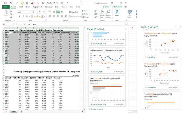
Theoretically, you only have to choose one or more cells and then click the Ideas button located on the home page tab of the ribbon. On the right side of the window, you will notice a task pane with all the recommended charts for trends, outliers, correlations, and even PivotCharts. All the formatting is done for you and the axes, labels, titles all filled in automatically.
These are some of the fundamental features of Power BI, it uses the same AI, but because your Excel spreadsheet presumably doesn't have an established complex dataset, which most Power BI data sources do, the results won't be as in depth. However, just by understanding which pieces of data don't fit with the rest can help you to quickly recognize anything unusually good or bad in the dataset. This is especially useful in situations when you adopt a dataset from someone else.
Practically, getting Office Ideas to be valuable needs a bit of preparation. What you get out of the chart highlights are going to be as good as the dataset you start with, therefore, its worth the time investment to prepare your data before any further analysis. These are my top 10 tips for preparing your data for Excel Ideas:
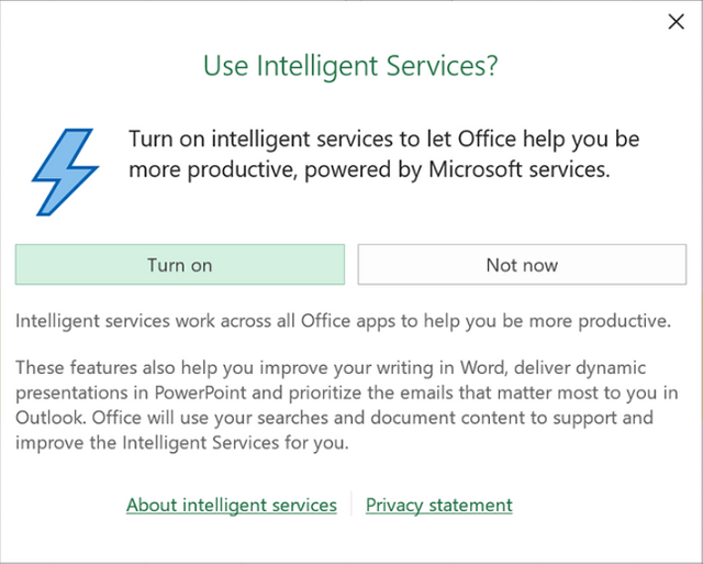
Before you can use any recent AI-powered Office tool such as Excel Ideas, Word Editor or Outlook Focused Inbox, you will have to turn Intelligent Services on even if you have been previously using some versions of the service because it uses the content in your file to make suggestions.
You will see a popup when you choose Ideas from the Ribbon, or you can choose File / Options and tick 'Enable services' under Office intelligent services.

For the second step, you need to format the data as a table with a single header row at the top using the terms you would like to see on the charts.
The way you can do this is by selecting the complete data after where you can press Ctrl+T key on the keyboard or select a Table Style from the Format as Table dropdown in the ribbon.If the table doesn't include all the rows/columns you want to include, pressing the Resize Table on the ribbon's Design tab can help by either typing in the furthest row and column letter and number, or drag with the mouse to make a new selection before clicking OK.
If there isn't already a specified row for headers with unique category names on them, type them into the top of each column. Follow some simple tips in order to do this step correctly: don't reuse existing header names, don't leave blank cells for header names and use a single header for each column, don't include merged cells, double rows or double rows of the header.
It would be a good idea to create a separate worksheet to insert a copy of the source data in case you need to format it to a fancier report.
In some case, it's good to take advantage of Alignment tabs to set Horizontal to Center Across Selections.
For this, you need to right-click a cell and choose Format Cells after where you can choose the Alignment tab and set the selection.If you would like to include data categories/columns from different tables, you would need to merge them together to form a more complex and valuable dataset.
Basically, the more categories you have in the table, the more ways Excel can classify data and look for patterns. If your dataset has a somewhat flat structure, add a few extra columns that you can use for analysis.
There are many techniques you can use to approach this step, my favorites are:
A) making the main table using Vlookup AND/OR Index&Match function in which case you pull values from multiple tables into the main table which we can be further analyzed.
B) The more advanced way to merge multiple tables into one unique is by using Power Query (Get & Transform tool) from Data tab / Get Data / Combine Queries / Merge or Append.

Make sure the Excel file is saved as an XLSX format or XLSM if it contains macros. Ideas won't work on the older file formats, so if you notice that the icon is greyed out on the ribbon, it's possibly due to files format.
A great habit to get used to is that before you begin working on your project, first save it on your PC in the right format and use the shortcut Ctrl+S to save your work at any time during your work.Need to make sure your dataset is below 16MB which is normally around 250.000 Excel cells. This is a current limitation of Excel Ideas. In some cases, you can filter out some data and keep only the most valuable.
For example, if your dataset is arranged by date, keep the most recent dates only, make a copy of the data and run Excel Ideas over it.The cells in each category/column should be properly formatted to describe the value of the cell, this way Excel Ideas can do a better job at analysis.
If for example, you have cells with text formatted as dates or dates formatted as text, Excel ideas won't know they are dates.
Things to keep in mind when working with Excel Ideas
- Ideas can only discover a handful of distinct classes of insights. Trends such as increases, decrease or repeating patterns in the data and suggesting useful groupings for organizing our data.
- Depending on our data structure, we might get multiple results for the same insights.
- Usually, there's always more ideas that fit on the screen and the more useful are usually hidden, so it's worth going through the list and see them all.
- The ideas panel is not dynamic. If you edit your data OR select a different table to get insights on, you have to click the Ideas button to make new suggestions. That makes you leave the charts in the task panel while you look through underlying patterns that might explain what you are viewing.
Creating Pivot Tables from Ideas
Having Excel automatically creating PivotCharts from the suggestions is a big time saver.
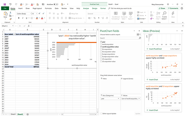
Click the insert button on suggestions to put Pivot Chart on the spreadsheet so you can further analyze your data in more detail.

This creates a new spreadsheet tab showing the filtered data on the PivotChart Fields task pane so you can experiment with the fields and reveal new insights from your data.
Regular Chart in comparison to Pivot Charts doesn't use any color themes that apply to your spreadsheet instead they use the fairly accessible but simple palette that clearly highlights the single significant value. On the other hand, PivotTables do pick up your theme settings. Additionally, the chart titles are clear and descriptive and the chart follows a great data visualization method like for example showing data labels horizontally so they are simple to read or sort bars in descending order so you can see the full pattern even when you can't spot the specific value you are looking for.
Conclusion
Excel Ideas is considerably more helpful than the Recommended Charts tooltip because it saves us tremendous time and being more productive. Instead of charting all the data in our table, Ideas picks out the data for us and tells an interesting story out of it.
It's really powerful in combination with pivot charts, unlocking a new and powerful way of using them. Recommended Charts can only make blank Pivot Charts, leaving you to do all the work of putting the right data categories in the right place.
Even with its downfalls, such as the limitation of the number of insights currently available and the formatting you might have to make for your data to fit for Excel Ideas, it's still a great way of quickly get important information out of your dataset. It also serves as an introduction function to some of the more powerful and advanced features in Excel. I encourage you to try the feature out since there is no better way of learning how tools operate than by seeing them used in action.

@exgap purchased a 5.90% vote from @promobot on this post.
*If you disagree with the reward or content of this post you can purchase a reversal of this vote by using our curation interface http://promovotes.com