Would be nicer if the words "memechallenge" and " By@fibra59 " had a bit more clarity. Right now it's a bit difficult to read these words at first glance. Otherwise it looks pretty great!!
Would be nicer if the words "memechallenge" and " By@fibra59 " had a bit more clarity. Right now it's a bit difficult to read these words at first glance. Otherwise it looks pretty great!!
Thank you for your remark i will make few other versions with different font and colors :)
Good point!
I update it :)
Better visibility!! But is it possible the increase the visibility but keeping the color combination as the oroginal one you posted? Sorry i don't know much about photoshop. But the original blue color was a dynamite!!! Just the clarity was a bit of an issue!!
What about this one ?
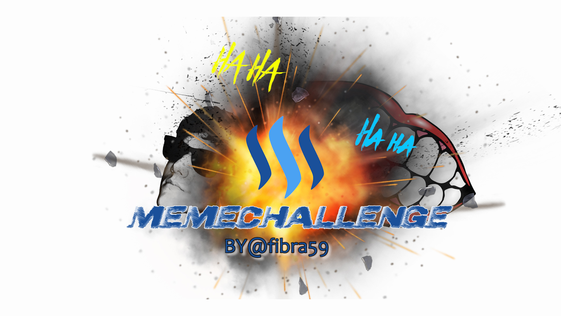
Daaaaaaamn you NAILED it!!! Absolutely Nailed it!!!
with your help :)
Haha you did all the hard work mate!!! I just spoke out (or wrote down) my thoughts!!