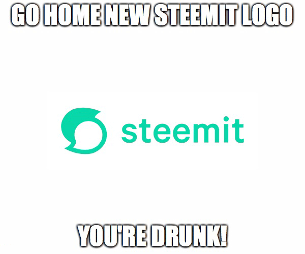
Go Home New Steemit Logo!
So I woke up today to the new "fresh" look of Steemit and quite frankly I'm kinda disappointed. I'm sure I'm not the only one on this. Making a good design is no easy task, for sure. Many elements need to work together to achieve a good result. A combination of shapes and colors makes up a good design. Failure to do so will just ruin the desired effect. The design has to look good on multiple formats and sizes, it has to be unique and easy to spot. To me, the new logo resembles a logo of an unpopular messaging app, and I have no idea why they used the greenish color that just pokes you in the eyes. I'm sure the developers had the best intention when implementing the new design, but maybe first they should have asked us before ditching the old logo, that actually looked good on a shirt, a billboard or somewhere else than the top left corner of the landing page.

I'm curious to hear what is your opinion about the new design, do you like it?

Yeah I wrote about this, this morning too. Change should be done gradually and with notice, especially when people are so invested in it.
In my opinion the logo is all wrong... it has no correlation to (STEEM) and therefore Steemit. The brand has lost it's hard marketing focus as have many people that invested and vested in it.
Odd, very odd.
I will check your post. I just think it's a strange move, not that it's the first time.The guys at Steemit are full of surprises, often times not really good ones.
This new rebranding, in my eyes, looks like a desperate attempt to distract users from the real problems the platform has, like draining the rewards pool, and the fight against abuse. Making the site look "fresh" does not solve that.
unpopular messaging app - that's exactly what I have been saying. It looks just like some chatty app.
And it was so good... simple, light and in dark blue :)
Whether we like it or not, looks matter.
The color reminds me of an old paying social media site (which is dead now)
I remember the time when making similar app theme with this teal color and buttons borders, panels and etc. Guess what this is 3-4 year old design haha
I just hope Steemt will not become the MySpace of the blockchain social media.
My complaining is mostly with the color. That green...
and the shadows - green...
Yes it pokes you in the eyes.
I can complain all day long, it's my specialty!
That teal color kills me ...
What kind of green is that anyway? :)
i guess is used to draw attention haha
Well, they have my attention, now what? :)
Just posted a similar article! I'm with you bro!!!
I think the logo is okay, but the color is what makes it non-steemit related in my head. Guess we have no other choice but to accept it as it is :)
The previous logo was better because it was easy to draw but now its too complicated.
"complicated" is one way of saying it :)
I'm with you to about the design and logo.
The new green reminds me of Upwork's ridiculous redesign, and the ols logo was better, this one really does resemble a chat app :)