MedBlock Logo Contest Entry by @deveerei (wallet: dev-eerei)
The deadline for submitting my logo entry is Sunday, August 13 at 6 pm EST. I submitted mine at past 5pm EST, and I'm just making this post! Had delays because of the requirements set by Ace, but all is good - he suggested I download a free trial of Photoshop and it saved my life. I missed using that wonderful tool. I will really have to have my good old laptop fixed. (Trial expires after 6 days, I'm gonna make the most out of it!)

Preview of Design in a Mobile App
Requirements for the MedBlock logo contest:
Logo Type: Vector based logo, 300 dpi
Theme: A decentralized electronic health record (EHR) system on the blockchain. Or you can also think of illustrating MedBlock as "Medicine on the Blockchain."
Format: .ai or .psd file that must be emailed to [email protected].
Create a new post entitled “MedBlock Logo Contest Entry" and include your logo entry and your BitShares account name.
Use the following tags when creating your post so that I can find your entry: medblock, medblocklogo, art, contest, steemgigs.
Email your logo file(s) to [email protected] and submit your logo entry post BEFORE August 13 at 6:00 pm EST.
MedBlock
A Logo's Journey
Logo Type: Vector based logo, 300 dpi
Theme: A decentralized electronic health record (EHR) system on the blockchain. Or you can also think of illustrating MedBlock as "Medicine on the Blockchain."
Format: .ai or .psd file that must be emailed to [email protected].
Create a new post entitled “MedBlock Logo Contest Entry" and include your logo entry and your BitShares account name.
Use the following tags when creating your post so that I can find your entry: medblock, medblocklogo, art, contest, steemgigs.
Email your logo file(s) to [email protected] and submit your logo entry post BEFORE August 13 at 6:00 pm EST.
A Logo's Journey
This was actually very hard - I've started thinking of how their logo would look like as soon as their project launched - they even haven't announced that there will be a contest for it. I was thinking of a cube - a block. And a cross - for Med'icine. So I started doing things with Photoshop 'the hard way'. I forgot how to use this little baby - I'm not even sure I'm meeting the guidelines set by their team, but I continued anyway. I had fun making this yesterday. Here's how I started working on it:
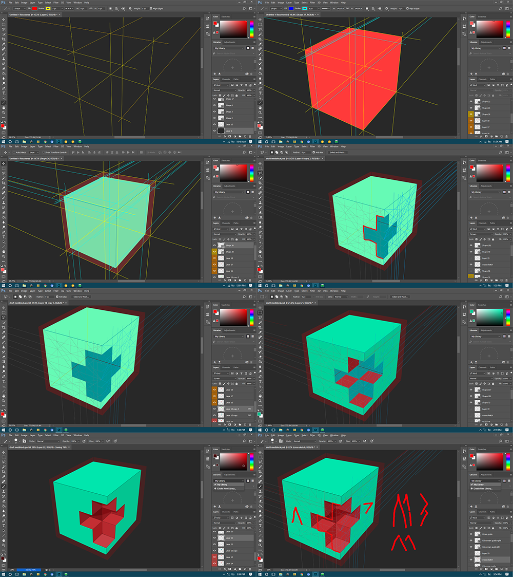
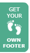
I made the cube! - I don't know how t use 3D in PS, so slash that! I did drafting back in high school and college and so I had to make tons of lines to get things right. This was already the 2nd draft - the first one lacked a few fundamentals so the cube wasn't physically possible to exist cause its perspective was all wrong!
There you have my cube - the base of my logo submission - it's pretty simple - I tried thinking of adding a few more elements to it - but in the end I kept it that way.

I had to make a MedBlock name/typeface from scratch too - just looking for existing and random fonts over the web isn't worth the prize of 900 Beyond Bits. Above is the draft

The M and the B are basically from the same image - altered a bit to make them recognizable.

This became the basis of the typeface of MedBlock's name. I edited the same layer until I completed all the letters in 'MedBlock'

Here's what the final 'MedBlock' name looks like.
As you've seen earlier there was an image that's 3 circles fused - That's the secondary logo for MedBlock - it's the base for the M and the B in it being fused. Which looked like this in the start:

After some alters, I decided to make it more symmetrical like this:

Those are the bases of my logo submission.
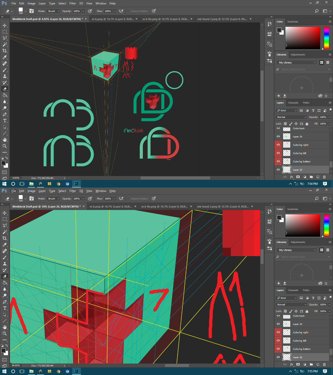
Making the Actual Logo
After getting all the base, namely: The Cube, The Name, The M-B Fusion, I started crafting my final logo.
The base images:


Here's the Variety of Logos I made from them:
They can have a white background, a dark one, and can be changed to be more colorful:


There are basically 6 main varieties:


Here's my final pick:


Final logo and image colors and positions can always be changed to whichever best suits the taste of the team. I have submitted the necessary .psd file to @cerebralace. The draft for the whole thing was 170MB so I tried sending that and failed. Lol. Hopefully, they like my work. I have finished this sentence 5 mins before the deadline.
There are a few things highlighted by the logos I made:
The cube - A block (also blocks and medicine and security - cause of the cross in it and the shield aound it)
The cross - blocks and medicine
The M-B logo - Looks like a Chain or the Rod of Asclepius.
The shield on the cube - Security of the block chain.
The Medblock name's d+b looks like a medicine capsule too.
The logo also forms a heart.
The MedBlock Team is free to use all images in this post as well as all images submitted to them - I can compile the rest of the images and upload them in the cloud for them to get access to all of it, if requested. I apologize for some hiccups in my work - if image cleaning is further needed I will be more than happy to fix it. Thank you so much MedBlock team and Ace!
My bitshares wallet name is dev-eerei.
Contest submission required tags, this post is from a Filipino residing in the Philippines. Go @steemph family!
Thanks for viewing my work! Happy Steeming!
More info on MedBlock.com
Look at This Mess:
Look at This Mess:
The Workspace Drafts


That's very impressive!
Hi, upvoted and resteemed by the Minnows Accelerator Project.
Thank you so much @accelerator!
And an extra one from me! Good luck with the logo contest!
Thanks @rycharde! Hopefully, I win. I appreciate the support.
So proud of you Dev! another amazing creation of yours! pinapabilib mo tlaga ko! Keep it up! ^_- Upvoted full blast, hopefully next time I'll have my 3 dragons to help me out haha, but don't worry, GOT your back!
Haha. That'll be great if they help out too. Just don't say thay word or else I'll turn to ash easily. Thanks Gil!!
Haha hindi yan, natrain ko na yan sila lol. Welcome Dev ^_-
As you say queen
no. Khaleesi sounds better lol nangarap si Mariang labandera! haha
Dapat di sa dragon nakasakay ang Khaleesi.
Sa Khalesa dapat... Na hila ng dragon? Hahaha
Just can say wow! Your brilliant concept express through your creation.. Keep it up..I really like it.
Thanks a lot! :) Glad you liked it.
oh wow...i would say gorgeous as ever...but think you out done yourself with this one! I love it.
Hehe. Thanks a lot @atopy for appreciating my work! :) Hopefully it wins. 1st prize sounds real good, but any place is cool. :) Off to the next contests!
I didnt see the other entrys...and yeah i know any place is cool. But sure feels like this deserves the no 1 spot. Good luck!!
Thank you! Really! There are tons of good ones and most are made by professionals. If you see my entry I had some difficulties on aligning some stuff. Got to fix that. :(
Awesome job on the logo Dev - thanks for submitting your entry and good luck!
Thanks so much Ace! :)
I edited my post and added a mock-up Mobile App design too. :D
Cool got everything - I'll be announcing the winners later today.
That's great (fingers crossed)
Galing tol, parang CAD ung interface ng Photoshop.
Thanks! Tagal ko na di nakagamit ng PS. Umaasa ako sa Pixlr.com hahaha. Nanibago - di na ulit marunong. Para-paraan na lang. :D Gusto ko nga rin mag-aral ng CAD. Civil Engineering kasi course ko dati, pero nag-shift di umabot sa subjects na CAD.
Nice galing naman ng outcome pg PS mo. Nakalimutan ko na rin mag CAD :)
Ganda din ng PS CC 2017. Amazing gamitin compared sa CS4 (yan lang gamit ko). Ako never ko pa natry mag-CAD.
Excellent job Deveerei! My AE/PS files get in a right state as well.
Thank you so much @ghostcode! :)
Uf thats a clusterfuck .... You should use more empty space.
I dont like the logo for these reasons:
I like the 3D shape.
I appreciate your comments @andrejcibik. I kinda look up to you since you're a designer by profession. I'm just doing these things cause I like creating stuff, like a hobby. I'm gonna check with the MedBlock people if they want any revisions on the design.
Thats a really good idea.
I have a personal motto or "truth". It goes: "First variants are always the worst".
That means even if you like current version, it will get even better in next variant :)
I like the sound of that. I will study more about design too. Any site you know?
Behance, Dribbble and me on Steemit :P
Haha. I did try using the marvelapp site that you used. It's amazing. Thanks.
Im glad you found it my friend!
Have you seen my Bunghole? My people; we are without Bungholes...
There's lots of things to do there. It would be fun experimenting on that website. Didn't know all the functions so all I did was make a page and map it.
Your designs are awesome!
Thanks so much Tom! Hopefully, it wins 1st place too. Haha, I poured my heart and brains out yesterday for this and had a few cups of coffee. Other submissions are really great though. There was another Filipino who created a Steemit account solely for joining the contest. :D
Amazing work Mr. master graphic artist :)
Good luck!
Thanks so much @luvabi! I think I'm just an apprentice, @bearone is t he master. :D She should take me under her wing.
When will the fam meet? Please bring the PS installer. ;)
I know I have busy weeks at work but let's always make time for family :) kahit coffee meet lang
Yes po. :)