Id get rid of the faded Med Block in the background, it makes it look childish, and just ad a drop shadow to the front one. also change the MED letters to the same colour as the BLOCK ones. it'll flow alot better that way, also get rid of the gradient
Thanks for submitting your entry so quickly @ericdyce. If you created your logo in Adobe Illustrator or Adobe Photoshop, can you please send your .ai or .psd file to [email protected]? Also, please make sure that it is a vector based logo with 300 dpi. Thanks!
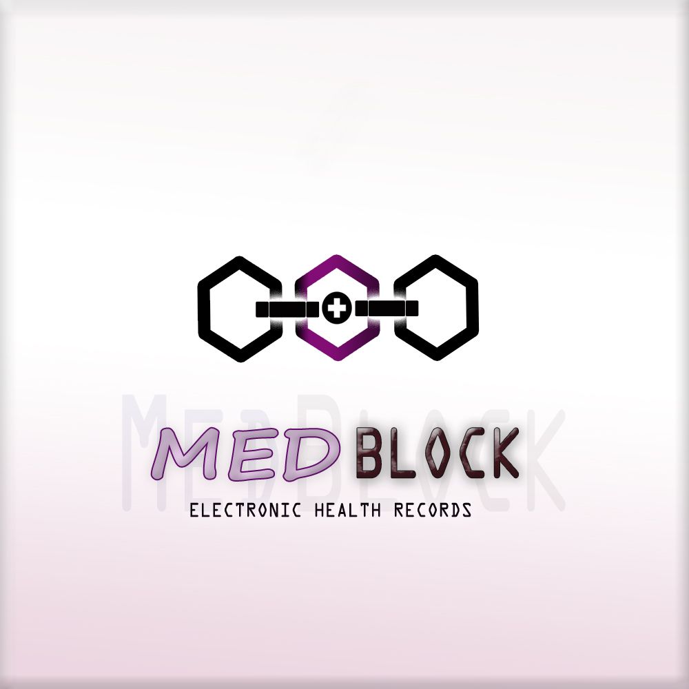


Id get rid of the faded Med Block in the background, it makes it look childish, and just ad a drop shadow to the front one. also change the MED letters to the same colour as the BLOCK ones. it'll flow alot better that way, also get rid of the gradient
Alroght..... thanks for the observations
that looks alot better now, nice work!
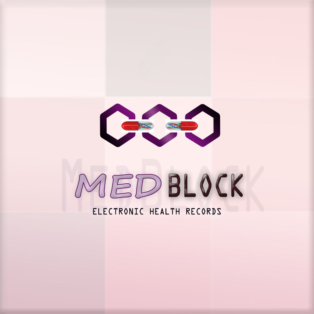
you want designs to be simple, and legible, people like simple, it makes it stand out more
Thanks fam
Thanks for submitting your entry so quickly @ericdyce. If you created your logo in Adobe Illustrator or Adobe Photoshop, can you please send your .ai or .psd file to [email protected]? Also, please make sure that it is a vector based logo with 300 dpi. Thanks!
You are welcome, and alright