Graphs - Lesson 1
Interpreting graphs
Often we have to represent data on a graph. They are visual representations of data. In previous grade learners were introduced to bar graphs, histograms and pie charts. In grade 7 we are also going to look at linear and non-linear relationship graphs.
Prior knowledge learners should have:

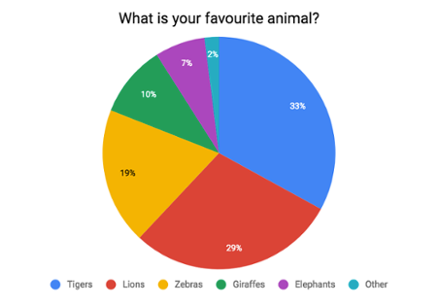
Pie charts are useful graphs to represent data if we want to compare parts of a whole.

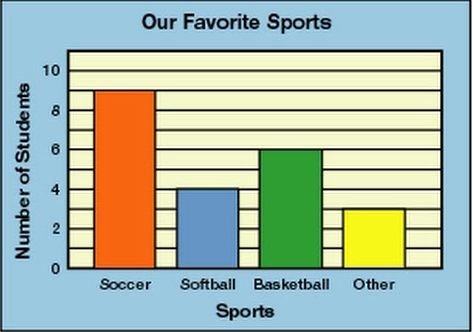
Bar graphs can be used to represent data if we want to compare properties of different groups.
During this lesson we will focus on line graphs. Sometimes it can be very difficult or even impossible to represent the relationship between 2 quantities that vary using a pie chart or a bar graph.
The quantity that changes is called the variable and to represent the relationship between two variables on a graph, we are going to use a line graph.

In the example above, the line graph shows the relationship between the temperature of coffee over a period of time.
- On the vertical axis (y-axis) we can see the temperature in degrees Celsius.
- On the horizontal axis (x-axis) we see the time in minutes.
We can also see that the temperature of the coffee drops, as time goes by.
The longer the coffee is standing, the colder it gets.
- We call the "temperature" variable the dependent variable
- We call the "time in minutes" variable the independent variable
Dependent and independent variables
In mathematical modeling, statistical modeling and experimental sciences, the values of dependent variables depend on the values of independent variables. The dependent variables represent the output or outcome whose variation is being studied. The independent variables represent inputs or causes, i.e., potential reasons for variation or, in the experimental setting, the variable controlled by the experimenter.
This means that the dependent variable is the quantity being observed and independent variable is the quantity being manipulated.
The coffee can not get colder if time does not go by. The more time goes by, the colder the coffee will get.
The temperature of the coffee is dependent on time.
We can analyze the graph by saying that the temperature of the coffee decreases over time.
After:
- 5 minutes, the temperature of the coffee was 90ºC
- 10 minutes, the temperature of the coffee was 85ºC
- 15 minutes, the temperature of the coffee was 80ºC
- 20 minutes,the temperature of the coffee was 75ºC
- 25 minutes, the temperature of the coffee was 50ºC
- 30 minutes, the temperature of the coffee was 20ºC
The longer the coffee is standing, the colder it will get.
This line graph is just an example, it is just an indication of temperature being dependent on time and not the time dependent on the temperature.
In the next lesson we will have a look at linear and non-linear graphs.


