Sharing with you my brand new logo design - Concierge Security Inc.
Hi guys, for those who don't know me, I am a professional graphic designer who mostly design logos, even though I can also design banners/business cards/labels/etc.
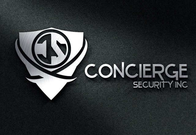
This new design, is a logo I designed for a security company, I tried to combine the sharp elements to go along with the strong, clean & creative look.
My client really liked the design, and even written me a big "Thanks" on the social networks :)
This is the logo design of the business:
I would like to know if you like my design/have suggestions for changes, modifications. Please write your feedback below!
-------------------------------------------------------------------------------------------------------------------------------------
100% POWERED UP POST!

-------------------------------------------------------------------------------------------------------------------------------------
Do you like my post? FOLLOW ME FOR FUTURE ONES! @lazariko12
Thank you for posting @lazariko. Very nice design, great choice of colours, materials...ie.matte background and metallic elements.....as @kyusho has stated, the design reflects security and strength. If one may add a critique...one might say the format of the company name and the logo letters somehow do not compliment each other...it may need a bit of tweaking....nothing major. That being said...it is a security company, therefore it may appreciate the use of a bit of non-congruency.
Thank you for the opportunity to ponder these things.
Congratulations on a logo well done.
Thanks for your building feedback, I will take your feedback into account
I like it, as a shield is security, metal is strength, the wrapped ribbon is nurturing, and the whole thing looks sort of like a shirt and tie idea of a Tux... and of course Black and White, good and bad. The backwards C did throw me a bit, first appearing like an E.
Thanks Kyusho, your feedback is very important to me :)
wow such a great logo, i love design and it is so good that is black and white! It looks very powerful, upvoted and followed!:)
Thanks!!
great logo design :D
Thank you very much, I appreciate your feedback :)
Can you create a signature for the end of my posts? If so, I will pay you 10 Steem, or we can negotiate. I also have been using fiveer for logos recently but would pay you to see what you can come up with. I have BTC, ETH, SBD, STEEM, USD, CAD and more. I would be pleased to work with you. I like your skills.
I could use a logo for @keithwillshine. my Steemit username.
Inside the circle its hard to make out. I see a video camera lense. Was there something else hidden inside there?
But I like the style, and it looks professional definitely. But sometimes simplicity works wonders. Now i see it. Is has a backwards C and an S. with the second lense broken to get the S. Very GENIUS.
I do like the style of the logo but i struggle to see a dragon inside it.. the 'c' is a bit confusing in my eyes. I believe you have a 'c' and an 's' inside the shield?