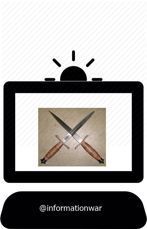
Here are the basics for the logo I'd like

obviously, this isn't right; it needs a simplification; I tried to to take out the background and format these daggers as just black and white...or just fill-in with black. I couldn't do it. The daggers also should be resized to proportion and centered. There was no point in me doing that until I had gotten the daggers right to begin with.
I've been spending all morning on this; it's out of my skill level, and I'm out of time to fix that.
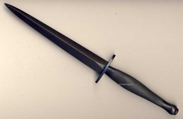
the crossed daggers should be Fairbairn–Sykes daggers

The meaning, from top to bottom
The half-sun is not only illuminating the truth, but is in RISING mode. It's on the way!
The computer screen and keyboard indicate the campaign is being fought on an information battlefield.
The use of the Fairbairn–Sykes dagger is associated with the OSS and British commandos; this represents:
Covert, or underground operations
Specialized in function
The defense of Liberty
And of course the account name...
What needs to be fixed
- The crossed daggers must be reduced to black outlines of the Fairbairn–Sykes dagger (Hilt down, as in my draft)
- The daggers should be centered and proportionate to the computer monitor
- All elements should be centered
- Logo should remain in black and white, and cropped to proportions
here's my submission..
please tell me if there is any changes..
Awesome, the second logo is almost exactly what I was looking for. Sending you 25 SBD now.
I might ask you to enlarge the daggers a bit, tho. They look to fit the space now, where I had thought there was too much white space on my first look {edit - NEVERMIND the request; the space lloks fine, thanks ;> )
And could you fix us up the posting/commenting banner based on the second (fully opaque) logo?
Thanks again!
after enlarged the daggers
I'll bounce back and forth between them. Looks very nice! Thank you!
thankyou for your appreciate...will fix that soon, about posting and commenting banner, may i see an example..?
how about
Although it looks like the convention on the site is to include the creating artist's account on the logo, I'd like to keep this simple by leaving it out ;)
no quote marks on the banner, using them here to highlight the words
and thanks again!
I like the logo and conceptual idea.
@cryptohustlin has voted on behalf of @minnowpond. If you would like to recieve upvotes from minnowpond on all your posts, simply FOLLOW @minnowpond. To be Resteemed to 4k+ followers and upvoted heavier send 0.25SBD to @minnowpond with your posts url as the memo
I also wanted to make a logo ! It has been discontinued because of several issues.
Hi, We have selected a logo today. Thanks for the interest!
I also wanted to make a logo. But it's pending !