My Logo Design Process for a Charity Organization helping kids in hospital.
When I heard about the newly established Charity Organization "Sykehustøffinger", meaning something like "hospital tough guys", I couldn't help myself but to volunteer as a designer for their logo.
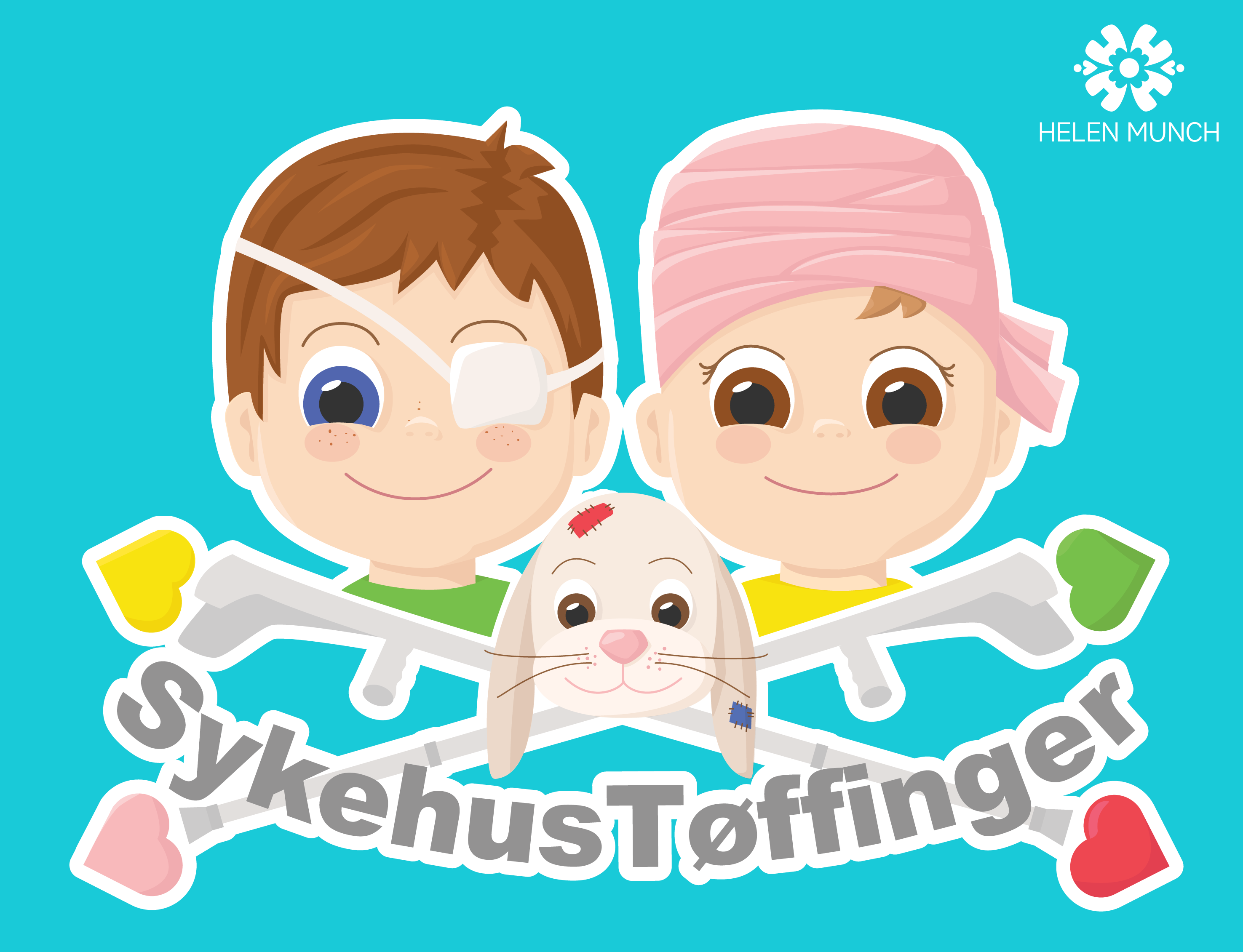
The organization aim to help long term ill kids and their next of kin with information and activities while in hospital. Here is what I came up with.
Before I took my idea into Illustrator (the software I've used for this project) I did a lot of quick sketches of ideas that came into my head. They are very rough, when I start a project I don't take the time to make them look nice, it's just for brainstorming. Here are some of them.
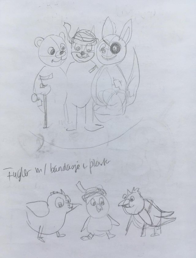
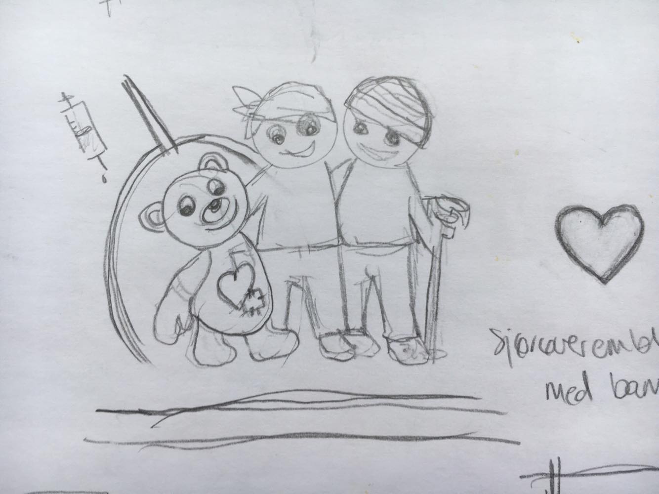
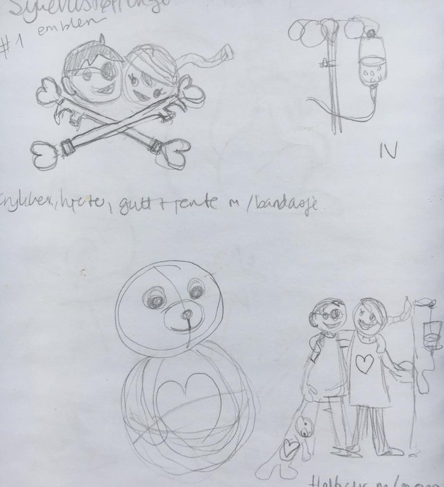
When I decided which idea to go for I started drawing the shapes a little more detailed.
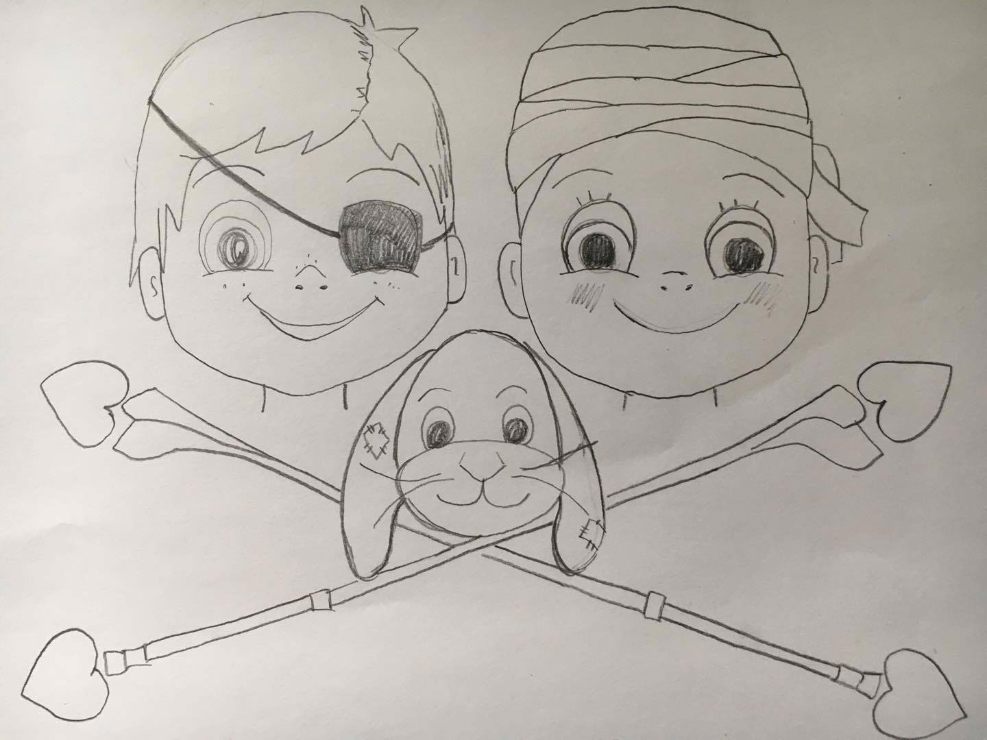
Then I began the illustrating process on the computer. I always start with the outlines and it can look a bit messy.
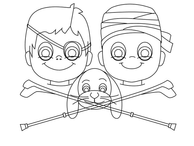
To fast forward I spent a lot of time on the colors and shading/highlighting before testing out different color versions.
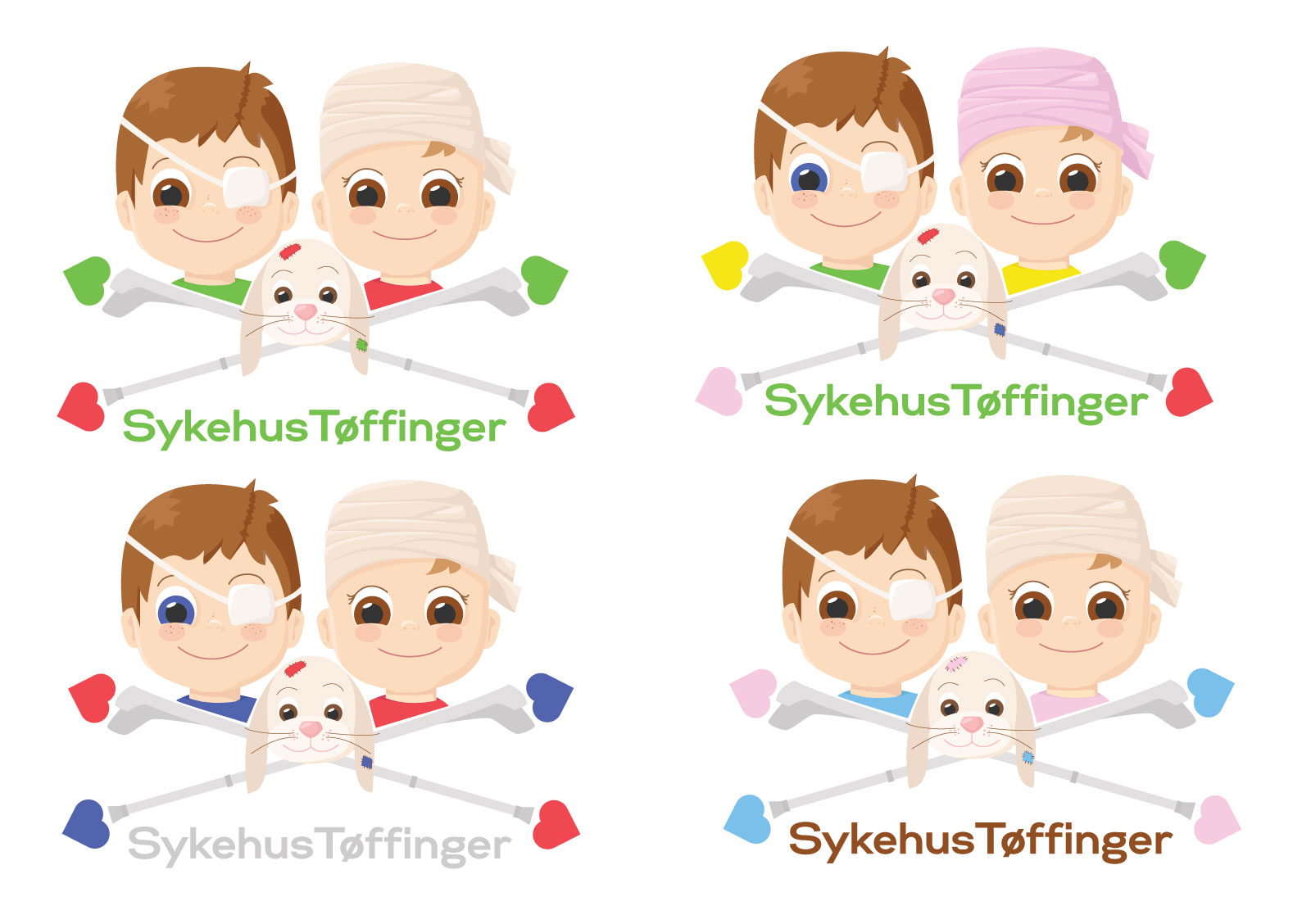
Then I ended up with the final result.
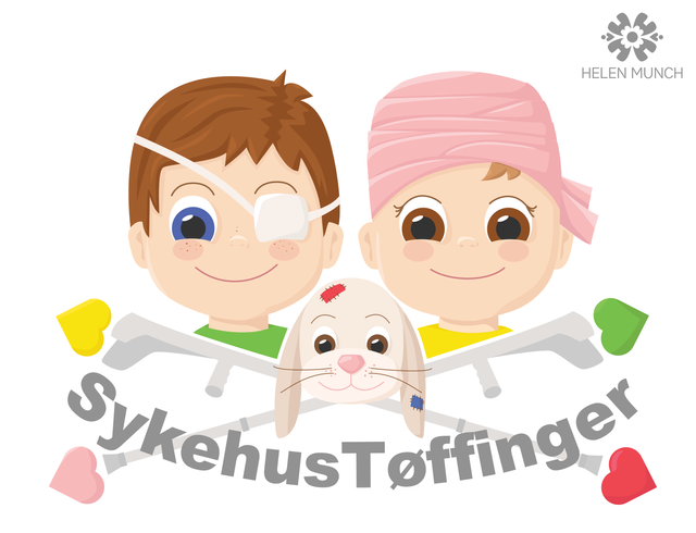
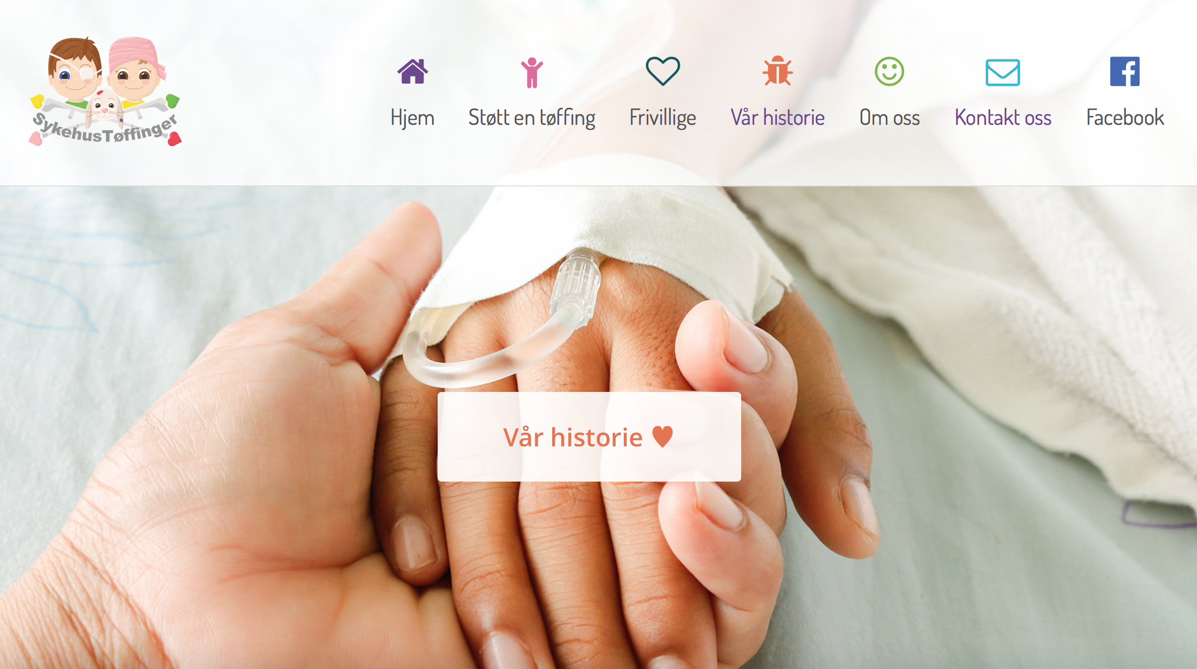
Here the logo is presented on their website.
Thanks for reading!
:) Helen
Flink! Og fin ting å hjelpe dem med ❤️
Tusen takk! Ja, er en fin måte å kunne bidra bittelitt på :)
Gøy å se hele veien fra papiret til endelig resultat, og det ble veldig bra!
Er det Illustrator du bruker når du digitaliserer?
Tusen takk Svein, hyggelig å høre! Ja, jeg bruker alltid Illustrator til logodesign , men bruker ellers Photoshop til andre prosjekter :)