Logo Design Process - Understanding Blockchain Freedom
Client: @lukestokes
Project: Understanding Blockchain Freedom
Budget: Under 10 hours
Brief: Logo & Brand Attributes
When it comes to creating a logo, my theory is to refine the mark to it’s most essential elements, right down to the point where it starts to fall apart. For color, I always start with black and white. If the logo doesn’t work black, then it doesn’t work.
Step 1: Getting Out the Shit
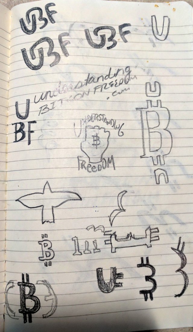
I wanted to see what the letters looked like on paper. I try to identify unique negative space or relationships. The domain & name “Understanding Bitcoin Freedom” is 27 characters (half a tweet), so my preference was to create a unique mark than can stand alone without any words. It’s pretty long and hard to remember, so a memorable mark is essential the brand recognition.
• That upper blob is the “Tread On Me” snake… (FREEDOM)
• Lightbulbs (UNDERSTAND)
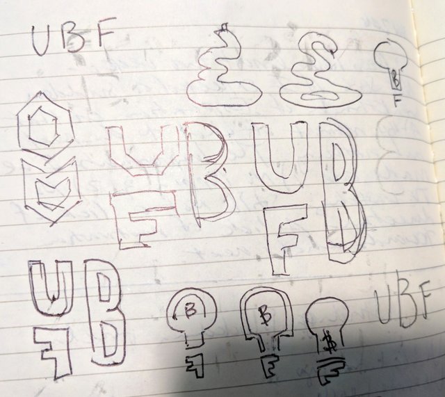
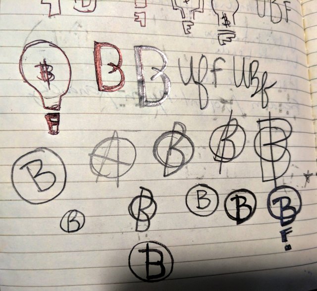
Anarchy
I like how the anarchy symbol is an ‘A’ with a circle and the Bitcoin logo is a B in a circle. I thought there could be some alignment there. I decided to try another direction because most people flock to cryptocurrency for the profit, not the freedom. I wanted to make the mark as approachable as possible.
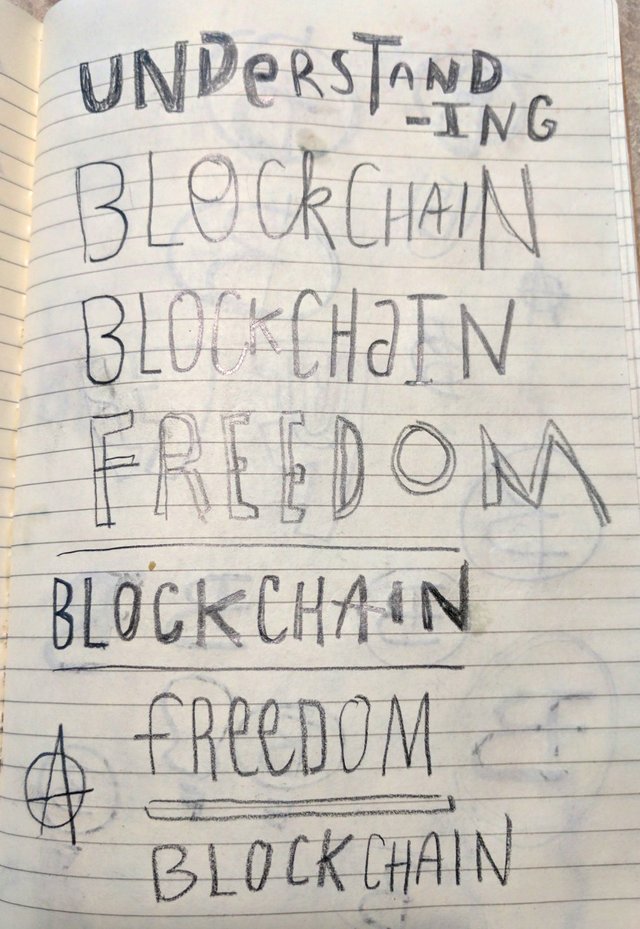
Typelogo
I also like to write everything out and stack it. This helps me see the total character of the words.
₿ Heavy Approach
“Understanding” & “Freedom” are very difficult to capture (visually) without relying on cliches like lightbulbs, flags and patriotic American symbols. So I focussed on Bitcoin and using the ₿.
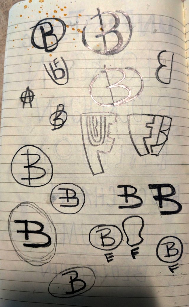
Starting To Form
Yes, I went with the protest fist. Like I said, you have to get out the crap first 😉 but the idea is forming.
The Meaning is the Core
For what they're trying to do, “Blockchain Freedom” is the most important message to focus on. Most cryptocurrency graphics I’ve seen are telephoned-in… lazy and wholly unoriginal. Zero effort involved and only meant to generate vapid views from their audience.
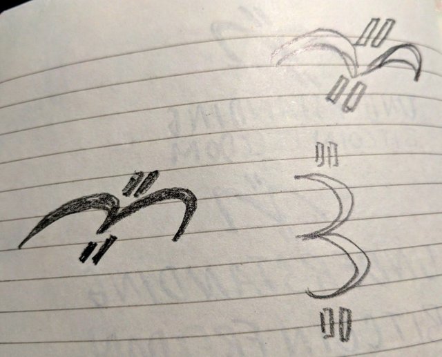
If they stay away from international symbols like flags (and they should since blockchain is global), the bird is the most common symbol of “freedom”. The same dual-arches of a bird in flight are the same dual-arches as a “B” when on its side. The double vertical currency lines indicate upward motion, flight and pay homage to the most well-known currencies (dollar, pound, euro, yen, bitcoin etc.) Visually, it hits the mark.
Refining The Idea
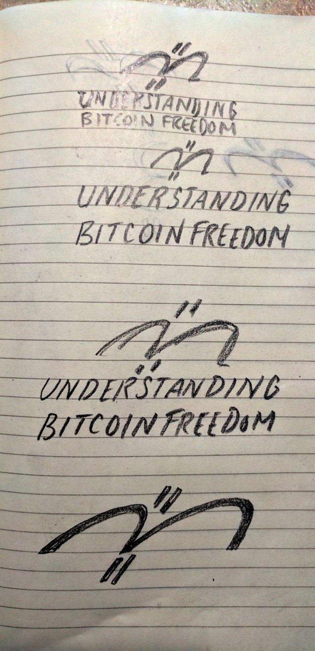
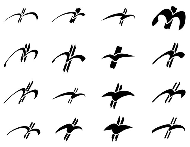
I've exhausted the bad ideas and I'm starting to see the final form. I know I am because it's getting to the most essential elements. The least amount of pixels for the eye to take in, sparking recognition of simplicity and exciting the memory. A signal to the synapses .. we're getting close.
Universal Symbol
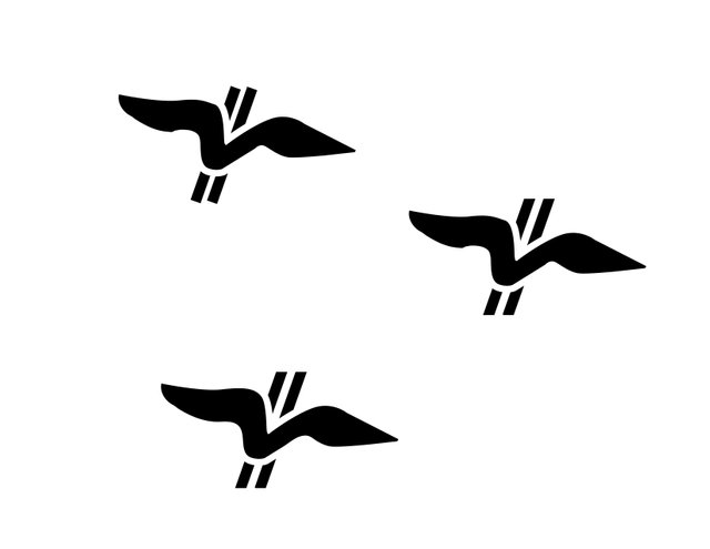
What do Michelangelo, a caveman & some toddler in Mongolia all have in common? They each created the universal symbol of a bird in flight. Yourself included. It runs through time and space as one of the most recognized shapes for flight, freedom and travel.
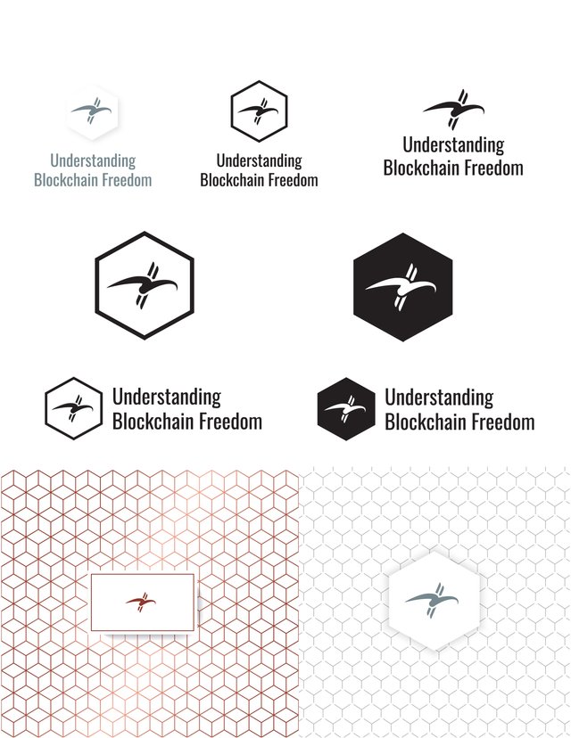
Bam. It's SHOWTIME!

Feedback
I'm always up for constructive criticism, but please realize the final logo has already been approved and is in use. I've been designing logos for 20 years and I'm super passionate about the process. I'd love to talk shop with you if you have any questions or want any feedback on logos you're working on.
If you want to check out some of my other logos, take a gander and geek out with me.
If you're interested in commissioning a logo or brand in trade of crypto, I'd be happy to have a 15 minute phone call on me to see if it's a good fit. Cheers.
I really like where you ended up. The surrounding shape or frame really makes the whole design makes sense. This was the most surprising thing about watching your design process for me.
Love the small white on black background to the right above the blue earth. As a matter of fact, I have a project I'd like you to work on as well.
Did I hear a rumor King Bill would be gracing Nashville's presence soon? Let's get white Russians and talk shop.
yassir. I'll be back end of next week.
I'd like to do that phone call.
I'm in need of a logo
Sounds great Nicholas... I've got some availablily this afternoon after 3PM or tomorrow morning. I'm on Central time.
Today would be great.
I'm in EST
Just was looking on your site and didn't see a phone number
That's intentional ;)
615-397-9595
So around 4:30 my time good?
Perfect. Look forward to it.
Welp... At the hospital... Had a mishap fixing something on RV. Have to talk later.
Will this morning be good?
@jonny-clearwater so I guess I'm not getting paid?
To be fair also, as I've not really had the extra SBD to pay for the final product yet, I've not asked for the files.
You still have possession of them.
Hardfork 19 has had an effect on my revenue on here.
Hopefully we can finalize this soon.
Understandable, just need to keep communication open. Haven't heard back on any Dropbox comments and there's no Steemit IM.
Haven't heard from you in awhile.
We need to get this wrapped up.
You have already been paid 100sbd however.
Let's get this done.
good work :-) @gomattew
I can't see any of your pictures you have loaded up @gomatthew.
Or do you want a logo for each one?
Weird. I'm trying to figure that out now.
Here's the error message I see when I try to view an image directly:
I was using image link instead of direct link on imgur.. thanks for the heads up.
NP bro, keep steeming.
from the post i got to now you are a good logo designer. liked the post upvoted.
Much appreciated. Check out the images now that they're working
yeah saw it followed you. give me a follow back i am new.
잘 보고 갑니다. Thanks...^^