Here’s everything you need to know about Google Trends data (and how it works)…
When I started writing this article, I realized there is some confusion about Google Trends data across the internet.
Many people think that the trend curve is the direct representation of the query’s search volume over time (like the one you can see in Google Keyword Planner tool).
That’s not exactly how it works.
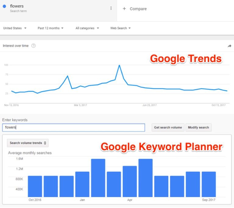
Let me show you the trends graphs for the keyword “flowers” in Google Trends and GKP tool:
SIDENOTE. You can no longer see such graphs in Google Keyword Planner unless you’re spending a certain amount on AdWords ads.
As you can see, they look quite similar, but they’re not identical.
While Google Keyword Planner shows absolute search volume data, Google Trends shows the relative popularity of a search query.
Here’s the explanation from Google Trends Help Center:
Trends adjusts search data to make comparisons between terms easier. Each data point is divided by the total searches of the geography and time range it represents, to compare relative popularity.
In other words, relative popularity is the ratio of a query’s search volume to the sum of the search volumes of all possible queries.
The resulting numbers then get scaled on a range of 0 to 100 based on a topics proportion to all searches.
Trends eliminates repeated searches from the same person over a short period to give you a better picture. And it is important to note that Trends only shows data for popular terms (low volume appears as 0).
Here’s the Google Trends graph for the query “Facebook” over the past 12 months (in the US):
facebook trend in the US
To demonstrate you how Google Trends builds its “Interest over time” graph, let’s pretend I have the same data Google has. (I don’t really have it, unfortunately.)
The numbers I will use below are by no means accurate. They are just an assumption to demonstrate how things work.
Assumption 1: the total monthly number of all Google searches in the US is around 10 Billion (Source)
Assumption 2: the search volume for the query “Facebook” in the US is 83 Million (according to Ahrefs Keywords Explorer)
Here’s the table I made for this simulation:
To build a graph the way Google Trends does, you need to take the following steps:
Calculate relative popularity as a ratio of the query’s search volume to the total number of searches.
Scale these values proportionally so that the maximum value is 100.
Put the dots on the graph.
Google Trends graph simulation
This example gives us two important takeaways:
Search term popularity changes when the query’s search volume changes (see May 2017 — June 2017). That’s pretty obvious, right?
Search term popularity will also change if the total number of searches changes, even if the query’s search volume is constant (see June 2017 — July 2017 in my example above).
Now you see that popularity used in Google Trends does not always correlate with query’s search volume. But in most cases, it does.
For example, if you take the keyword “Star Wars,” you’ll notice that the same spike (December 2015) appears in Google Trends and Ahrefs Keywords Explorer.
Star wars example
This is despite the fact that Keywords Explorer shows the search volume trend, whereas Google Trends shows the “popularity” trend (as outlined above).
Now let me show you how you can (and should) use Google Trends in your online marketing activities and during keyword research in particular.