A childhood friend is travelling to South America and this is how I helped him
I've been to many places in South America here and there, but nothing beats a road trip and a willing partner to experience it in all of its glory.
Since my late twenties I've dreamt of getting to all the hidden paths, beaches and uncharted territories of the South, alas, I never did it, but I hope to do it someday...
My friend @amaruromero will achieve this soon. Him and I are childhood friends. We attended the same primary school when we were only 9 and 10 years old.
After finishing primary school I moved to a different high-school, but we were still friends. While he started rock-climbing I was only an expectator with my crew at the time, which included my younger, rock-climbing sister.
One day he suddenly left Venezuela. I never heard back from him until we connected again on Social Media, of course.
After 12 years travelling through many parts of Europe he is back. I too, recently got back home in 2016 from a three year hiatus.
After being here for about 3 years @amaruromero and his nomadic soul are leaving again, this time from Venezuela all the way to Argentina. He is also going to teach kids and the youth how to skateboard, rock-climb and maybe even surf along this journey. It's an extreme sports odyssey, if you will.
His brave and adventurous sidekick is Oriana, a yoga rockstar and an expert at circus and theater performance who will also gift kids with her many talents.
How did I help him?
I created a logo he could use on all his social media channels and his crowdfunding campaign.
When Amarú asked me to do a logo for him, it was a no brainer. I love supporting this really good cause, he is a long time friend and I am more than happy to help him get the funds necessary for this trip: "XtremeCombi: Art. Culture. Sports." His campaign is at: https://gogetfunding.com/campana-xtremecombi-sin-fines-de-lucro-arte-cultura-deporte--por-sur-america/
The logo creation
The name I was given at first was "Create your path" and I suggested they should change it...
Even so, I started with a very minimalist approach. I wanted to convey the basic elements of the journey: the combi van, south america, yoga symbolized by a lotus flower and skateboarding. I did some vintage/stamp-like logos.
These were the first drafts:
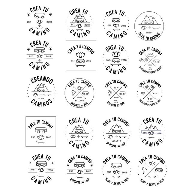
These drafts weren't as well received as I thought they would. They wanted something more grungy-looking and "curvy". They also wanted the iconic combi to be part of the logo.
Oh well...It was time to get back to the drawing board.
Final logo
This time around I changed the cold san serif font for the vintage-looking font Swistblnk Moabhoers. I added more grungy elements and a pop style to get this result.
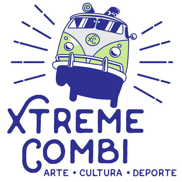
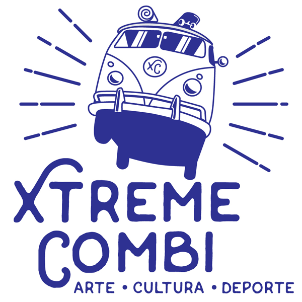
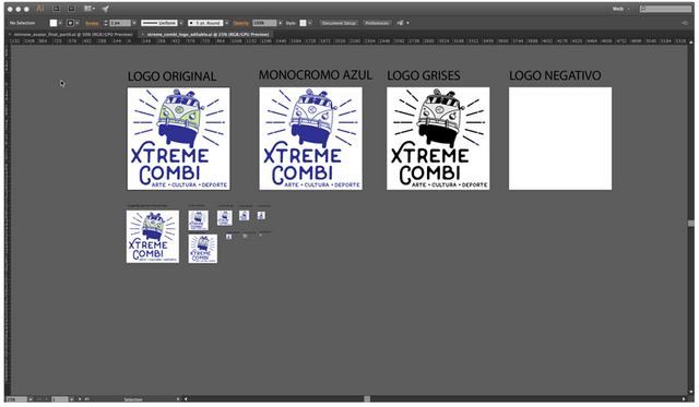
I added a yoga mat and a skateboard on top of an iconic combi van jumping in the air, and replaced the brand with the acronym XC. The XC element is ideal as a browser favicon.


Keep in mind, this had to be done in one day, because everything in design is "urgent".
So, there you have it, that's how I'm helping my friend to get an identity to promote his campaign.
Tbh I was really dying to post this project because it is very dear to my heart, but I had to wait until the actual campaign was all set up.
All photos and images in this post are my own.
If you want to know more about this project and support it as well, you can check it out at: https://gogetfunding.com/campana-xtremecombi-sin-fines-de-lucro-arte-cultura-deporte--por-sur-america/
Finally they have their logo and my lucky self gets to travel to all those places in spirit.
This post has received a 0.26 % upvote from @drotto thanks to: @banjo.
Muchísimas gracias por todo el apoyo y energía positiva que estas compartiendo y ayudando a que se haga posible este proyecto. Seguimos trabajando en ello hasta llegar a nuestro objetivo. Un abrazo muy grande y mucho éxito.
De nada @amaruromero, para eso estamos los panas! :)
Thats a really nice gesture
Thanks! I hope he has an awesome trip and finds a lot of supporters. I only helped the only way I could. Thanks for reading and stoping by :)
Congratulations! This post has been upvoted from the communal account, @minnowsupport, by Creativista from the Minnow Support Project. It's a witness project run by aggroed, ausbitbank, teamsteem, theprophet0, someguy123, neoxian, followbtcnews, and netuoso. The goal is to help Steemit grow by supporting Minnows. Please find us at the Peace, Abundance, and Liberty Network (PALnet) Discord Channel. It's a completely public and open space to all members of the Steemit community who voluntarily choose to be there.
If you would like to delegate to the Minnow Support Project you can do so by clicking on the following links: 50SP, 100SP, 250SP, 500SP, 1000SP, 5000SP.
Be sure to leave at least 50SP undelegated on your account.
Wow, how cool! The logo is really well done, lucky friend of yours :) both the first minimalistic drafts and the final results look really pro and awesome. Thank you for showing the behind story of their creation, I learnt a great deal from it. Its true that visual identity is a must in social media and crowdfunding, but I've never seen a designer's process behind it.
Thank you for your kind comment @shinyforest :). My logo posts are more detailed about everything, from concept to final. Sometimes I sketch by hand, and sometimes I go directly to the computer. I'm glad you got something out of this, even a tiny bit. Thanks for your support. Have a great day!
You got a 5.72% upvote from @steembidbot courtesy of @creativista!
You got a 2.63% upvote from @getboost courtesy of @creativista!
I love all the propossals! I wouldn't be able to pick one!
That happens to me all the time, so I just throw everything at the client and tell them to chose. I know it's the worst design practice ever haha, but I'm really indecisive and usually like things that the client doesn't like...