Light in #architecture
Yes, I am architect and this is a part of my book I made many years ago:
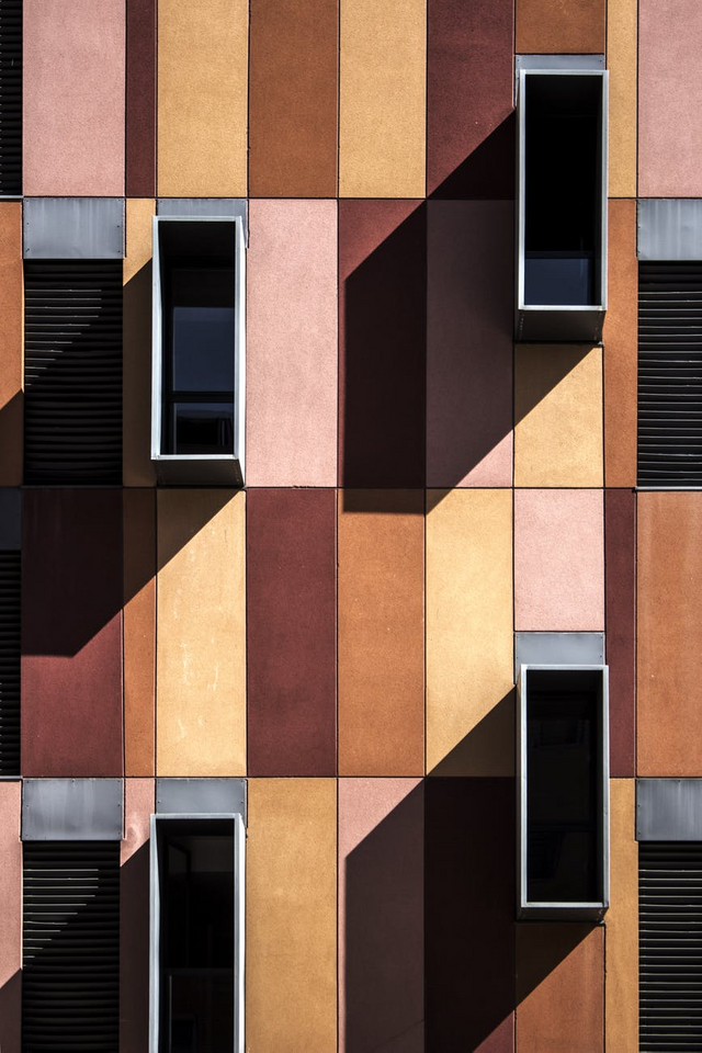
Light is one of the most important factors guaranteeing the success of the entire design stage, which is visualization. The lighting of the stage on which our model is located is one of the most important and the most complicated elements of the whole creation. The complexity of this activity is based on the design person choosing both the right frame and the lighting. It is wrong to say that if you set it up and that it is enough. With this approach we are later confronted with doubts on the principle of "this program is not suitable" or "too thin". Such reasoning is the most wrong. In architecture, we can not assume that the scene itself generates lighting for us. We can not assume that we will only set the sun's light, its angle, location, or color ... and it's ready. Illuminating eg a room in the form of a kitchen, we must ask ourselves how we want our room to be picked up. We can illuminate them with direct light from behind the camera and pay no attention to details. However, we can offer a climate solution. Spotlights placed under hanging cabinets, working stove, or a candle on the table give us a certain view of the whole situation. If we add a delicate light to the window, we will create an atmosphere much more interesting than simple lighting. It is not art to put in a few lamps and turn their light on max. In order to properly fulfill the task entrusted to us, we must recognize what effects we will achieve by using different types of lamp lighting. This will be the beginning of our path towards "enlightenment" and choosing the appropriate method for our stage. However, we must remember that we will not be perfect the first time. Just like learning to balance when cycling, lighting is a long and tedious process, which in the end gives you a lot of joy. All the reflections and refractions of light on any real object can bring our mind to no little confusion. And that's what it should visualize the hardships of realistic scene lighting. Illuminating the stage, we can go two lanes: mapping the effect of full realism or the final effect. Each time, we should ask ourselves how we want to see our final view. What effect do we expect and what are we striving for? "The contrast of the picture depends mainly on the play of chiaroscuro - if on the bright stage we use long and strong shadows, characteristic for dawn, for example, we get a big difference between the light and dark areas of the picture. The result will be the capture of a large number of details from the picture and their exposition. In contrast, small contrasts help to hide details, creating calmer, more tonally balanced scenes. In a big simplification, bigger contrasts favor the presentation of specific objects, while small ones are great for creating flat, static images presenting a large space in which there is no central element. Likewise, the dynamics of the scene - this is usually to attract attention, and thus favors the use of sharp shadows. The intensity of lighting is the total area that is under the influence of light and the power of light. Usually, you should try to spread it evenly, while avoiding sharp spots of chiaroscuro. The latter will be reserved for situations where the effect will be intentional - they allow to draw attention to a specific element of the scene in a very concrete way, and to display or hide it. "Quote from" Compendium blender "by Kamil Kukło, Jarosław Kolmaga. When undertaking lighting tests, he proposes a small exercise, which illuminates the types of lighting. For a bigger effect, I suggest you do it not on the computer screen, but in a dark room. We will need an object, such as a plushie, a torch and a dark room. Put the soft toy on the floor, let it shine with a flashlight held by our body. We have a lighting effect at the front. We see clearly everything that is directly in front of us. The next elements on the roundings and the sides disappear into the dark. Such lighting is the most flat adverse to our needs. All shadows are directly behind the object and we are not able to catch them. Then let us shine on the side of the object. Side lighting, which we used, gives objects the most depth, and creates on the object an interesting game of chiaroscuro through strong transitions between the areas of light and shadow. With the help of such lighting, we can highlight the most important features of the object while showing the most amount of details. Placing the light behind, behind the object, so that the plush toy is between the flashlight and we get the so-called. rear lighting. Note that we only see the contour of our object. The advantage of this treatment is displaying the shape with the hiding of all details, which, for example, we do not have.
By setting our flashlight over the object we give it an undesirable effect, which in specific situations can become our ally. Undesirable because we hide the lower part of the object, and our chiaroscuro neither masks details completely nor exposes them excessively. For the same reason, this lighting can become our ally. Wanting to show in the room of the exemplary kitchen all countertops and some cabinets, without penetrating into the details of the fronts of the cabinets, this is a perfect solution. The lighting of our object from the bottom gives it a horror effect. It resembles the face lighting in the darkness from the bottom - an effect often used in movies to trigger a specific reaction. However, in architecture, this procedure turns out to be useless in most cases, and most objects illuminated in this way lose their value. However, if we now fix a second flashlight and combine different lighting from the above, we can get quite interesting effects. The above exercise aims to make people aware of the effects of simple lighting. This is the easiest way to try the basics, using the method of tools that we already know perfectly well. "
This was a part of my book, made for my pleasent only :)

