Mosasaurus - Digital illustration w/ tips and tricks [IT/EN]


Mosasaurus - Illustrazione digitale
Tecnica: illustrazione digitale realizzata in Adobe Photoshop. Circa 1 ora di lavoro.
Non ho apprezzato particolarmente Jurassic World, ma mi è piaciuta molto l'introduzione del Mosasauro, che mi ha ispirato a dipingere di getto questo paesaggio dove l'ho inserito in forma scheletrica.
Condivido qualche riflessione a cui faccio riferimento mentre dipingo.

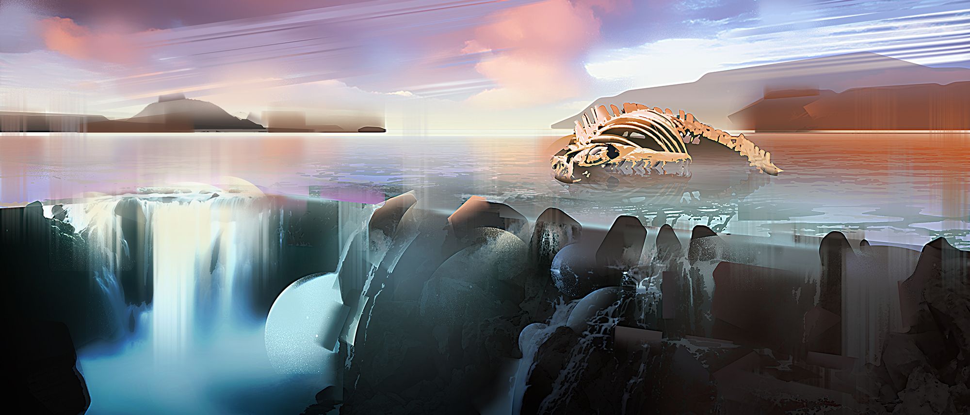
Mosasaurus - Digital illustration
Technique: digital illustration with Adobe Photoshop. Done in about 1 hour.
I did not particularly appreciate Jurassic World, but I really liked the introduction of the Mosasaurus, which inspired me to paint this landscape where it's featured in skeletal form.
I'm going to share some reference points that i take into account while I paint.


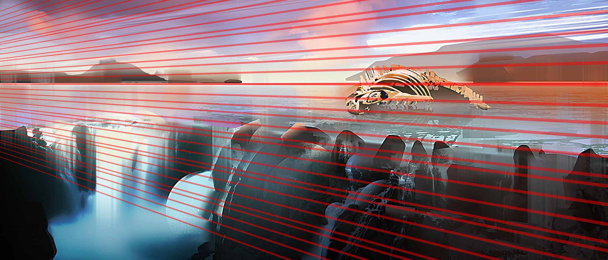

Utilizzare delle griglie prospettiche anche in un paesaggio naturale aiuta a far percepire la profondità della scena. Le nuvole e la cascata, difatti, seguono la prospettiva.

Using perspective grids even for a natural landscape helps to perceive the depth of the scene. The clouds and the waterfall, in fact, follow the same perspective.

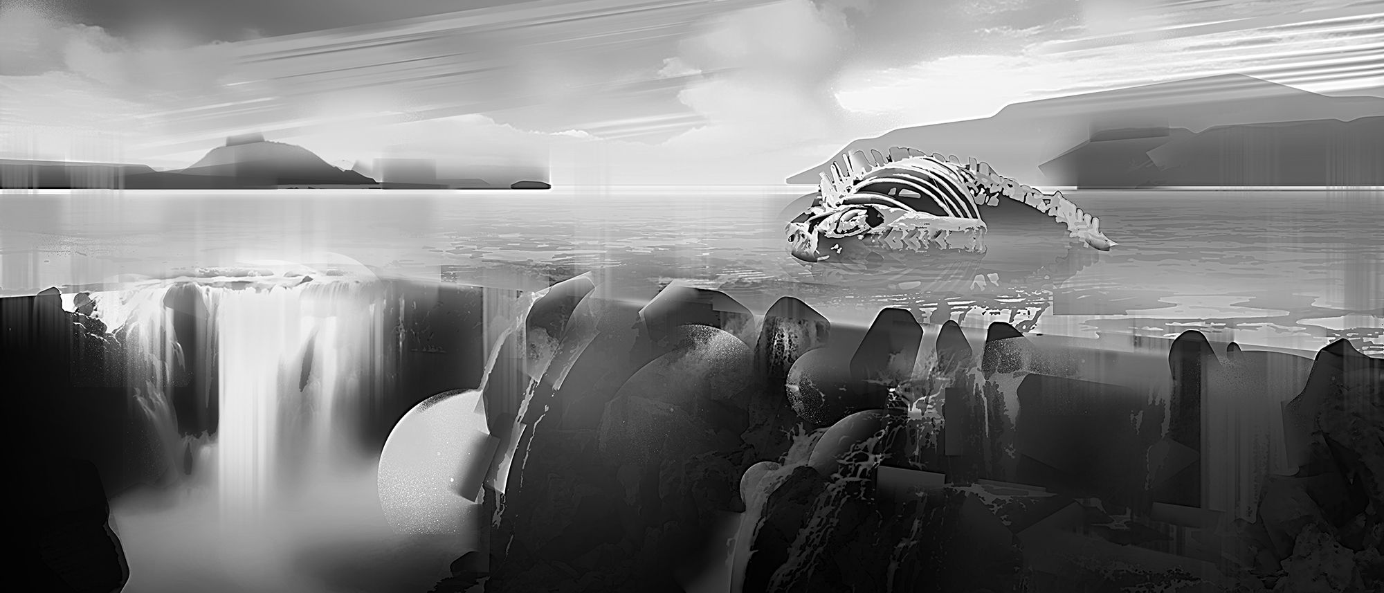
Durante la lavorazione a colori, tenere anche una versione in bianco e in nero per controllare in ogni momento il bilanciamento dei valori tonali. Trasformando il lavoro in bianco e nero ci accorgeremo subito di un'eventuale illuminazione piatta e quindi poco interessante.
During color processing, also keep a black and white version to check the balance of tonal values at any time. Turning the work into black and white, we will immediately notice if the lighting is too flat and therefore not very interesting.
It looks great at full size. It's not a link but I right clicked to view it larger.
Thank you so much and you're right, i'd not considered posting a link per the fullsize version :-o Will do Next post!!
Wow, that's wonderful @onicreative!
Thanks to your post in #trialbycomics discord channel I found you! Love your style. Happy to meet you!
Upvoted, resteemed and Followed! ;)
Your stuff is not that bad either, you got a nice use of colours!
Thanks! :D I have to practice a lot!
Congratulations @onicreative! You have completed some achievement on Steemit and have been rewarded with new badge(s) :
Click on any badge to view your own Board of Honor on SteemitBoard.
For more information about SteemitBoard, click here
If you no longer want to receive notifications, reply to this comment with the word
STOPCongratulations @onicreative! You have completed some achievement on Steemit and have been rewarded with new badge(s) :
Click on any badge to view your own Board of Honor on SteemitBoard.
For more information about SteemitBoard, click here
If you no longer want to receive notifications, reply to this comment with the word
STOP