WRITING - PART TWO / LA SCRITTURA - SECONDA PARTE
WRITNG - PART TWO
Hello dear friends,
as promised I' m back with the history of writing.
If you missed the start just take a look at my post yesterday :-D
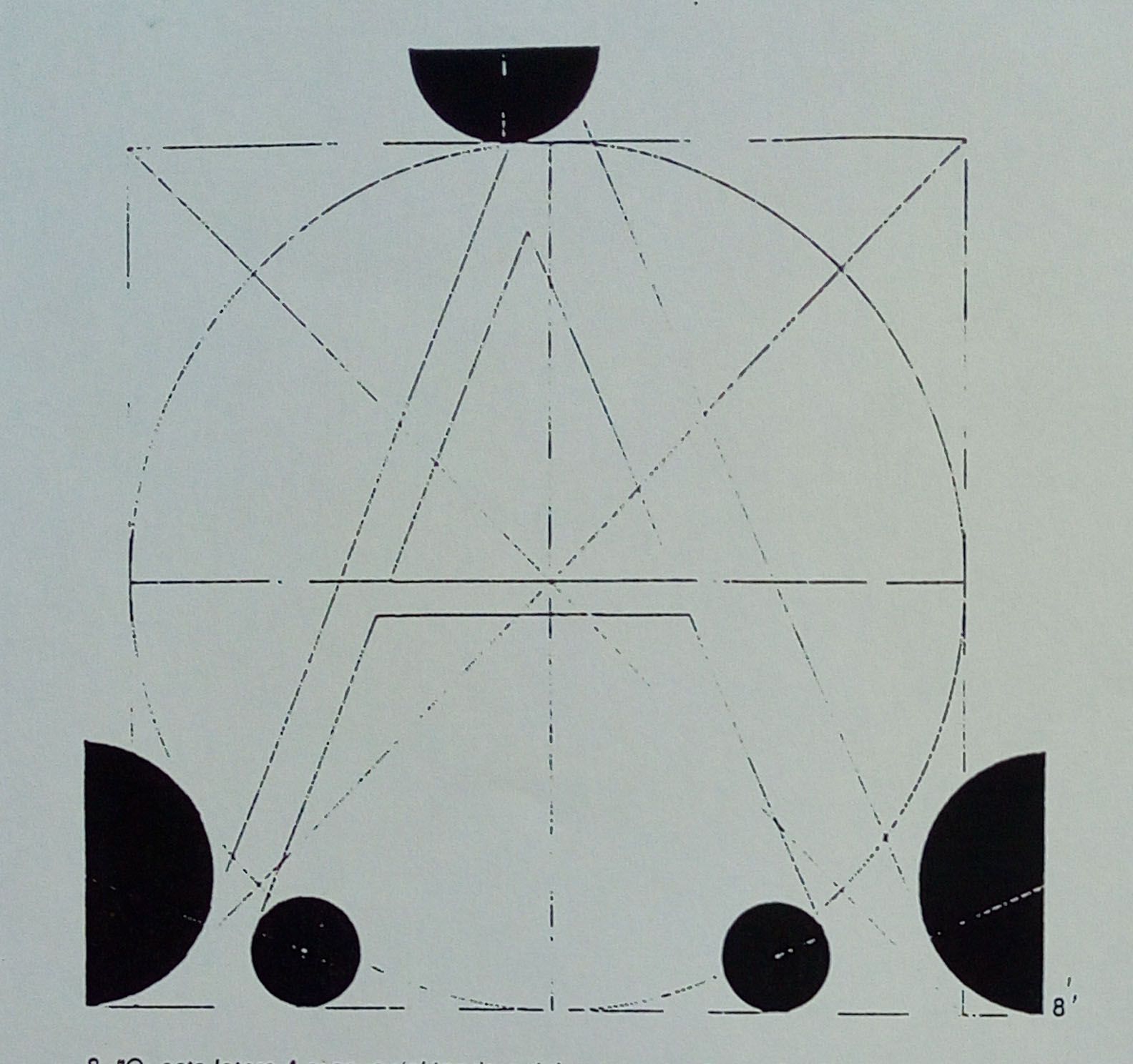
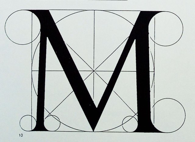
Today we start with the Renaissance, in which we return to the canons of classical composition. In 1463 Felice Feliciano designed the Alphabetum Romanum, and in 1509 Luca Pacioli created the Alphabeto Dignissimo Antico. Both are based on the geometric pattern of the square and the circle.
LA SCRITTURA - SECONDA PARTE
Ciao cari amici,
come promesso oggi torno a parlare della storia della scrittura.
Se vi siete persi l' inizio basta che date un' occhiata a mio post di ieri :-D
Iniziamo dal Rinascimento, nel quale si torna ai canoni di composizione classica. Nel 1463 Felice Feliciano disegna l' Alphabetum Romanum, e nel 1509 Luca Pacioli crea l‘ Alphabeto Dignissimo Antico. Entrambi si basano sullo schema geometrico del quadrato e del cerchio.
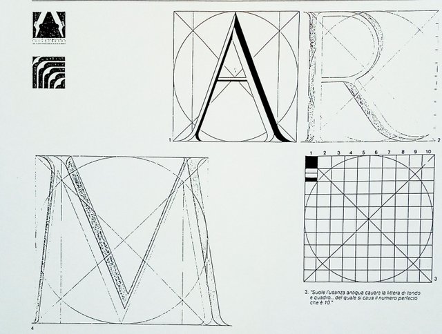
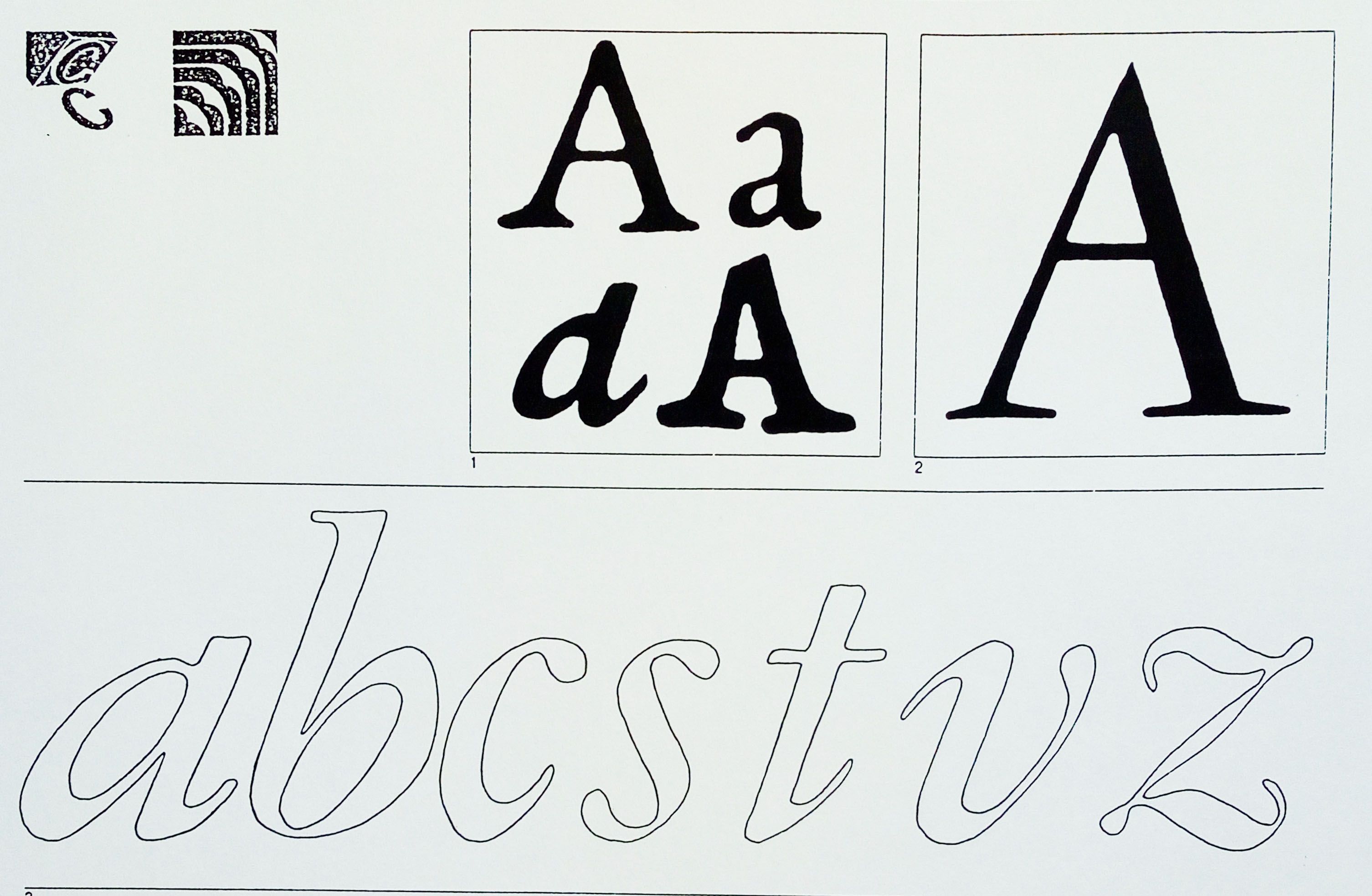
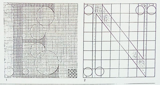
At the same time, in 1495 the character Bembo came out. You can see here how much geometry is used to create a single letter.
Contemporaneamente, nel 1495 esce il carattere Bembo. Potete vedere qui quanta geometria viene usata per creare una sola lettera.
In 1531 Claude Garamond designed a new character for the French printing company l'Etienne.
Nel 1531 Claude Garamond disegna un carattere nuovo apposta per la tipografia francese l' Etienne.
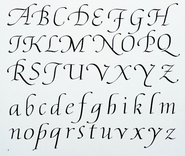
Around 1522 the writing Cancelleresca was born, created to be extremely practical and readable.
Intorno al 1522 nasce la scrittura Cancelleresca, creata per essere estremamente pratica e leggibile.
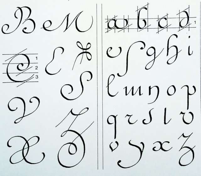
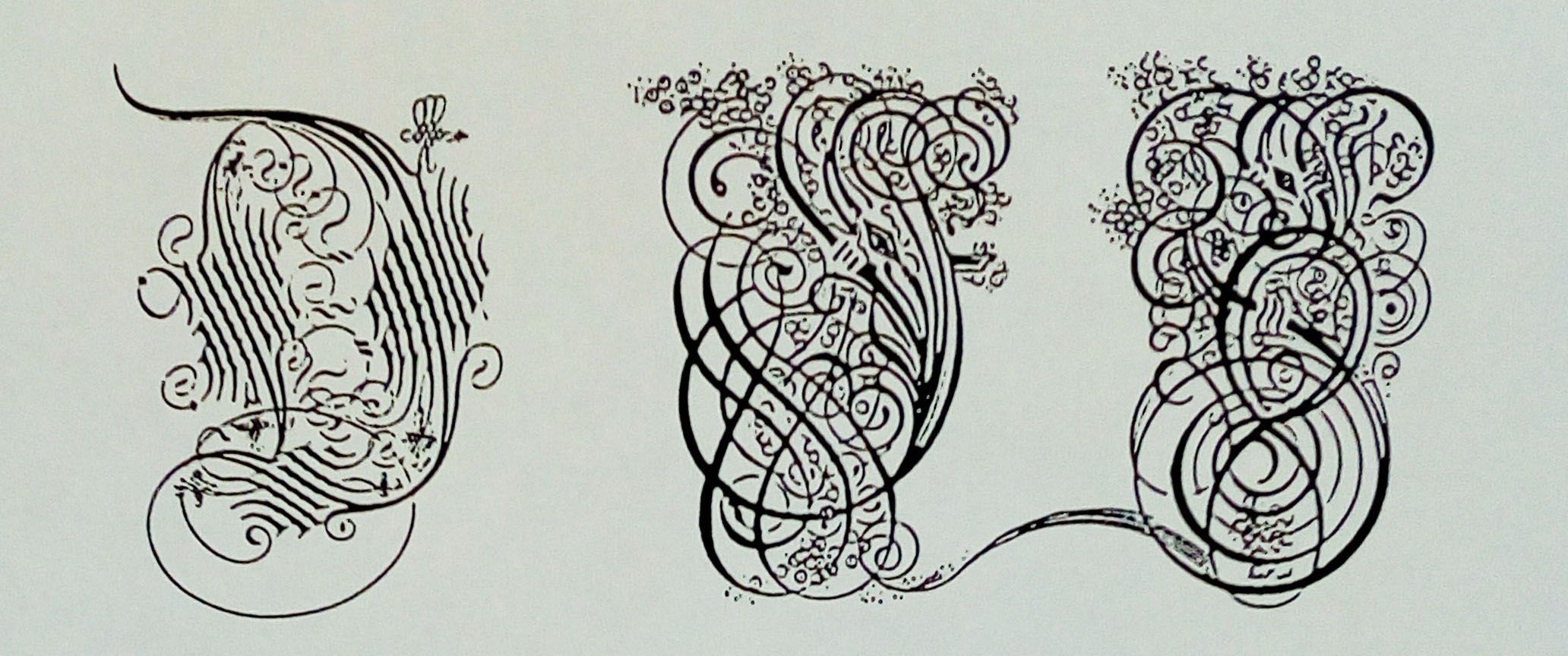
In Venice Giovanni A. Tagliente invents these decorative letters.
A Venezia Giovanni A. Tagliente inventa delle lettere decorative.
In Baroque time we really have an explosion of decoration throughout Europe, and the letters reaches forms of sumptuous elaboration , the most used becomes the Ronde writing.
Nel Barocco abbiamo davvero un' esplosione di decorazione in tutta Europa, e la scrittura raggiunge forme di sontuosa elaborazione, la più utilizzata diventa la Ronde.
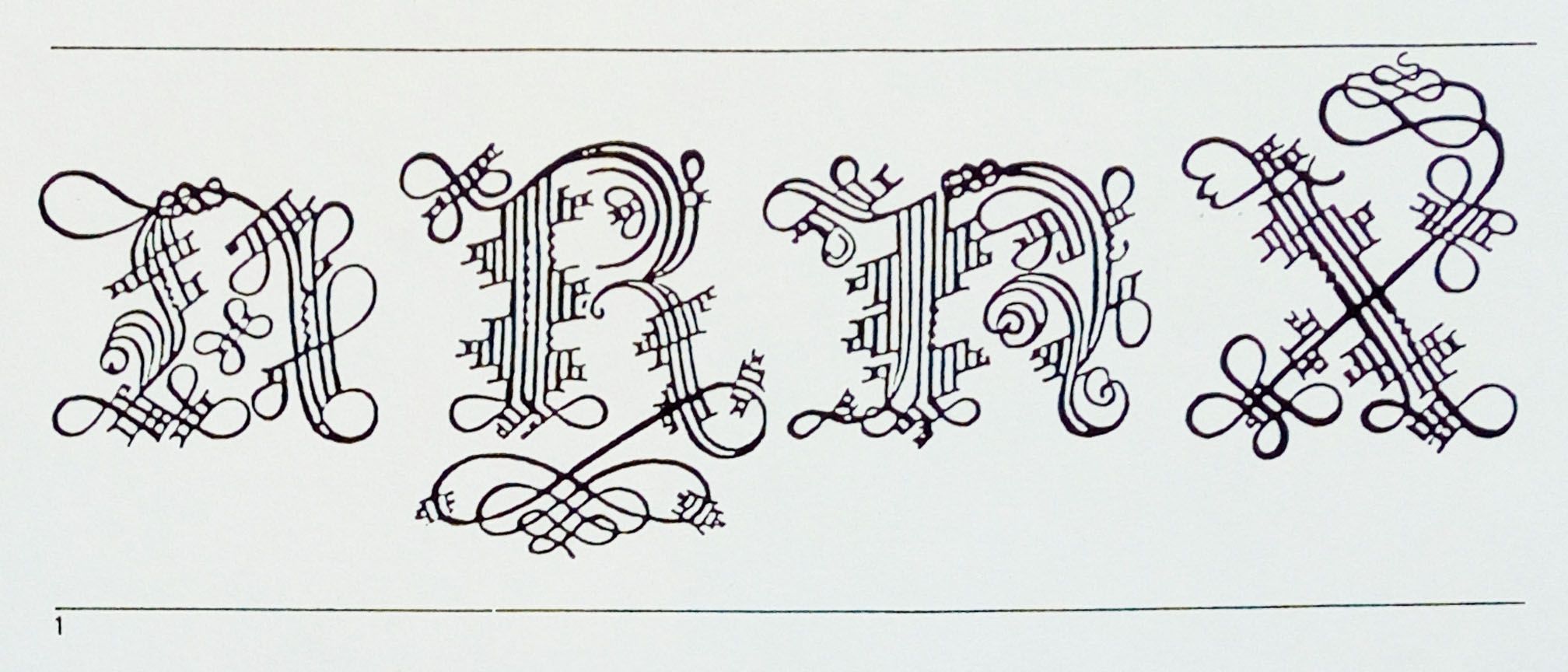
Here are some baroque uppercases.
Eccovi delle iniziali barocche.
In 1702, the character Romain du Roi was born with Luigi 14th.
Nel 1702 con Luigi 14esimo nasce il carattere Romain du Roi.
All documentation comes from my time sheets of the artistic high school:-D
But there is still more to say about letters, tomorrow I will do my last post, speaking also from the present.
Tutta la documentazione proviene dalle mie schede dei tempi del liceo artistico:-D
Ma siccome c' è ancora un poco da dire su questo tema, domani faró l' ultimo post sulla scrittura, arrivando fino ai tempi nostri.
Thanks to all those who follow me and I wish you a good Sunday ;-))))
Grazie a tutti quelli che mi seguono e vi auguro una buona domenica ;-))))
Bellissima la scrittura decorativa e affascinante come i caratteri Bembo e Romain du Roi avessero alle spalle delle strutture geometriche ben precise.
Onestamente sono affascinato da questi post!
Grazie mille, pensa che al liceo l' avevamo addirittura come materia "Scrittura" :-D
Davvero interessante e ben documentato. Visto che questi caratteri li abbiamo sentiti nominare un po' tutti è bello sapere da dove arrivano!
Grazie mille, è un mondo a sé :-))))
Bello
Grazie infinite :-D
Degna conclusione del primo post, con un bis molto gradevole e curato, complimenti per l'ottimo lavoro complessivamente realizzato, molto brava
Grazie mille, domani arriva l' ultimo ;-D
Interessante post Caroline
Aspetto il prossimo
Ciao a presto
Grazie mille, oggi arriva l'ultimo :-D
I never thought that these letters were created specially). I thought that this is an invention of artists)).
Thanks, there is so much more to say, but it a was long enough with three posts ;-)))