Technical analysis of the financial markets.
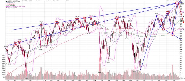
I created this chart of the S&P500 stock market index this morning and I thought you may find it interesting. I know it is a lot to look at. In a nutshell, the blue lines are resistance and support (hard for the stock market to get above or below) and the red, dashed line is where I think the US stock market is headed. As you can see, there is what appears to be a megaphone pattern/expanding triangle. This megaphone pattern usually results in a declining stock market outcome. As you can see, this week, we are up against the top, blue, resistance line which is hard to get through. Not much upside. Lots of possible downside. 