Creating an Image Using Text as a Design Element
Creating an Image Using Text as a Design Element
I was chosen to create a "designer inspired t-shirt" for the first product offered by a new group named Helvetickahaus - a group that raises money for grants to students who plan to attend art school.
As stated on their website:
Idea 1
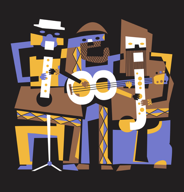
My idea was to use the Helvetica font in the image. I presented two ideas for it. My first idea was an interpretation of Picasso's famous painting Three Musicians, substituting letter forms for the musical instruments. You can see the first musician playing a lower case i with flute hole fingering. The second person is playing a guitar with the body of the guitar made from the number 8. The third musician is playing a lower case j like a saxophone.

Idea 2
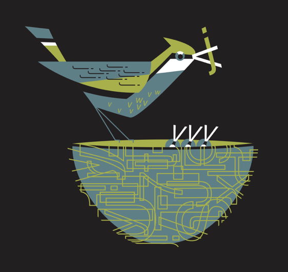
For the second idea I chose to create a bird feeding her babies in the nest. She has a worm in her beak that is a lower case j. The bird beaks are lower case v's. The mother bird's body is detailed using lower case j's in the wing and w and v's in the body. The nest uses many letters changed to outlines to simulate the complicity of sticks used in nest-building. They break out of the solid nest shape to give it that organic feeling that an actual birds nest has. This image was chosen to be used on the first t-shirt.
This was for a screen-printed t-shirt, so color choice and use is very important. I chose three colors to use. The turquoise is the darkest color. The green is the midtone to compliment the turquoise. White is used as the third color to add sparkle and push the overall contrast. These are printed on black t-shirts, so the black in the image is really an absence of color, allowing the black t-shirt material to show through. When printing on black material, an undercoat of white is printed so that the main colors maintain their brightness and don't get absorbed too much into the fabric, which dulls them out. The image also lasts longer when washed.
