Help Us Pick A Logo For Our Farm!
Happy Friday to you! I hope this morning is treating you well. I will be super busy today repotting herbs for my new gig and veggies of my own. There is a lot of seeding to do as well!
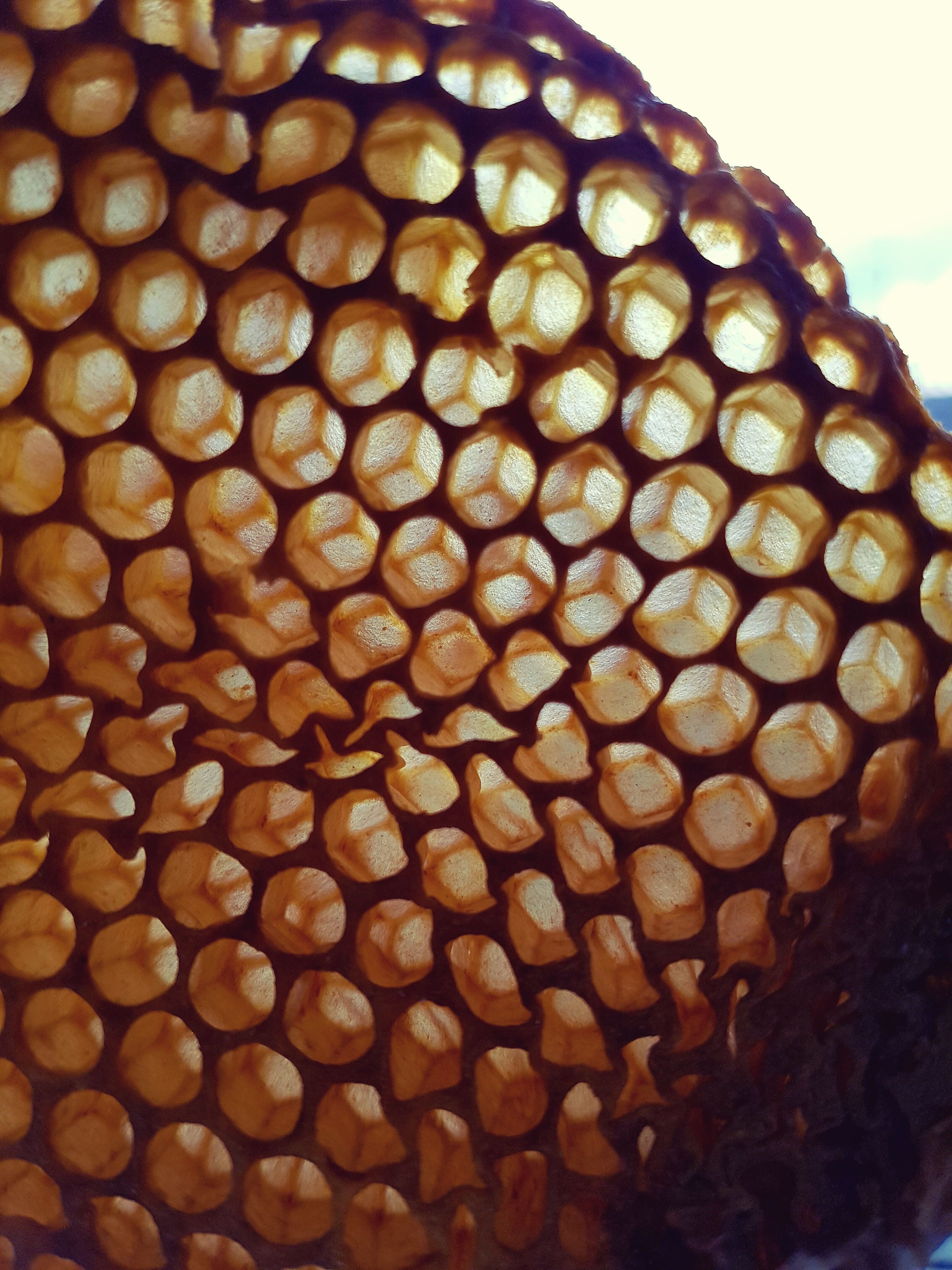
Cool pic of some of our honeycomb, just because. 😉🐝 Can you see the peace symbols in the comb???
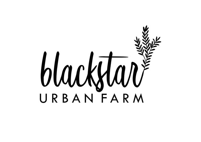
The reason for this blog is that I would love your help with deciding which logo should represent our farm. A quick poll, if you will haha! If you could shout out in the comments which you like better, I would greatly appreciate the feedback. If you like neither, that's cool too, please let me know!
first option
second option
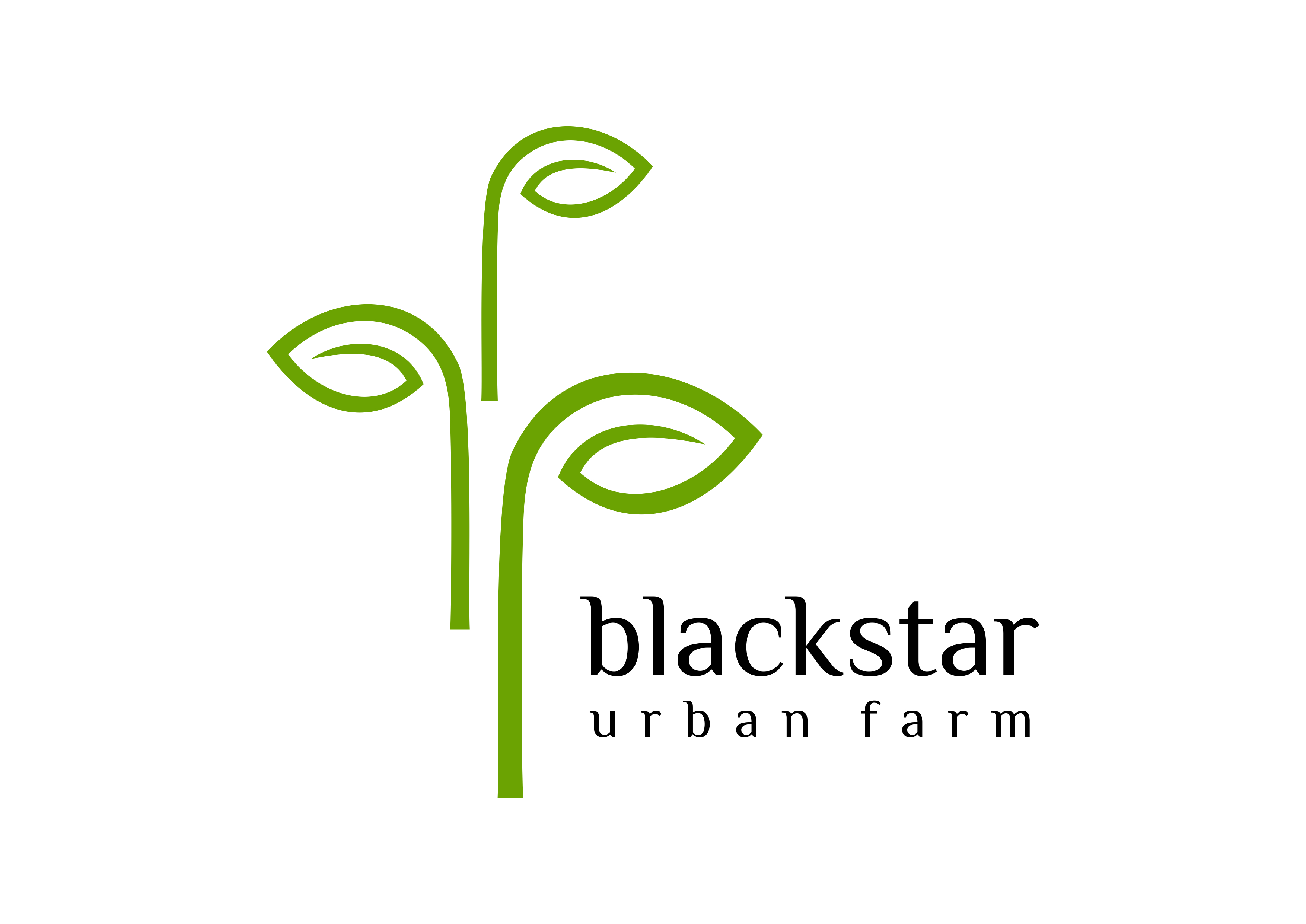
Those are them! I will keep to myself which one I prefer but, I will tell you that the majority of my little family like the opposite one! I am really looking forward to what you all think!
Thank you for reading! Take care of you and yours ❤
The first one is better for keeping the eye on the name of your farm. The leaves and stem at the end of the name is a nice touch. The second option puts a lot of the emphasis on the green shoots. That's where the eye is drawn. Not necessarily bad if you want folks to remember you for your green shoots as opposed to your name.
What would be nice is if you could take the concept of the second with the green shoots and incorporate it into the leaves and stem of the first by coloring them green. Not sure what that would look like for color balance or symmetry but it would give you more than just a black logo if you'd like to have the mix.
The other option I see is having the green shoots be smaller so they're not dominating the second logo so much.
Nice advice about changing the color of the shoots on the first one to green.
Seemed to be where the second one was going, if not for the dominating green shoots. Sounds like there's consensus with what I was saying with you and @retro-room, and since he's a professional... :) Or maybe I'm providing consensus, since my comment came way after yours. :)
Right?
Thank you so much! I really appreciate the detail in your response <3
I am asking the designer to try both those suggestions! I think the first idea would look really cool on the leaf-tail thingy!!
I think the first one and was going to say the same thing @glenalbrethsen said about the green, but what about a green star shinning down on the green leaves and highlighting them? Get the star from the name and the green from growing both in it.
The second one looks to much like Corporate America which sort of gives me the creeps, lol.
Ooohhhh too corporate looking vs homey....I had another person say it was cold. The green star is a good idea, thank you! I appreciate it <3 I like the first more right now too I think
I prefer the first one myself. I'm a graphic designer and I often run into issues using logos that aren't square or horizontal. Plus, the image is way larger than the text, which I would personally reverse if it were my design.
Oh wow, thank you for those tips @retro-room. I liked the first one best as well. I will ask the designer to do that to the second and see how it looks. Cheers, I really appreciate your time <3
I Think Second option i best . its my only personal opinion.
Thank you @sabbir1213! I appreciate it, it is the one most people liked so far!
Hmm i also live this, that is why i comment it.
I also prefer the first one for many of the reasons already mentioned in the comments. The green sprouts in the second one really seem to be dominating the text and seem disjointed from the font. I am also wondering where the name "black star" came from and if there is history to the name that can be worked into the graphic. I also work as a graphic designer and really enjoy when the branding tells a story for a business. Cheers, Aimee
Thank you @canadianrenegade! I agree with the green sprouts size being off. He sent me a rough of it moved:
But I still don't know...
Blackstar just came up in a brainstorm with my best friend (since literally 6months old) who I adore. She is a witch <3 <3<3 I just loved the suggestion and it stuck.
Wow, that sounds like a super special friendship. <3 I think the new composition is better but I still prefer the flow of the other logo. Looking forward to seeing what you decide. -Aimee
Definitely the second one! Green is a much better color for someone who grows things, than black....
Now if the first one was in green, maybe I'd select that one, as it is simpler. But maybe not, as it's a bit harder to read...
Yes, I have had more people say it is harder to read! The green for growing is what has me on the fence...thank you for weighing in! Happy Saturday! <3
I think the second option is better. the philosophy of three pieces of young leaves are meant to fertilize. base my opinion. thanks
Thank you @rikaz87 <3 <3 <3 I do love that philosophy and the number 3, maybe why I was attracted to it as well! Have a wonderful day <3
You are welcome ms. @karenfoster
Number 1, by far. The name is the important part, not the decoration. It is bigger and more professional looking. It is unique without being overbearing or busy. You have the right instincts.
This makes me smile! Starting to feel really good about number 1! Thank you for the detailed critique, I love all of your points. <3
I definitely prefer the first version. I like how the tail end of the lettering ends organically. The lettering also seems to be more stylish and have some character to it. The second logo option looks a little bit more corporate in my opinion. Nice to have options!
I know what you mean....homey vs business-y looking. I do really like the little plant tail there too. Thank you @allforthegood! I appreciate your words and time <3
I prefer the second it is easier to read, just easier on the eye. No need to make it fancier than it needs to be.
Thank you @anthrovegan for your time! It does have nice and simple lines. Clean looking